How effective and at the same time it is most convenient to organize the space of a small living space? This question sets the owners of apartments around the world. And today we invite you virtually to visit the city of Turin in Italy to get acquainted with yet another solution to the problem.
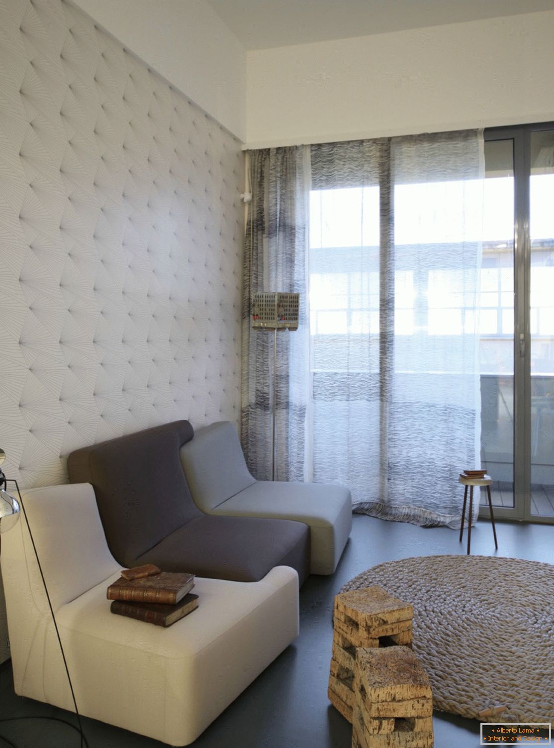
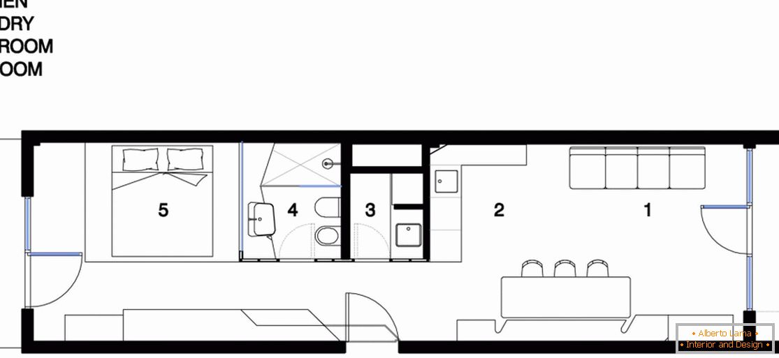
This residential project was another achievement of the notorious design company UdA. The apartment has a simple layout, reminiscent of a container, and a small area of 40 m2. Before Andrea Marcante and Adelaide Testa, leading employees of UdA, the next opportunity to compete with peculiar features of the post-industrial architectural space was opened. Designers fully coped with the task and developed the theme of the location of several structures inside each other. Thus, the internal decoration is arranged as a continuous single entity, which on its way meets with the usual scenarios for everyday life.
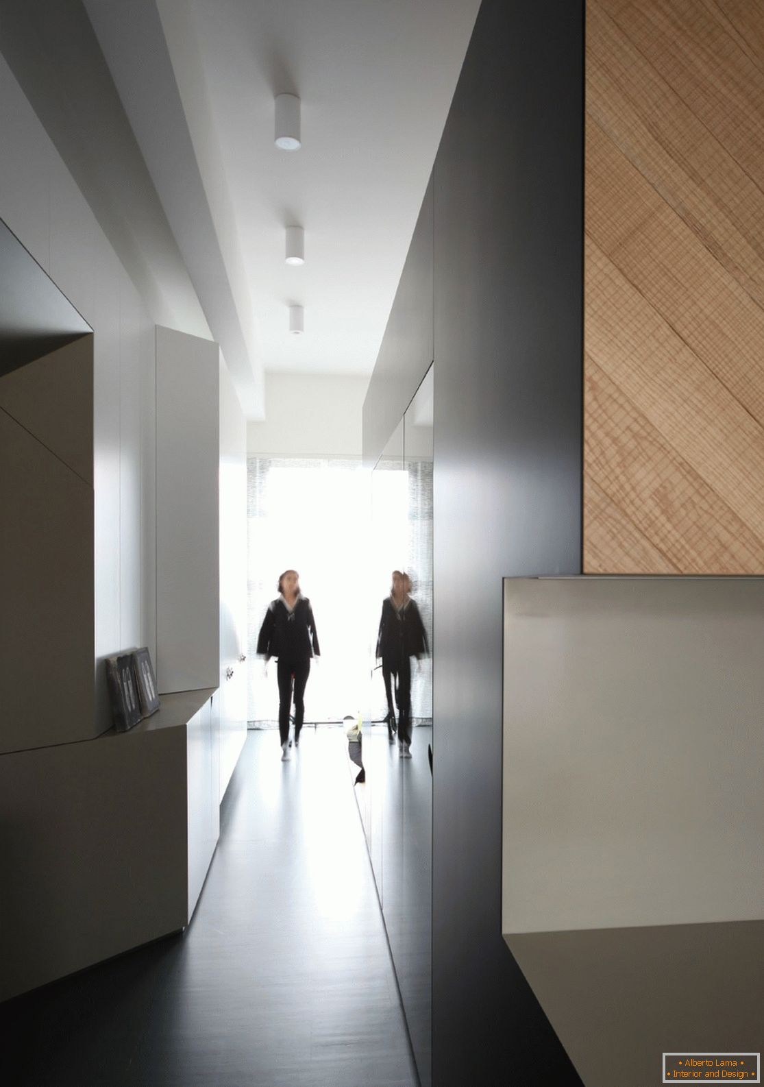
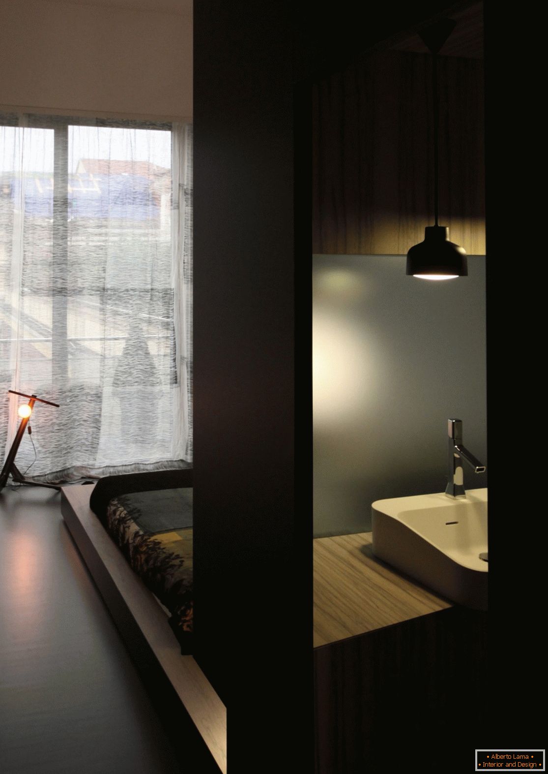
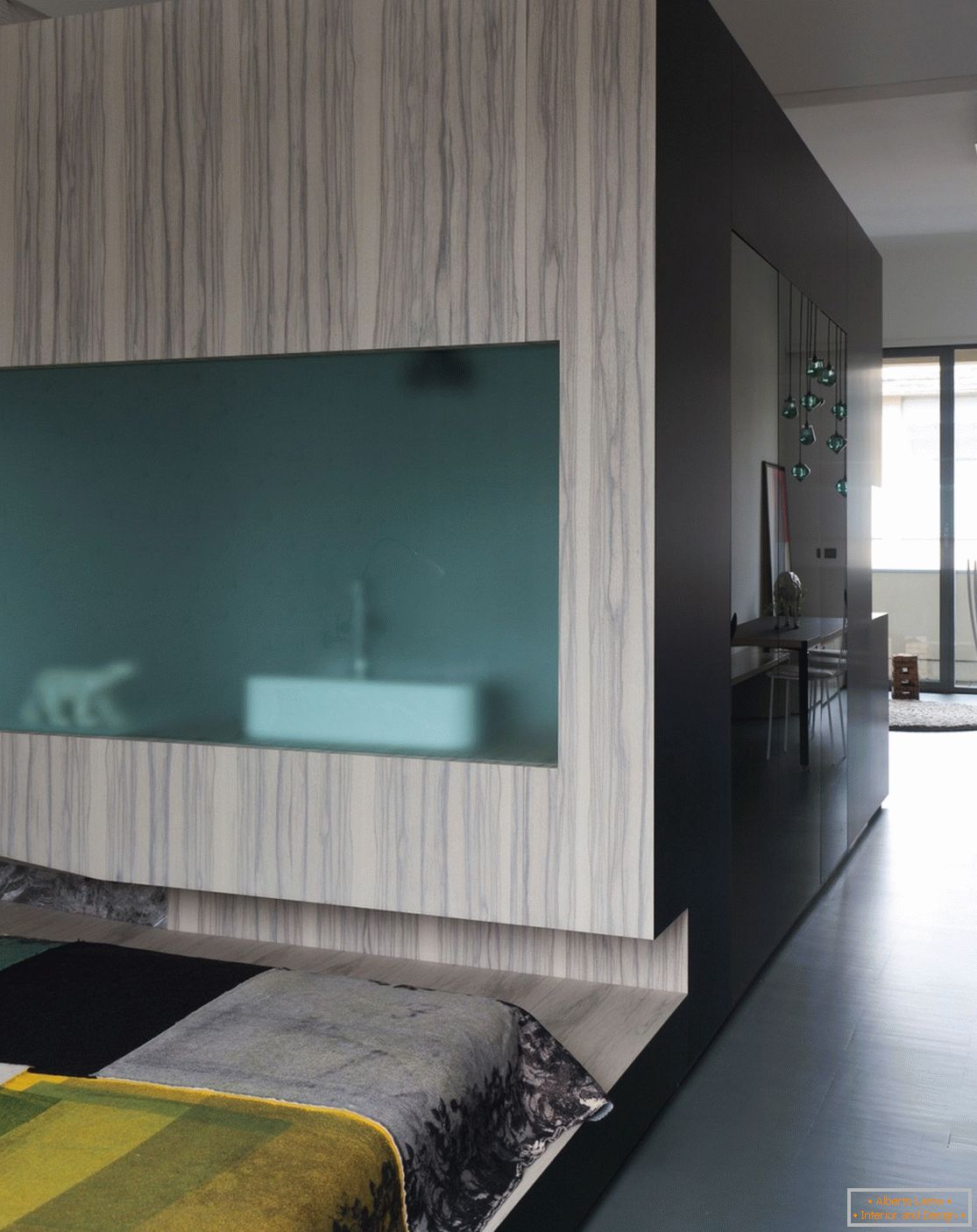
The long and narrow space is organized in the form of a sequence of "modules" deployed to meet the neighboring square and inward, where the tenant cooks, eats, sleeps, works and has fun. This leads to a minimization of the living space in which materials and furniture constructed from them smoothly flow from one functional form to another.
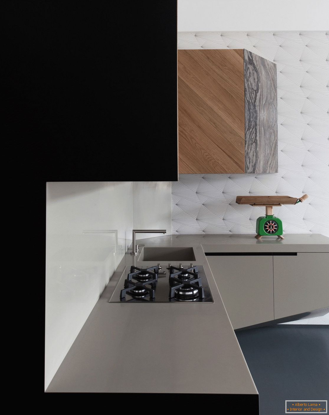
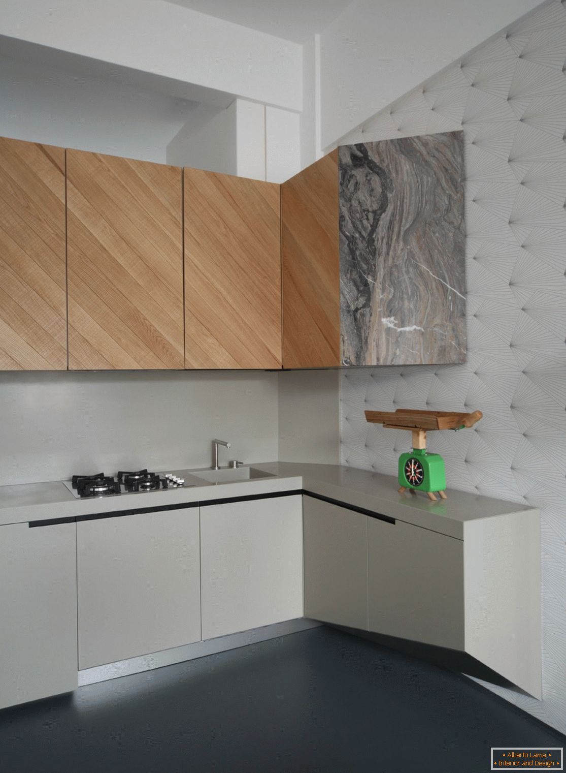
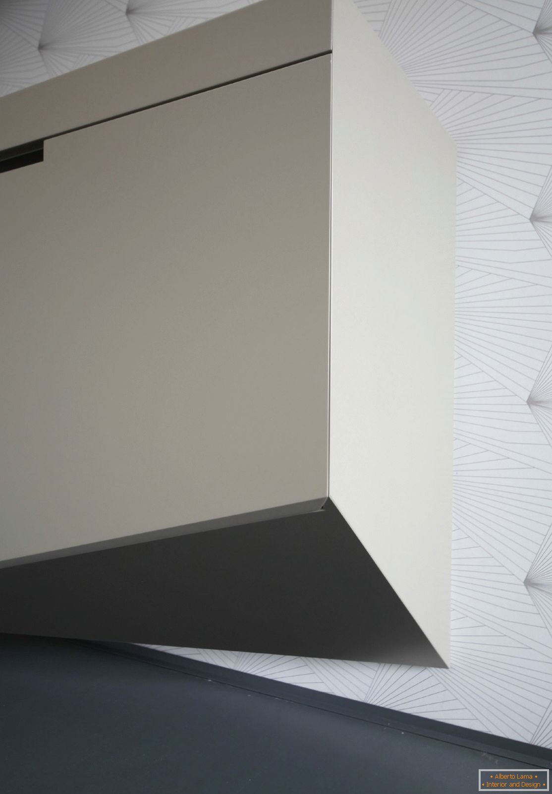
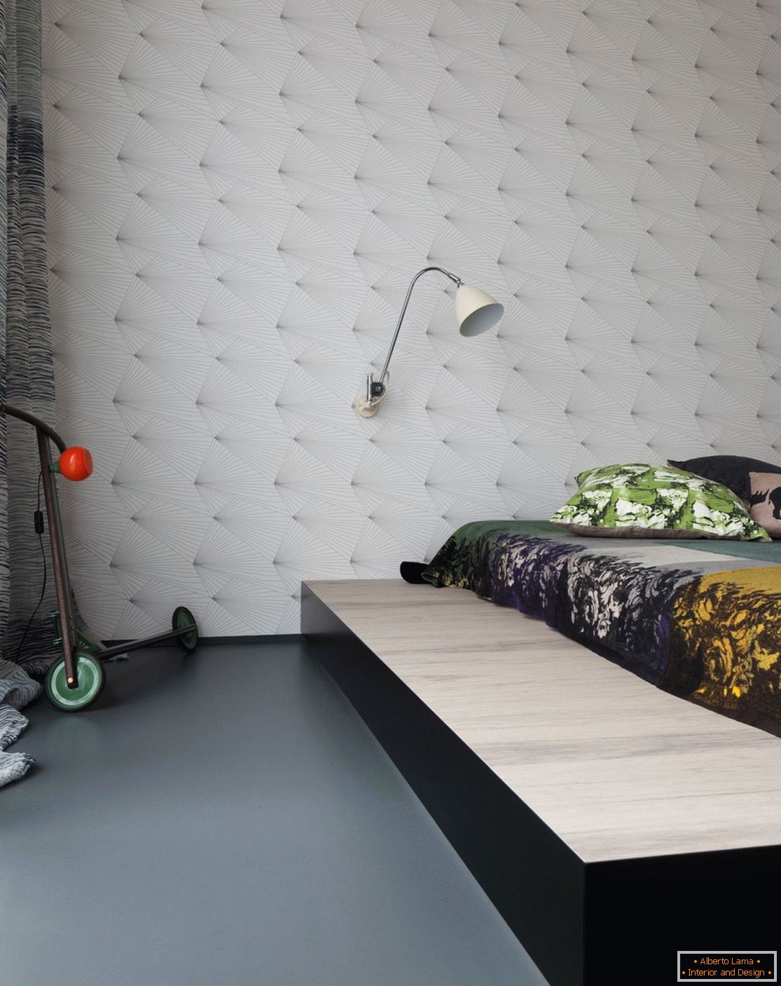
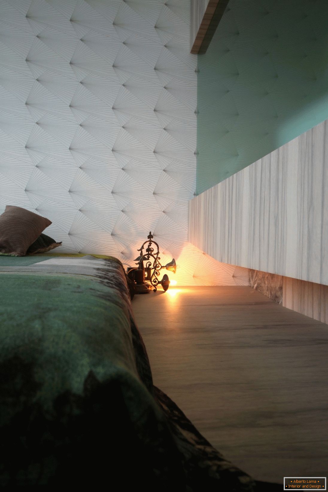
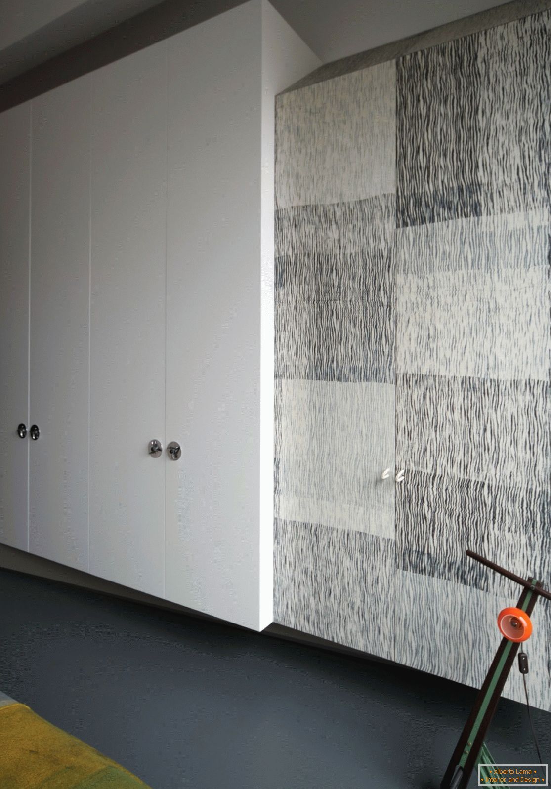
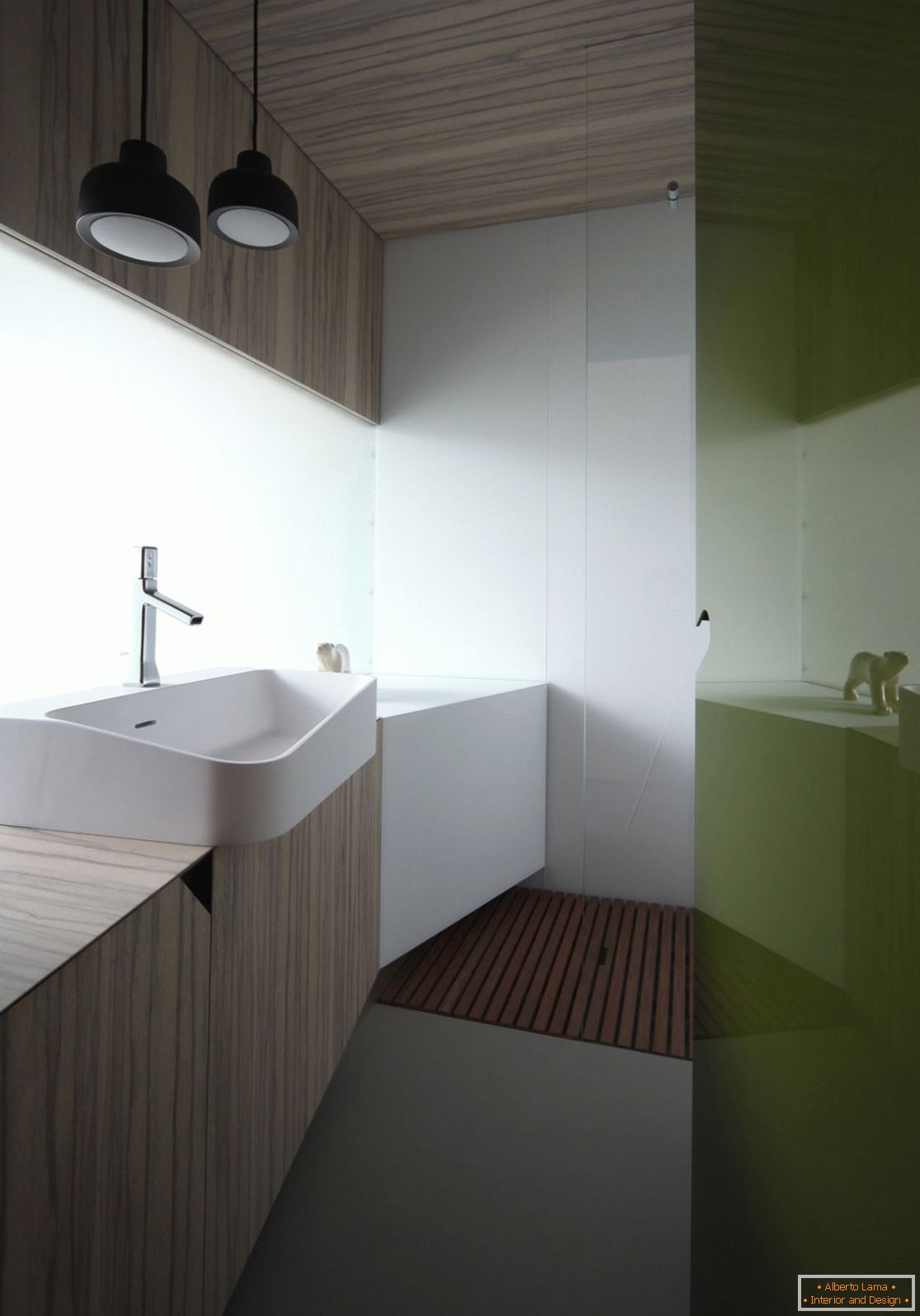
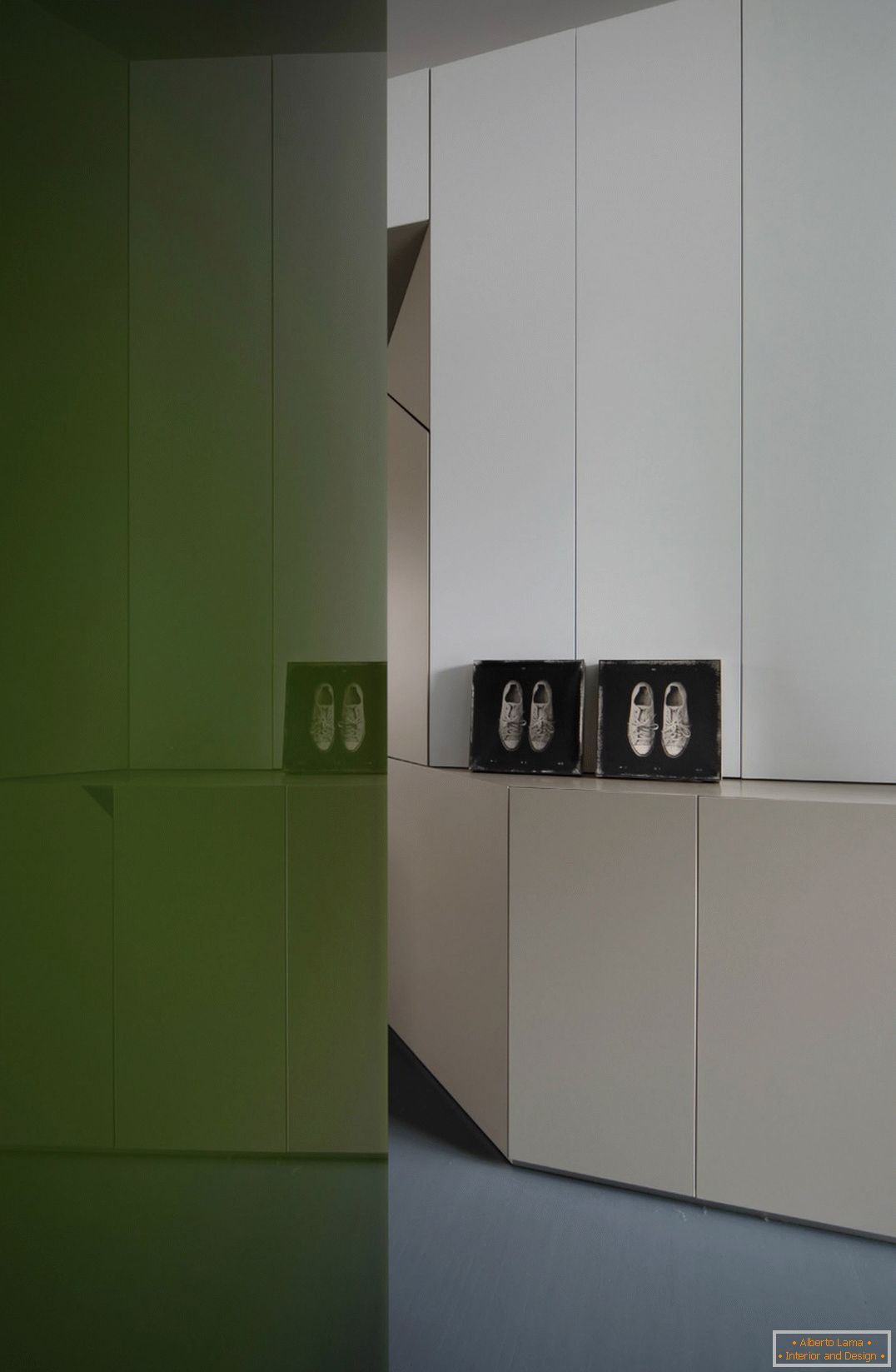
The wooden decoration changes on its way from the bedroom, through the bathroom to the kitchen. Marble slabs look modest, unobtrusive, and sometimes even hidden with caution and prudence, as if they were abstract symbols in human comedy. And the black lacquer surfaces, similar to the play of shadows, act as binding elements of the whole plot, while the rigid geometric shapes send graphic hints and begin a dialogue with the motifs of the wallpaper of the surrounding walls.
The material is kindly provided by UdA. Pictures of Carola Ripamonti.

