Every situation needs special zones, on which people will concentrate their attention. Without bright spots, even a refined interior picture looks too boring. Accent areas are designed to achieve two effects:
- Accents in the interior: choose the color
- The scheme is "warm-cold"
- The "Additional" scheme
- The "Similar" scheme
- Accents in a neutral interior
- How to keep balance
- What can be used as a bright accent
- Conclusion
Accents in the interior: choose the color
Under the color accents are meant elements of the design pattern, which are knocked out of the overall design palette. Most often in their role is the decor, but sometimes full items of furniture can attract attention. The choice of color palette depends not only on the desires of the owners, but also on the size of the room, lighting features, stylistic solutions. The latter should be taken into account if you are using not a potpourri of directions, but a specific style with characteristic features and frameworks. So, in minimalism on black and white with a gray background, the accents are chosen on the basis of the "neutral interior" principle. Absolutely any tone brought on the light canvas of the situation will be noticeable and bright. In the Provence, where the snow-white floors are combined with the same furniture, or in hi-tech accent colors are chosen on the same principle. In darker shades of classical style or art deco with a game of tones it is recommended to be more careful, since such an interior does not all endure. If you are sure of the flawlessness of your taste, then the combination of colors can be chosen intuitively. However, it is recommended to use one of the generally accepted schemes. At the heart of each lies a certain principle.
See also: Black color in the interior: ideas of color combination +75 photo 
As for the compatibility of the color solution with the dimensions of the room, it is not recommended to overload the small rooms with dark accents. In small spaces, interiors are used in light colors (more snow-white and pastel shades). To visually add a room extra meters, accents need to be done according to the principle of light color transitions, rather than contrasting borders.


The scheme is "warm-cold"
Depending on the psychological perception of a person, the colors are divided into cold and warm colors. The first include blue, green, purple, turquoise, lilac and blue, and to the second - red, yellow, orange, pink. The basis of the principle was the color combination in contrast. For example, all the decoration of the room is made in shades of one "temperature". Attention will be focused on details that are performed in the tones that are on the other side of the conditional axis of the color spectrum. The tinted picture turns out to be organic and balanced, since the opposite colors complement each other.


The "Additional" scheme
The principle of addition implies the use of a pair of basic shades in the interior. To one of them add that contrast tone, which is strictly opposite on the spectral circle. For example, the interior is dominated by pink and orange shades to balance and dilute add accent blue or blue. If the situation pulls "cold" (blue, purple), then the details are made in brown tones or gold with yellow. Such a color scheme brightly and slightly aggressively decorates the interior, so it is not recommended to use in rest rooms: a nursery, a bedroom.


The "Similar" scheme
This principle of combination is distinguished by calmness and relative neutrality. The color temperature of the room remains almost unchanged, since the nearest "neighbor" is chosen for the main or additional shade in the spectrum. The boundaries of the background and accent zones will have a transitional character, instead of sharp contrasts. Recommend in a similar manner to design bedrooms and rest rooms.
See also: Beige color and its combinations with other colors in the interior 


Accents in a neutral interior
If the color scheme of the room consists of brown, black, white, gray, beige shades, you can safely enter accents of absolutely any tones at the owners' choice. And not necessarily limited to just one option. It is acceptable to use several colors, but only after a preliminary assessment of the tonal congestion of the room. For example, in monochrome rooms, you can safely add even two or three accents. In interiors, which already combine brown, beige, black and white, do not recommend overloading the situation with a couple of additional shades.

Before you buy a decor carefully weigh the degree of compatibility of accents with each other. Perhaps one can completely drown out the second, thereby questioning its use. It is desirable that both shades of the same intensity.


How to keep balance
In order for the background and accents to be in harmony with each other, it is necessary to observe the norm of the relations. A kind of rule "golden section", adapted for the interior composition. The ratio concerns three colors:
| Main | Its percentage should not exceed the level of 60. |
| Secondary | This is not an accent, but just an addition that helps to display the depth of the main color. It accounts for not more than 30% of the composition. Choose a color, usually from the "neighbors" of the main tone in the spectrum. |
| Accents | Bright spots in the interior should not occupy more than 10%, otherwise their overabundance will negatively affect the perception of the room. |


This rule does not apply to all surfaces. Designers usually do not take into account a tree or materials that imitate it. They are viewed as a neutral background. This is a classic wood of natural shades (oak, pine, wenge), and not about plastic panels, the surface of which repeats the texture of the original, but painted in acid colors. A similar situation develops with white, plastered ceilings and walls. They are simply thrown out of the color composition, since the solution of "puzzles" with such a large neutral background will inevitably lead to incorrect results and the broken composition.


What can be used as a bright accent
In the role of an accent any decorative objects or the basic situation act. The interior painting is usually "polished" with the help of:
- Textile. The option that allows you to focus not only on the color or pattern, but also on the texture. The main advantage of the fabric lies in its replaceability. You can completely change the accents in the room, if the current ones are already fed up. Tissues allow you to experiment without even sacrificing your purse, even with those colors that quickly get bored;
- Decor items. In their role can act any interior object, the main purpose of which is to decorate a room;
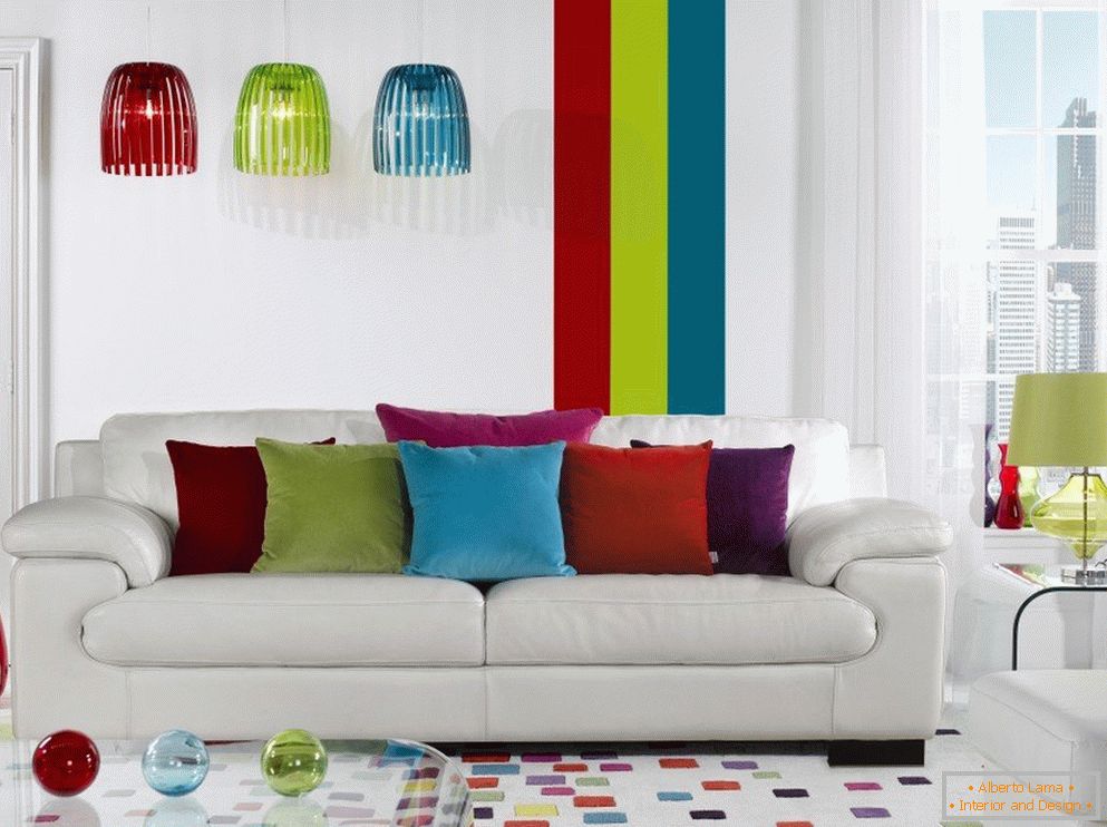
- Objects of furniture. With these objects and brightness it is better to be more cautious, since similar shades are still recommended to enter the room strictly dosed. For this reason, a sofa for example, it is better to choose not entirely red, but with catchy legs and armrests. Optimal use of modular furniture is considered, where only certain parts are painted in bright colors;
- Accent zones. By this concept usually mean a whole site, which is given to "tearing" the decorative elements. In the role of the accent zone can act wall, podium, a separate corner of the room.


In the living room accents are mats, cushions, plaids, curtains, vases or boxes on the shelves, lamps, chandeliers and individual parts of coffee tables or shelving. In kitchens, the interior is polished due to bright aprons, dishes, houseplants, tablecloths (for the dining area), curtains and countertops. In the bedroom, usually, all accents are centered on the wall at the head of the bed. As a result, it turns out that there are bright colors on the palette, but the sleeping people do not notice them, which, accordingly, does not interfere with sleep. Also in this room use catchy curtains, pads, bedspreads. In the halls are limited to a couple of paintings on the walls, a rug under the door and a bench for re-training. In children's rooms, bright colors are used everywhere: the more colorful the situation (within the limits of course), the more the child develops more actively.


Conclusion
Bright accents are vital in interior design of a city apartment or a private house. It does not matter what type of housing you have and where it is located. If people spend time in it, then the situation should be cozy. And it is impossible to receive it without observing the color balance (background-accents).


