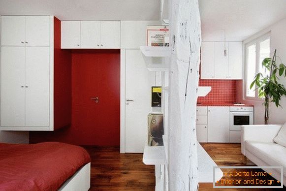
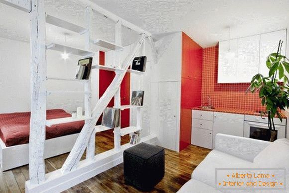
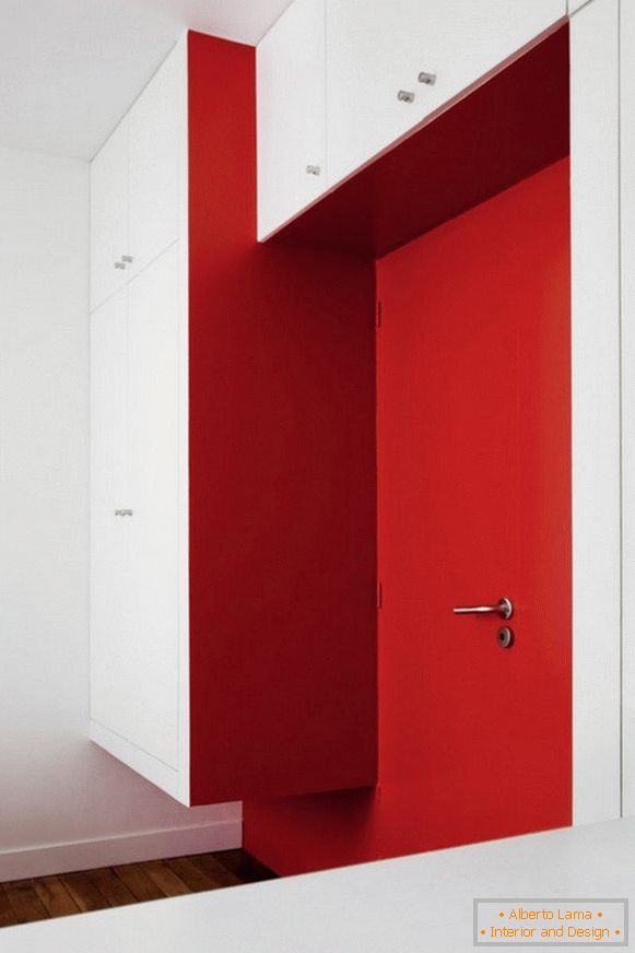
This small apartment, with an area of only 25 squares, is located in the French capital. It was designed by SWAN Architects. The designers managed to make the incredible. They could fit into the small apartment a bedroom, kitchen, living room and bathroom, which was well hidden. That's just the bed is not clear why they installed directly opposite the entrance doors. This is a strange decision, but perhaps the owners will like it.
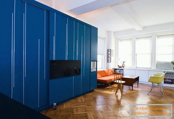
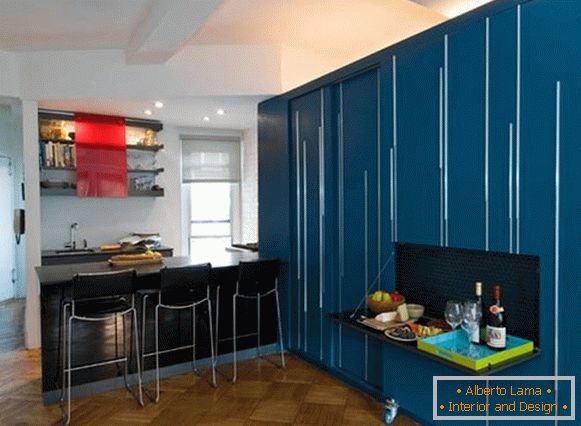
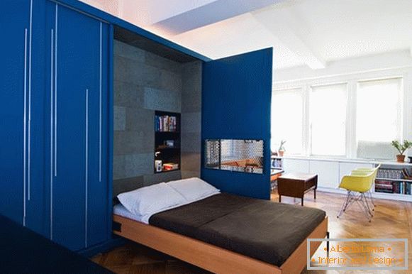
This project was created by designers from the company Normal Projects. They wanted to prove that in a small space you can fit everything you need for a comfortable life. The center of this interior is an amazing wardrobe of blue color. Looking around, the look itself returns to this giant. And as it turned out, this is not an accident. There were a few surprises in it. One of them is a bed with a folding mechanism. Also in the closet there is a comfortable table for lunch or work at the computer, which must be liked by the owners. This blue giant not only creates a vivid contrast in the design, but also fulfills its direct duties: separates the kitchen, from the main room.
The Su11 architecture company together with Design created an amazing interior on an area of 54 squares. A small kitchen housed a huge number of lockers, intended for storing dishes and other accessories. It was combined with the living room, which also serves as a bedroom. The flooring is made of natural wood, several flower pots and carefully thought-out lighting helped to do their thing. But best of all will appreciate this masterpiece by those who love minimalism.
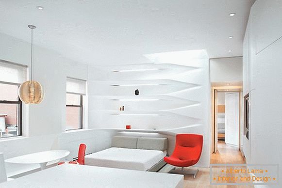
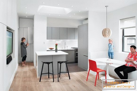
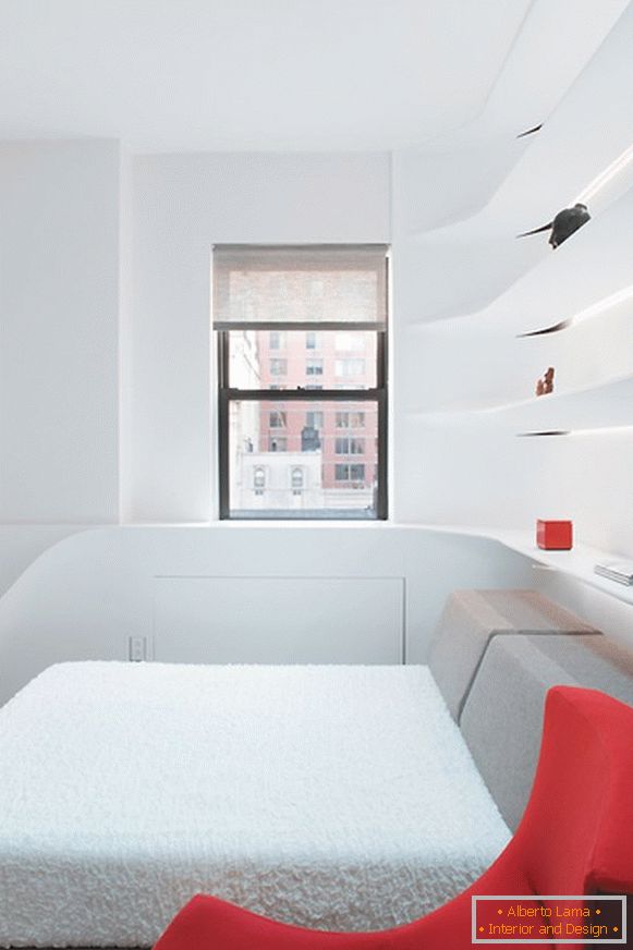
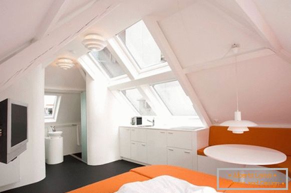
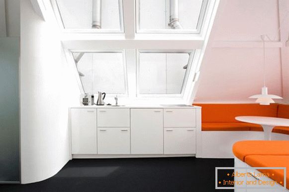
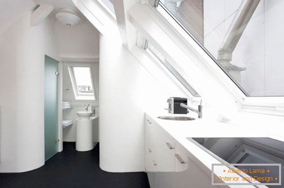
But the most memorable interior for me personally is the loft, created by MAFF. Many people do not quite understand this word. Most believe that the loft - a large production room, which has been thoroughly converted into a dwelling. But in our time, it turns out, you can rebuild the loft so that you get a few small apartments. Now it is possible for all its guests to show off their original decor and call it this way. The bed of a bright orange shade was connected with a zone for dinners. In this room I like everything - large windows, a small kitchen, ceilings and a floor covering of a dark tone, which does not make space heavier. In general, the design was compact, fresh and functional.
