Understanding the basic principles by which interior design is created, any space can be turned into a fairy-tale environment. Surely you know what it is like when you are in a well-designed room. When you literally feel how everything is related to each other, complements each other and works together cohesively for our pleasure. And if you look at each piece of furniture separately, you involuntarily notice that it is "just right". Do you want to achieve this effect in your own home? Then read the following principles of interior design. Combine this knowledge with practice and experiments, and you will undoubtedly find your way of creating a beautiful space.
1. Balance sheet
In the design, the balance creates a sense of balance. It's about leveling or approximating the visual weight of various objects. In this case, the balance is created not only through their form, but also through color, pattern and texture.
What is the visual weight? Take, for example, two identical vases in white and black - do they look the same on the same background? There are many ways to make an object look heavier or lighter than it actually is. Here are the main ones:
- Dark colors, bright, rich colors and warm colors give objects a greater weight than light colors, cool shades and muted colors;
- Heavy or unusual patterns and shapes also have a greater visual weight, since they attract more attention;
- transparent bodies and reflective surfaces always look lighter;
- Textured surfaces visually weigh more than smooth surfaces.
There are three different types of balance in the interior:
- symmetrical or formal - the balance that must be observed when creating traditional or formal spaces. For this, the room is evenly divided into two sides, which reflect each other. At the same time, the difference between the parties in some minor details is welcomed. If you prefer not to take risks and make both sides absolutely identical, then your room can become monotonous and boring.
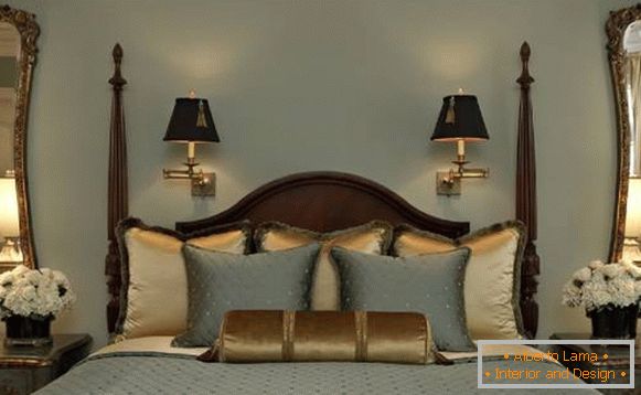
Interior design - symmetrical balance
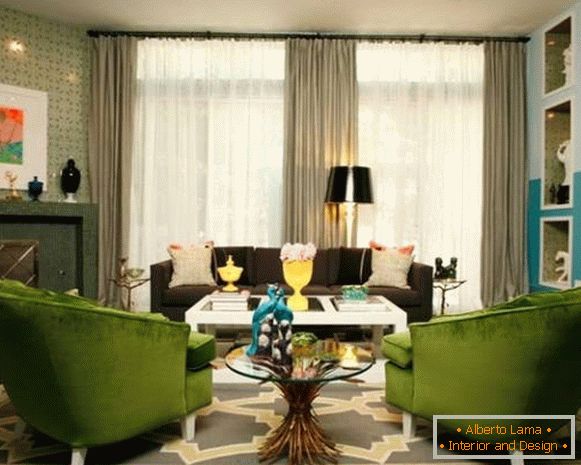
Interior design - symmetrical balance
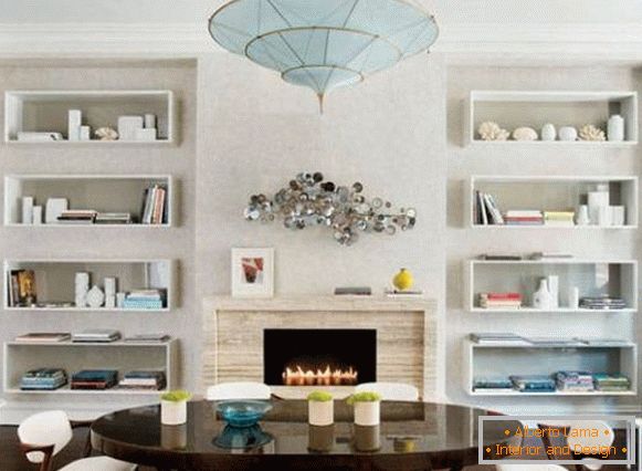
Interior design - symmetrical balance
- asymmetrical or informal - a balance in which all lines, colors, shapes and textures are balanced without exact duplication. Creating such a balance is more complicated, but also more interesting. For example, a sofa on one side of the room can be balanced by placing the piano on its other side.
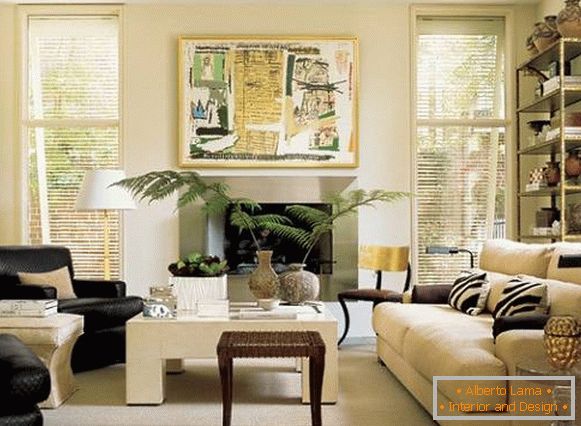
Interior design - asymmetric balance
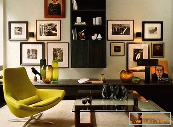
Interior design - asymmetric balance
- radial - the balance that is achieved by using the central object and all the other elements around it. An example here is a round dining table with chairs around it and cupboards located at the walls on either side of the room.
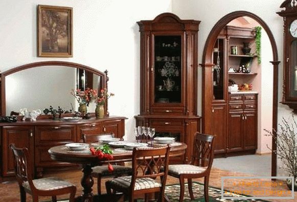
Дизайн интерьера — radial баланс
2. Rhythm
As in music, the rhythm in interior design creates repetitive motifs and contrasts to enhance visual interest. You can achieve this by alternating the same colors, shapes and patterns at specific intervals (distances). The purpose of this is to make the eyes move around the room.
For example, you can set a certain rhythm using the same pattern on the cushions, then lift it to the painting on the wall and repeat it again on the carpet at the other end of the room. Having lodged the room with his eyes and noticing the same patterns along the whole perimeter, a person can feel the integrity of the design of this interior.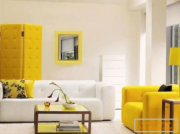
Interior design - rhythm
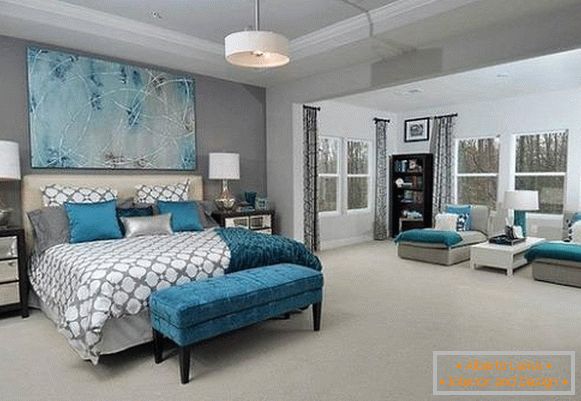
Interior design - rhythm
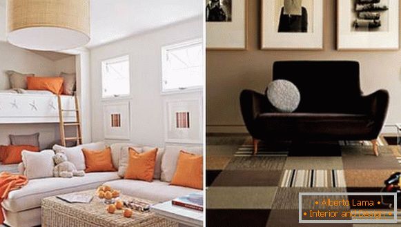
Interior design - rhythm
3. Harmony
Harmony in the interior is created when all of its elements interact together to carry a single message. Just as the rhythm can create an agiotage, harmony brings a sense of calmness. For example, you can create harmony by using only one color in the design, even if all objects are very different in shape, size, and texture.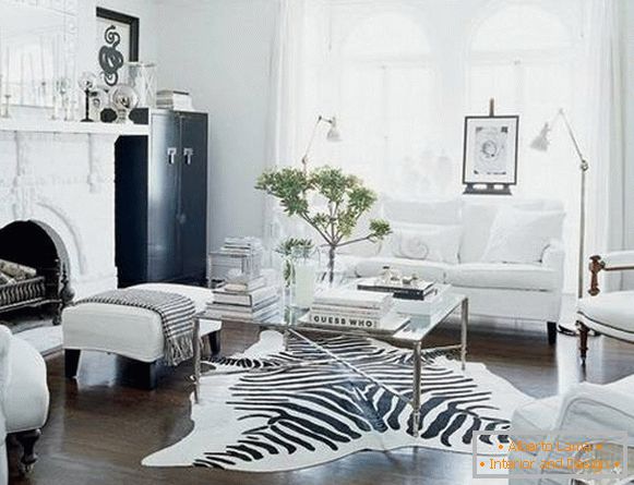
Interior design - harmony
4. Accent
A room where everything has an equal value will seem either scattered or boring. You need to focus on something. Architectural spaces often have so-called "points of interest", for example, a fireplace or a window with a beautiful view.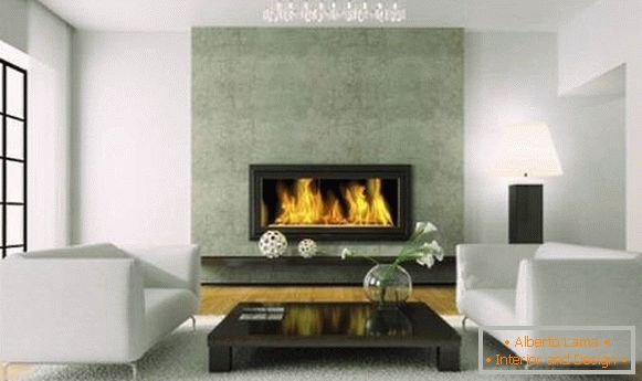
Interior design - accent
You can also place in the center of the room some bright object, such as a carpet or coffee table, and arrange all the other furniture around it so that it emphasizes its originality.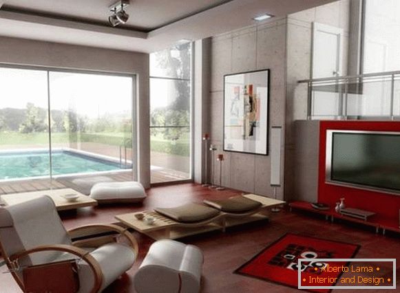
Interior design - accent
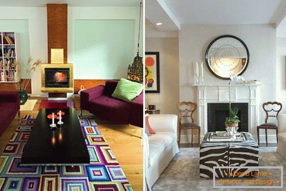
Interior design - accent
If there is not enough room for this, then simply group the furniture or add one bright element (carpet, vase or the like).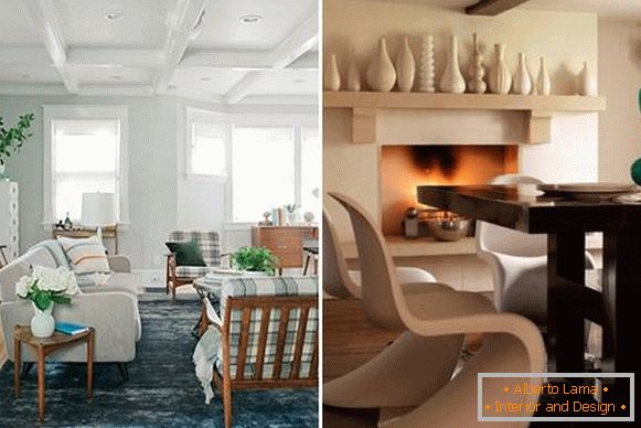
Interior design - accent
5. Proportions and scale
Proportion is the ratio between the sizes of two objects, and the scale is how the size of one object relates to the other or to the space in which it is placed. For example, a large sectional upholstered furniture in a small room will look inappropriate, occupying most of it, and leaving room only for a small coffee table and chest.
Why is that? Some proportional relationships between objects or object and space are more pleasant than others. The ancient Greeks came up with a golden rule that leads all proportions to one simple formula: the ratio of the smaller object to the larger should be the same as the ratio of the larger object to the space as a whole. This proportion is also present in nature, from where all artists and architects borrow it.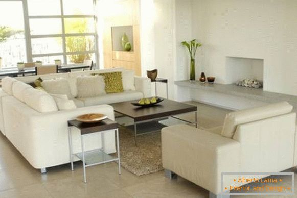
Interior design - the right proportions

