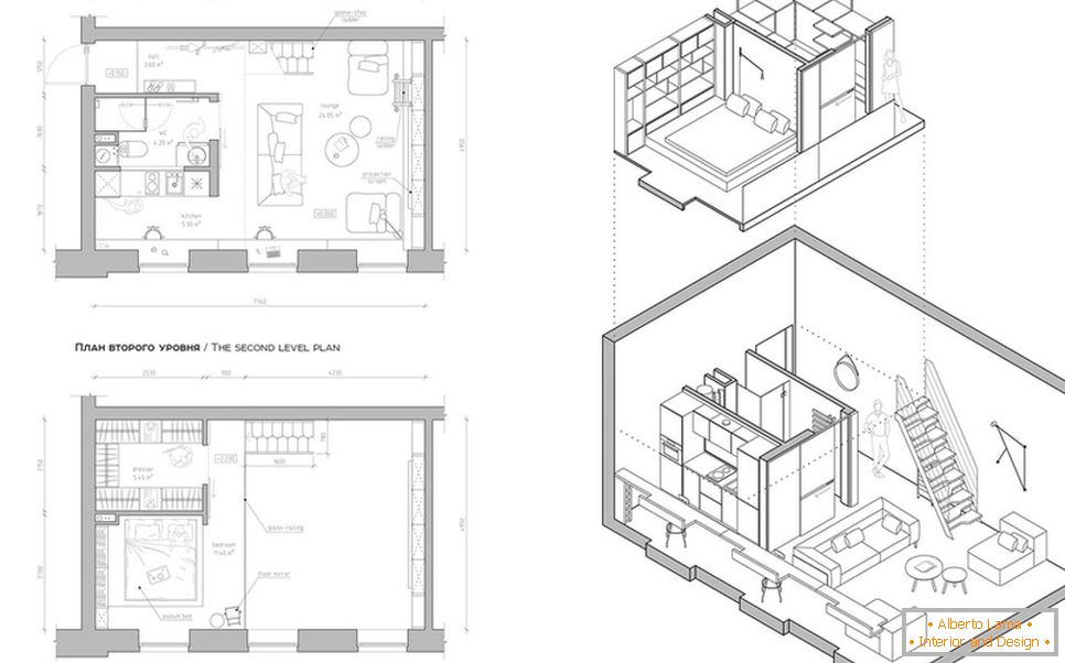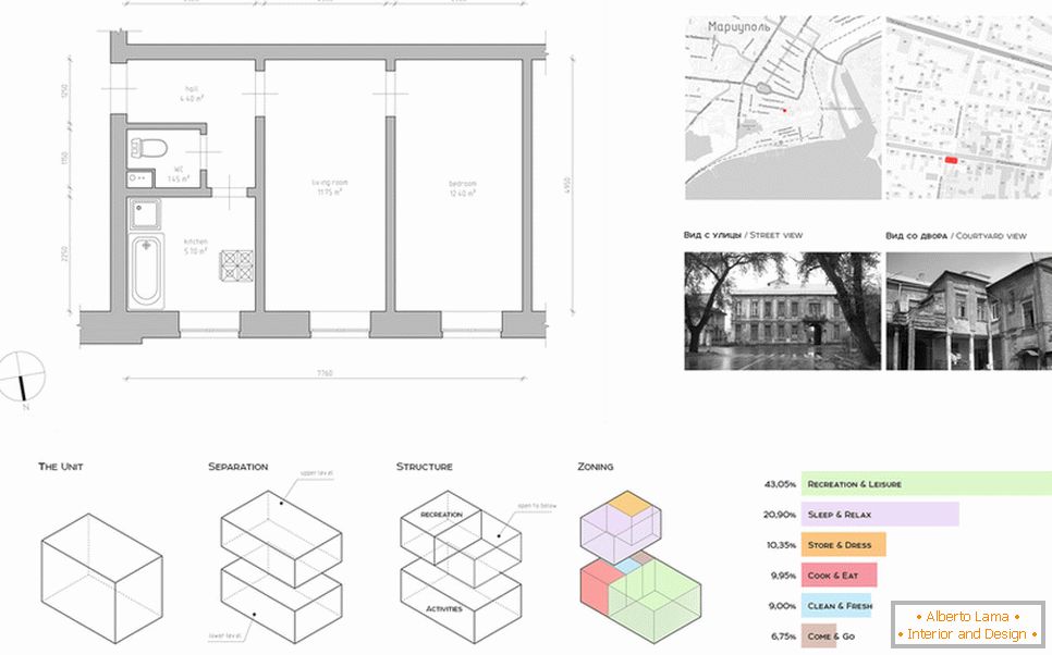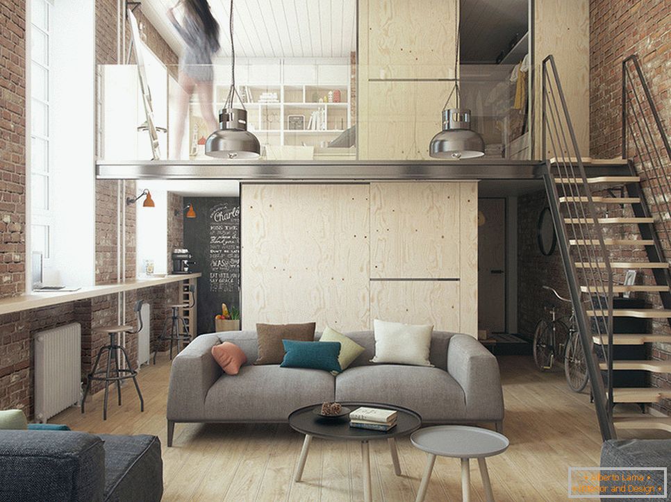
As a source material designers did not get too much. The usual "kopeck piece" of 36 m2, typical old housing. However, a nonstandard ceiling height of 4.2 meters came to the aid, which allowed using not only the horizontal but also the vertical space of the room.
Owners of the small family - a married couple, both spouses of representatives of the creative profession, young and active people, they like to travel a lot and meet friends. Preference was given to the modern concept of a city apartment - the most functional room, bright and spacious, without blocking the furniture.
The style of the loft in the interior is the legacy of the industrial past. When the former factory and factory premises were emptied, they decided to re-equip them for living space. The direction is characterized by high ceilings, an abundance of natural light and cold colors in the interior (blue, metallic, etc.). It was this idea inspired by the studio The Goort.
To begin with, redevelopment was required. The broken proportions made the room look like a well. It was a great success that it had no load-bearing walls and managed to unite the whole area together (except for a bathroom and a dressing room).
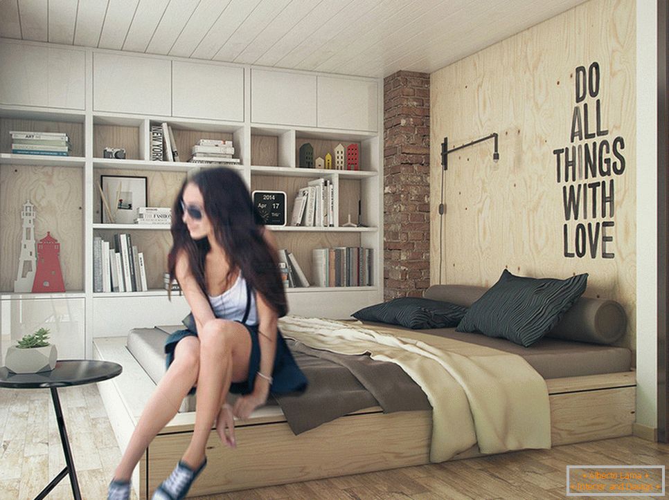
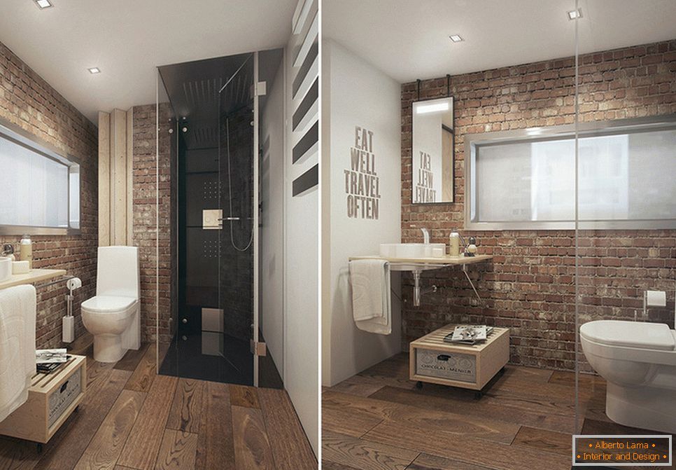
The ceiling of more than 4 meters allowed to divide the future family nest into two levels. On the first floor there is a hall, a small kitchen, a living room and a bathroom; on the second - a spacious dressing room and a sleeping area.
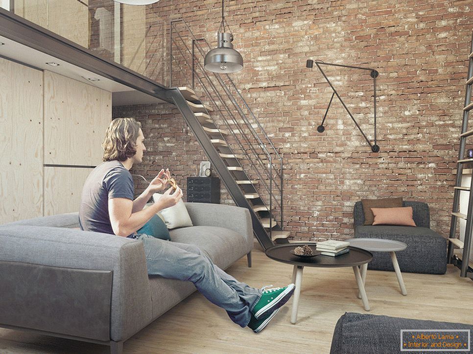
The manufactory style, brutality and spirit of freedom are emphasized by the relief decoration of the wall with a specially aged brick and ordinary untreated plywood. The idea of natural materials is supported by a ceiling of thin bleached boards, stairs in combination with metal and wooden floor.
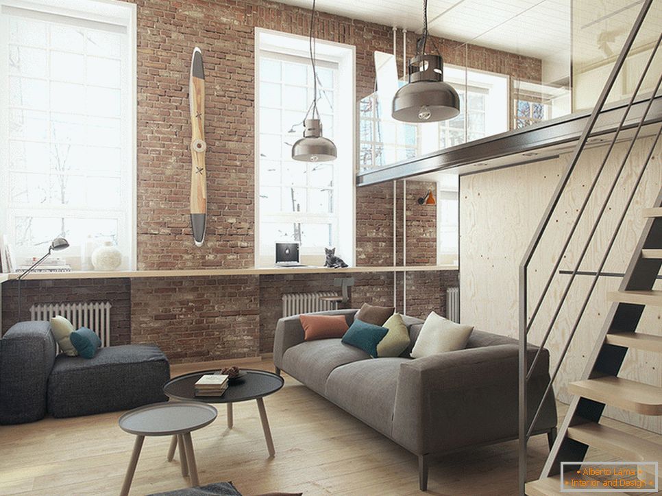
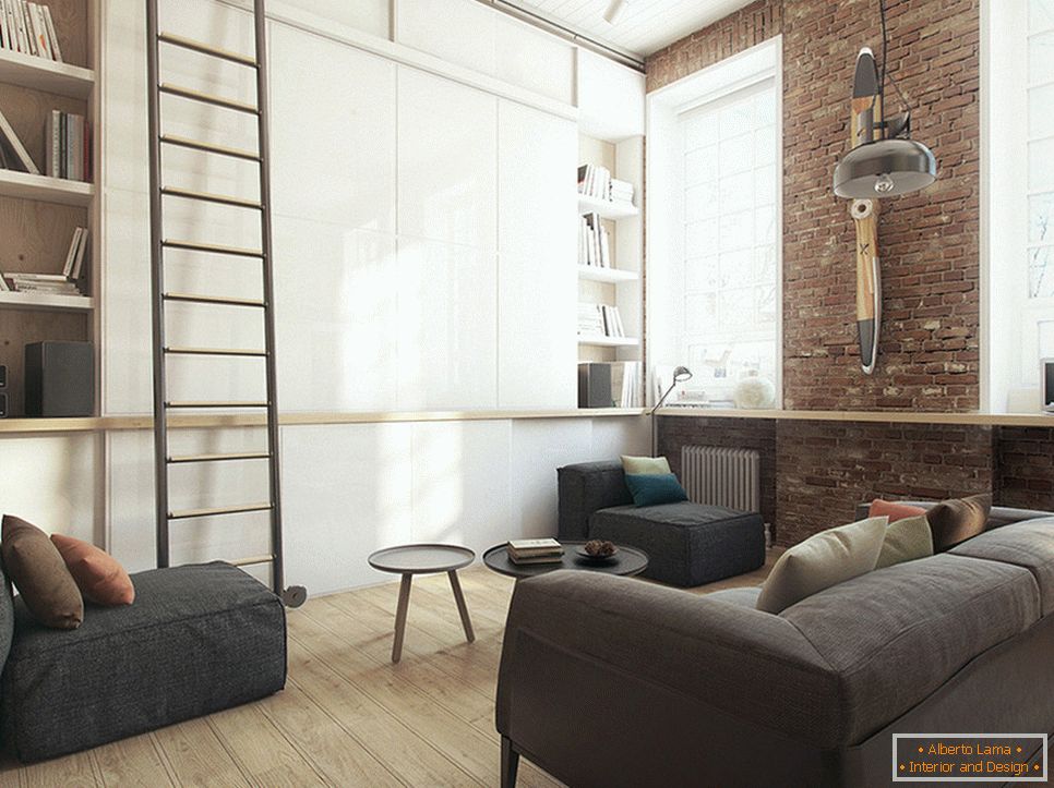
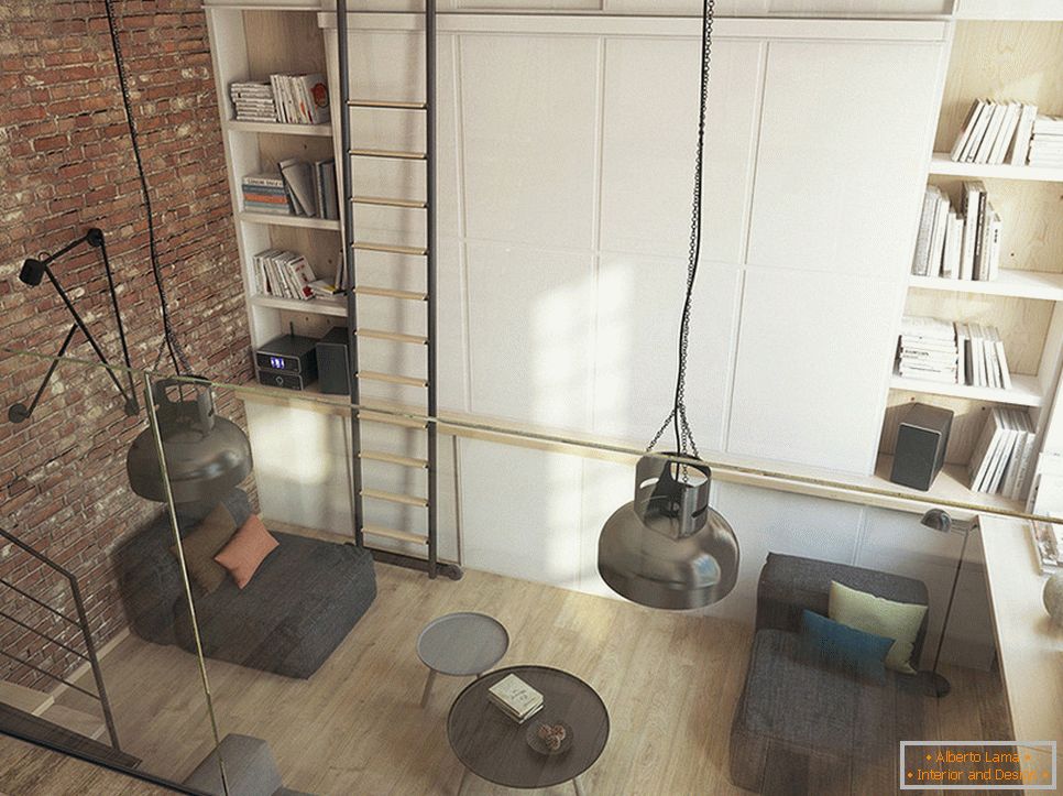
Given the small size of housing, the issue of storage is becoming increasingly important. To his decision, the experts also approached quite uniquely. On the first floor there is a huge wardrobe in the wall. Its main highlight is a ladder on rails that can be easily moved, as well as a projection screen that hides behind the doors. In the lower part, a collapsible table, pouffes, folding chairs and pillows are easily placed.
Upstairs there is a spacious dressing room and a bookcase for the owners, the kitchen kit is modest, including only the most necessary.
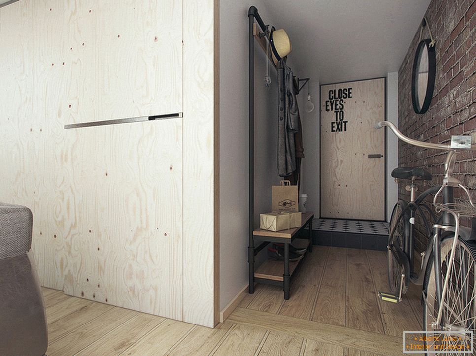
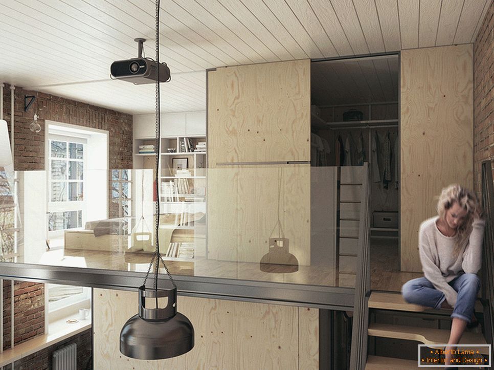
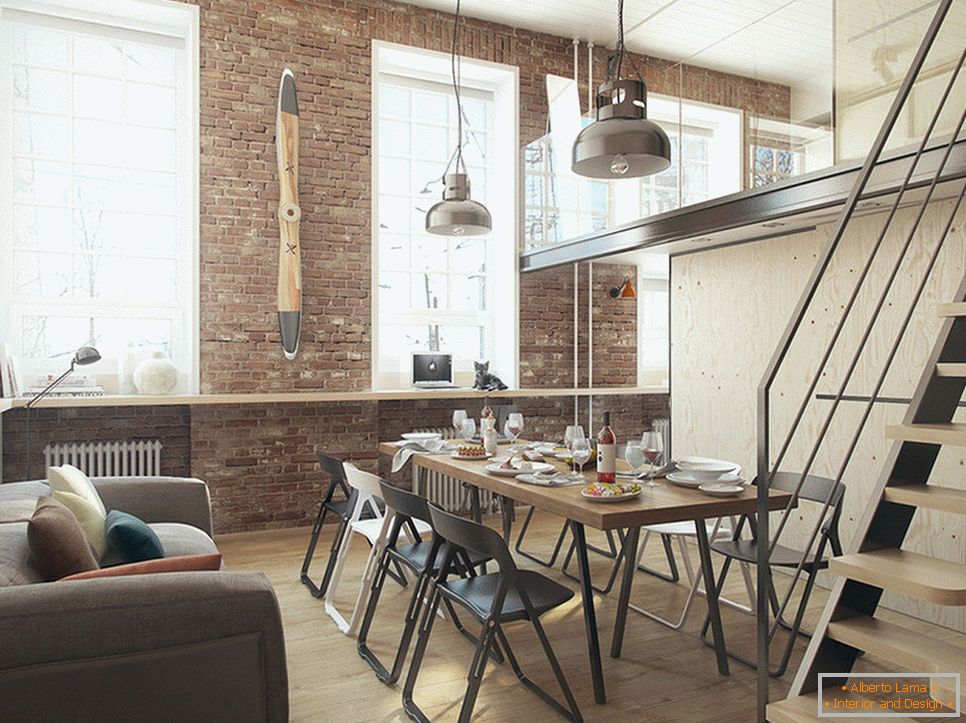
Despite the fact that three huge windows from floor to ceiling fill the room with natural light, making it even more attractive for living, a large number of additional lighting elements are used. They act as zoning elements: two metal suspensions in the living room, a sconce near the stairs on a thin tripod, ceiling spots with a turning function.
For the interior is characterized by a natural color palette, which is emphasized by a white ceiling cover and a cabinet that balances it and harmonizes it.
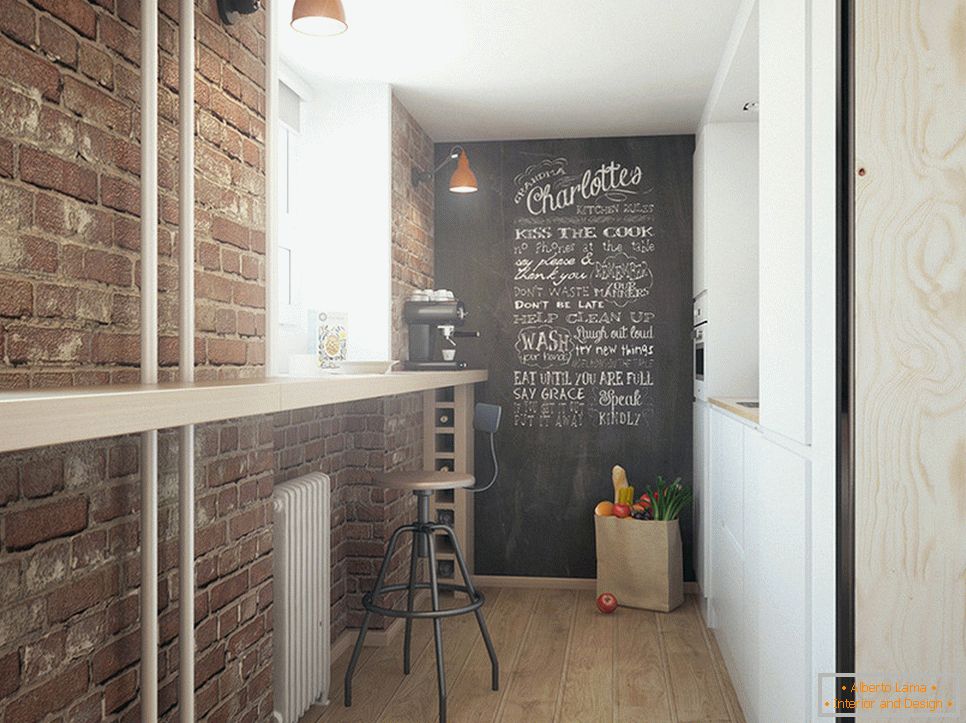
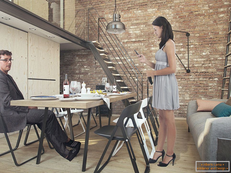
Atmosphere in the living room set a large sofa and banquet. They are supplemented with weightless coffee tables that are like a children's pyramid, you can hide one under another or move to the right place. For parties and receptions, a long bar counter is provided along the entire wall with windows, which in ordinary life can be used as a decorative detail or storage module.
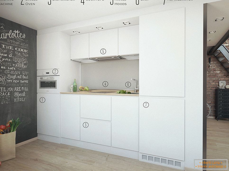
The kitchen area is very small and at first glance it may seem that there is nothing in it. However, a flat white wall surface, as if by magic, contains all the necessary household appliances, including a washing machine.
Due to the unique design, the space can easily be transformed depending on the needs. This is a noisy holiday, quiet gatherings with friends for watching a movie, a buffet table or an official prim. All this is achieved by flexible and mobile zoning of a very limited area.
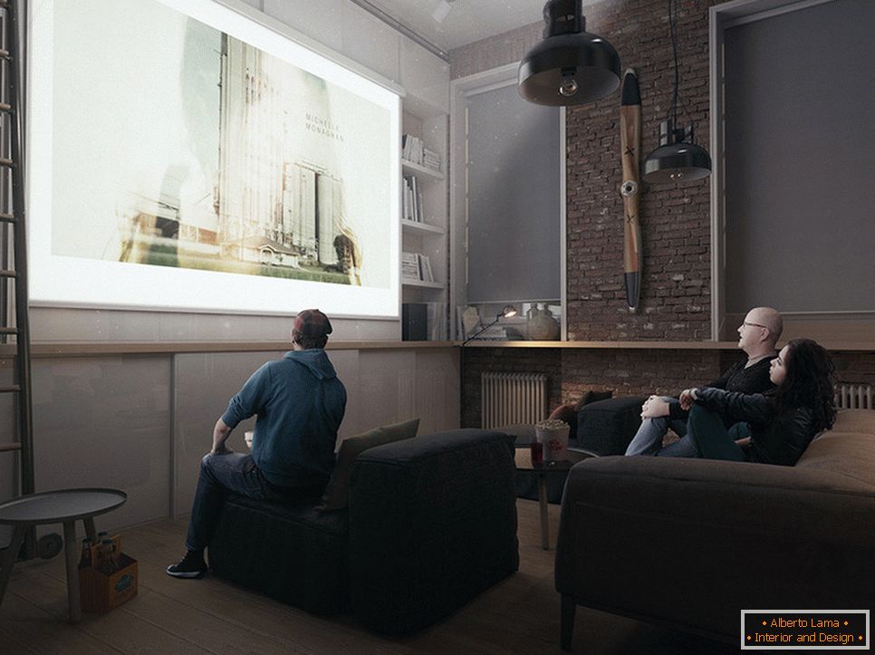
Readers certainly paid attention to the minimum use of textiles indoors, you can note only the presence of small pillows in the living room. Large windows, of course, create a space for creating luxurious draperies, but in these conditions they would invariably turn the house into a box. Therefore, it was decided to equip them with a design on rollers - compact and interesting in form. Colorite add graffiti.
Specially accessories and items corresponding to the style of the loft were not selected, the things of the owners of the apartment in such a harsh atmosphere by themselves acquired decorativeness.
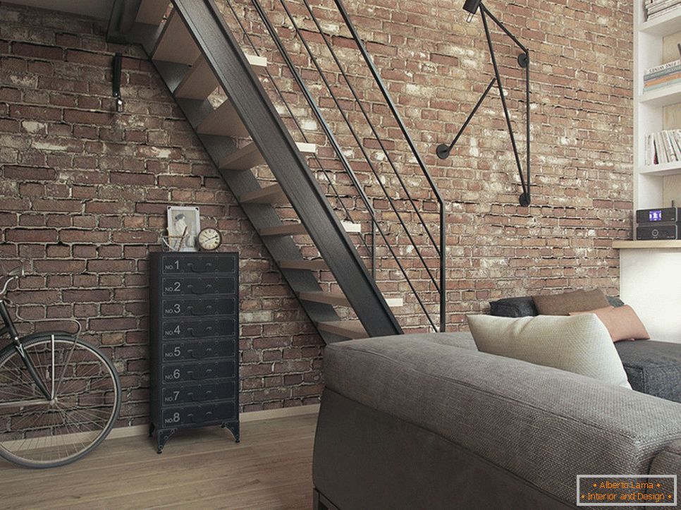
According to the authors of the project, they did not set themselves the task of sustaining all the design and layout within a certain style. Initially, there was a desire to work with a non-standard space of the room, which had its own characteristics. It is impossible to make the interior divorced from the construction of the building itself, they are interconnected and overlap each other with a certain imprint.
If you liked the style of the urban loft, we recommend using several tips for implementing it within your own apartment.
- this direction assumes the maximum open area, so safely remove all the doors and walls, except the bathroom;
- use the principle of dominance in choosing furniture, let it be a little, but it attracts attention;
- open your eyes what you can: shelves and racks, concrete or brick walls, etc .;
- let the storage function is performed by one large-sized system (a cabinet under the ceiling, a podium with boxes).
