Look at the amazing result of the work of designers who have transformed such a functional architectural element as a staircase into a true masterpiece and decoration of the house that sets the tone for the whole interior. We bring to your attention the best design ideas in the design of stairs.
Colorful strokes
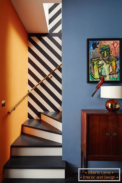
Designer Susie Hoodless created these striped black and white wallpaper that adorns the walls of a spiral staircase in a London house. Spectacular wallpapers complement the bright color scheme in the design of the interior and the steps in the monochrome.
Hovering steps
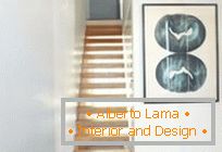
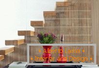
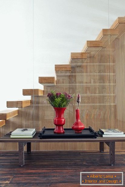
In this London house, straight panels of wood plating meet with even white coloring of the walls, combining the old and modern. The lining turns smoothly, forming a cantilever ladder, which is bounded by a transparent glass wall.
The combination of contrasts
The idea of combining two opposites is one of the main themes of the design of this house. Modernity and traditionalism, light and dark, strict lines and trophies from the flea market.
Path Map
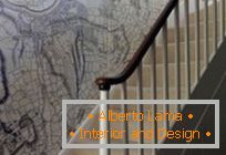
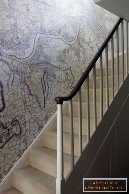
Designer and architect Ben Pentrit decided to decorate the wall above the staircase with an increased variation of the old map of London. The map begins with Kenonbury - the area where the house is located - above the uppermost step.
In white tones
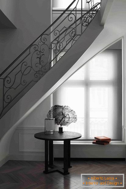
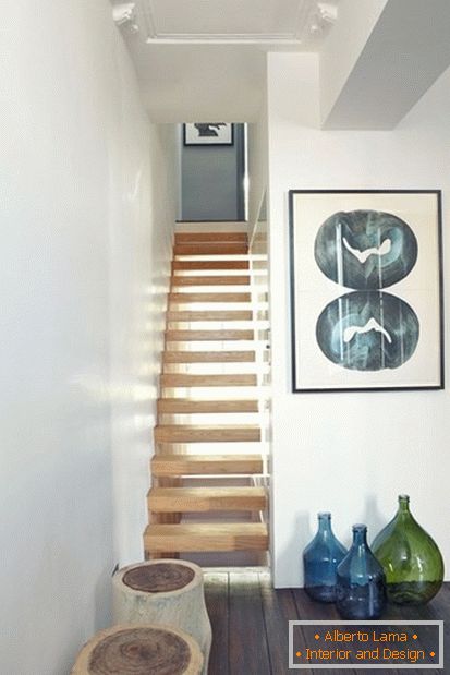
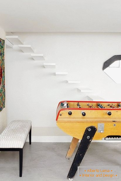
The soaring cantilevered staircase in this Parisian house is elegant and does not attract unnecessary attention, and also takes up very little space - and perfectly matches with the minimalistic design of the house as a whole.
Effective contrast
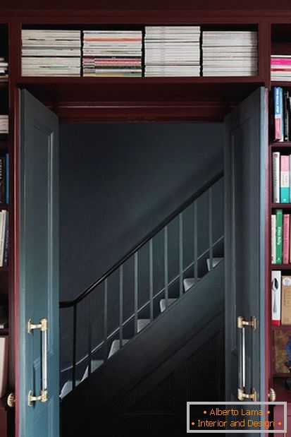
If you can not afford a complete reworking of the stairs, there is always the opportunity to simply revitalize the energy of the room with the help of colorful strokes. Dynamic contrast in the coloring of rooms is demonstrated in all its glory in the design of this house in east London.
Stunning lighting
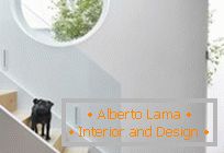
The purpose of designer Alex Michaelis, who worked on the design of this house, was to make it as light as possible. The task was difficult, but he found a solution: combine oak trim and glass, and arrange a large upper window directly above the stairs, as well as a round window in the wall above it.
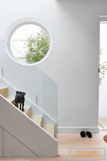
Exquisite Strips
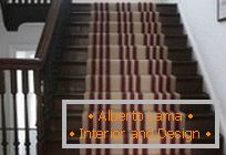
The work of the designer Roger Oates is one of the best examples of what an indelible impression can be made by a thoughtful design of the staircase. Over the course of 25 years, Oates and his wife turn the carpets into some kind of masterpieces of art, using traditional weaving techniques and modern design ideas.
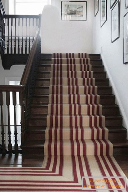
Line by line
In this beach house in Bordeaux, architect Jonathan Taki installed wooden partitions from narrow slats as a border separating the hall from the living room. Such partitions smartly combine transparency and the ability to wall one space from another, allowing each of the rooms to be unique in its own way.
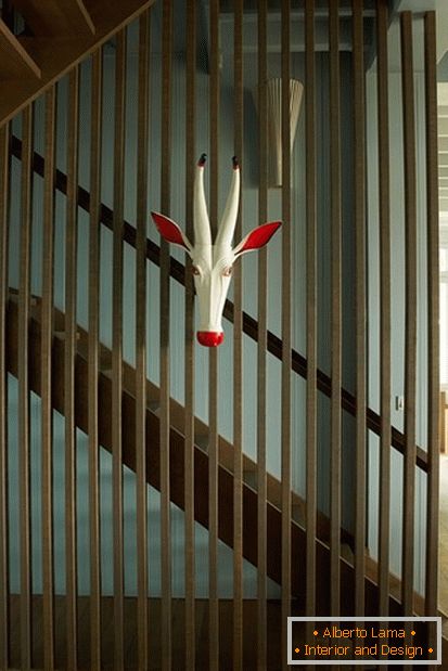
Black and white
In this Victorian house, the designer Suzy Hoodless used a monochrome color scheme to emphasize the architectural details. A simple black path on the stairs in combination with elegant hanging lamps, gives the interior a unique elegance.
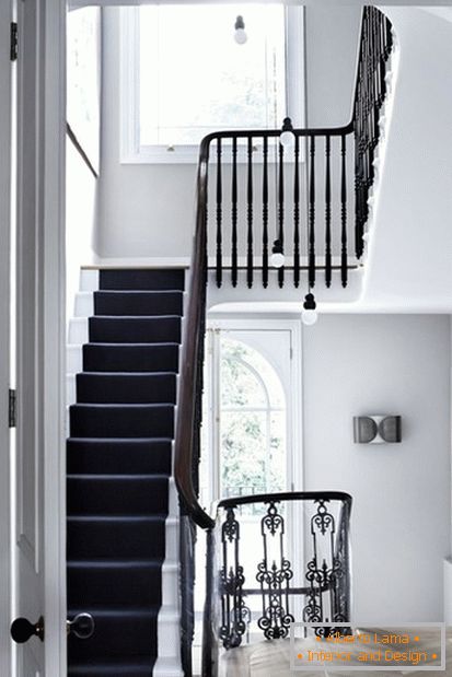
Under the stairs
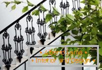
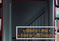
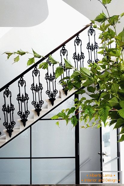
In the same Victorian house, the elegant lines of the original metal balustrade echo the dark lines in the design of the panel under the stairs. The second staircase, leading to the basement, hides behind a panel of frosted glass with black frames, adding modern graphic motifs to the overall design.
Double staircase
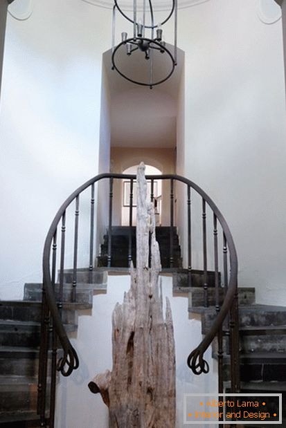
While working on this old house in Ireland, architect Matthew Shinners and designer Hugh Henry had the task of combining ancient motives, corresponding to the era of building a house, with modern practicality.
In the spacious cellar under the house leads this elegant double staircase. Railings and balustrades were made by a local blacksmith - they look particularly impressive against the background of a large fragment of the trunk of an old yew tree, which emphasizes the graceful lines of the staircase.
Art is attacking
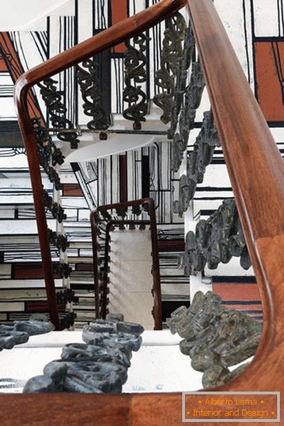
The owners of this London house wanted that all the interior design served as a kind of background for their collection of art objects and design ideas. The first thing you see when entering the house is a staircase, in fact a huge piece of art in the style of pop art, covered with laminated floor panels with a picture created by the artist Richard Woods.
Attic staircase
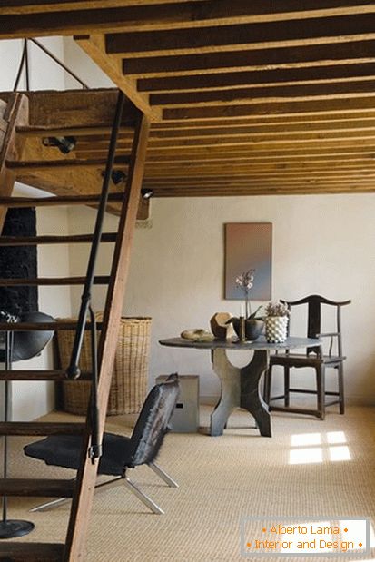
Finding the right ladder for the attic space is an important task, both aesthetically and practically. It should be a continuation of the architectural style of the house. The wooden staircase leading to the mezzanine floor has a simple, rude elegance.
New mood
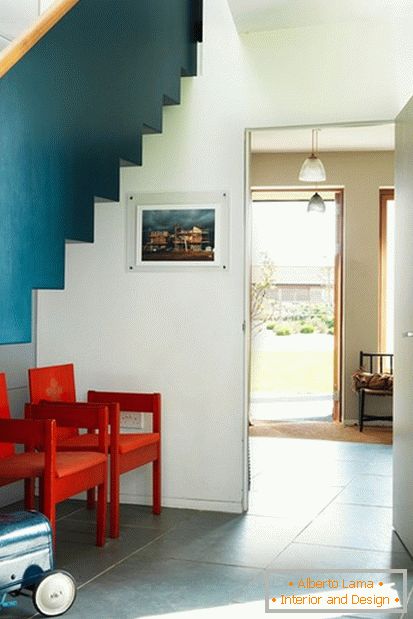
Designer Virginia White, who designed this house, used the asymmetry of the lines of rooms as a background for harmoniously diverse furniture and finishes. Under the dentate steel staircase in the lobby with light sea motifs are antique chairs created by Lord Snowdon in 1969.
French motifs
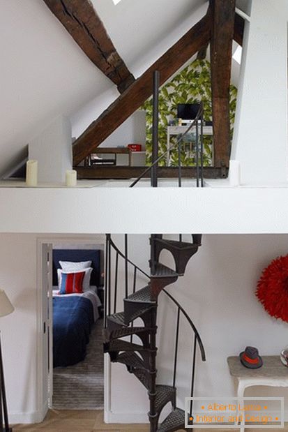
Designer Pierre Frey and architect Marika Drew decorated the interior of this apartment with a mezzanine gallery, which offers a view of the main living room - this gallery serves as a home cabinet. In one of the flea markets, the designer managed to find a vintage spiral staircase, which served as a staircase to the mezzanine, and now creates the brightest accent element in the interior of the room. In order to add warmth and individuality to the decoration, the original wooden slats are exposed for show.
In pink color
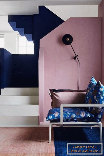
The decorator Gabby Diming used the architecture of this house as a canvas on which to create a vivid graphic drawing.
The Ladder to Heaven
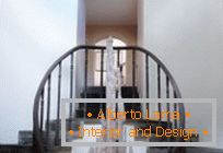
With truly Parisian elegance, the smooth lines of this spiral staircase give rise to a desire to rise up the stairs. It contrasts perfectly with the strict pattern of the parquet floor, and a minimum of furniture and a translucent mesh blind make the decoration even more spectacular.
