In our country it has become fashionable to build studio apartments, the layout of which assumes that there are no divisions between the kitchen zones and living rooms. On the one hand, this strategy allows you to visually expand the space, on the other - imposes certain inconveniences.
We will tell you how the owners of the studio competently organize a small space, highlighting the kitchen, not having stolen the extra centimeters from the bedroom or living room.
One resident of New York puzzled this question by designer Damon Liss and contractor Chip Brian. Without conducting any construction work, the customer received a stunning result.
The main secret of the transformation of the apartment is the proper selection of materials, colors and lighting!
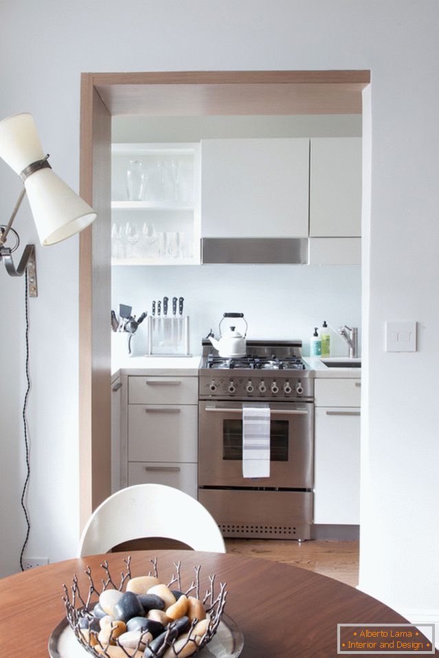
The doorway was decorated with light oak, which allowed to play in contrast and visually divide the zones. The whiteness of marble combined with lacquered cabinets and sanitary ware made of stainless steel allowed to visually enlarge the kitchen. A rational storage system, along with built-in appliances, turned love of cooking into a pleasant and at the same time comfortable process.
Kitchen as in the palm of your hand
Location: West Village, New York Area: 50 sq. M. m
Thanks to the new color palette, the view opening from the bedroom does not seem now dull. The light oak, with which the doorway was trimmed, smoothly passes into the parquet floor of the room, combining and echoing both rooms.
Such a concept allows creating in the interior a spirit of unity of spaces, at the same time placing emphasis on contrasts.
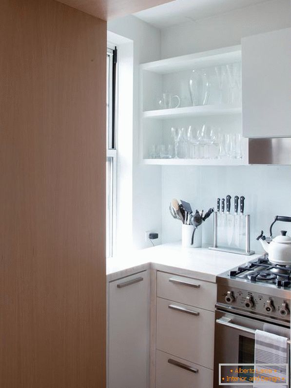
To ensure that the kitchen meets all the needs of the customer, the designer has selected strong materials that do not require special care. The satin surface of the cabinets reflects light falling from the window and artificial sources, thereby visually expanding the space.
Table top: Spa White with a hard surface; apron: glass; accessories: Doug Mockett
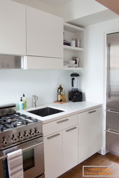
Compact embedded technology is hidden behind the doors of cabinets, and the refrigerator is recessed in the wall. Chip Brian preferred that the technology does not take up much space and is balanced in the interior of such a small quadrature.
High-quality furniture: made to order, varnished; refrigerator: Liebherr
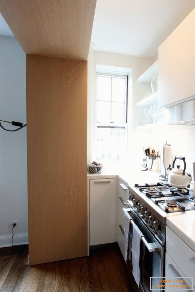
Lighting the kitchen, too, requires special attention. The only small window, located in the south, warms the sun with warmth and creates a cozy atmosphere. Lighting along the perimeter of the ceiling and above the key surfaces allows to make the cooking process really comfortable.
The client was very pedantic, which complicated the work of the designer. Damon Liss tried to use every centimeter of useful space. Open shelves for glasses and dining utensils emit elegance.
Pots for saucepans, deep cabinets and functional drawers, a pull-out section for garbage and a special compartment under the window for storing additional utensils help to put everything you need with comfort for yourself. Rectangular shapes of surfaces set the style of minimalism, and white-steel colors - classics and aesthetic ensemble.
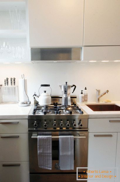
Brian together with the customer selected a small, but powerful technique that will serve for a long time. The plate of width of 70 sm of manufacture Bertazzoni became key figure in an interior.
Sink: Blanco
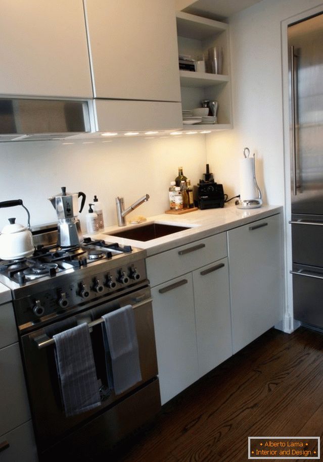
The lighting above the cabinets is muted using a special switch. This option allows you not to create a contrast at night with the living room, thus softening the light transition.
The conciseness of design, the correct arrangement of light and color accents made it possible to create a compact, elegant, ergonomic kitchen, yet at the same time not inferior to the large in functionality.


