The golden section for several centuries is considered a symbol of harmony, ideal proportions in the natural environment and in many spheres of human life - exact sciences, music, fine arts, architecture. It is also taken into account in design - it is assumed that the closer to the ideal proportions of the object, the location of objects relative to each other, the better this interior is perceived by the human brain, the more comfortable it is to be. About the golden section in interior design and landscape, examples of its use, in detail in the text of this article.
A special case of the "divine proportion" is the rule of thirds. It is due to the visual perception of a person - when looking at a picture, the eye "clings" primarily to the main four points located at the intersection of vertical lines with horizontal ones, provided that the drawing is divided into nine identical fragments. It is within these points that the main accents of the picture, its plot center, are placed.

Spiral of golden section
To the "divine proportions" is the so-called Fibonacci series or the Fibonacci spiral. The medieval mathematician compiled a sequence of numbers of the following form: 1, 1, 2, 3, 5, 8, 13, 21, 34, 55, 89, 144, 233, 377, 610, 987, 1597, 2584, 4181, 6765, 10946 and others, where the sum of every two numbers that follow one another, starting with the second, is equal to the third. A vivid example of the Fibonacci sequence is the phalanx of a person's fingers, the ratio of the first to the second and the third. Fibonacci spirals are seen from above on a flower of a sunflower, pineapple, cones. The shells of most mollusks, the horns of a mountain goat also correspond to them.
See also: Design of the room - 80 best photo ideas 
Use of golden proportions in the interior of your house, apartment
When you look at a beautifully arranged home interior, the first thing that catches your eye is a slight asymmetry, a barely perceptible disorder. The room, decorated in accordance with the golden proportions, gives a feeling of calm, tranquility. In an ideally-shaped room, the ratio of width to length will be 5 to 8, or 1 to 1.62.
At the beginning of the 20th century, for the planning of acceptable human habitable spaces, the architect Le Corbusier came up with a system of anthropometric proportions, called the "modulor." It is a stylized figure of a man with a raised hand. Growth, proportions taken are ideal, averaged, originally they were used in the construction of the first apartment buildings.

When planning the space
At the stage of calculations, a layout is drawn, which is divided into parts according to the principle of the "golden" spiral. Zoning of space, especially large, is made in strict accordance with the intersection points of the main lines - here furniture, screens, screens or partitions are placed in the studio apartment. The main emphasis on which you want to pay attention is also placed in these points.
When there are many premises in the house, they can also be perfectly planned: then the largest room will refer to the area of the whole apartment as 0.62 to 1, smaller - just as to the larger area, the kitchen - to the smaller room, the hallway to the kitchen, the bathroom to the hallway , balcony - to the bathroom.
If you use your growth, as a module, when building a house, then the space is easy to "fit" for yourself.
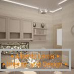
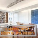


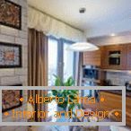
The golden section in the ratio of sizes
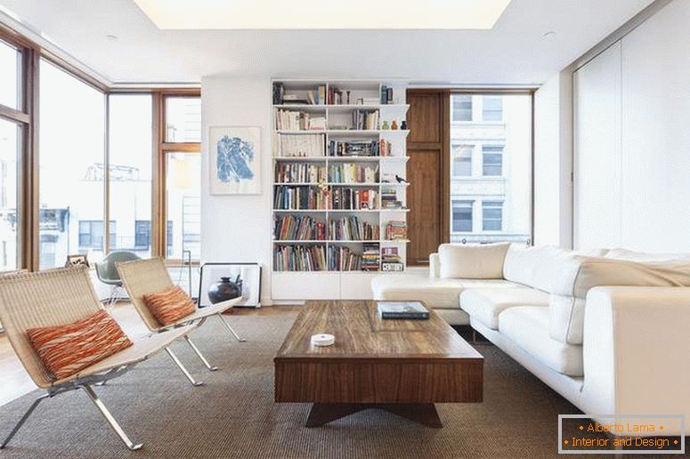
It is advisable that the sofa does not occupy more than two thirds of the wall near which it stands, and a coffee table - a maximum of two-thirds the size of the sofa. The height of the bedside tables, with lamps placed on them, is chosen with a height of 2/3 of the wall.
Large dark objects are placed below, small, lighter - above, so that a kind of feeling of peace is created. Any long segments, directed from top to bottom, create a crushing impression, ascending - on the contrary. Pictures of different sizes should be carefully selected in relation to each other, hang at an appropriate height.
Read also: Concrete in the interior - a trendy trend in finishing +30 photo examples 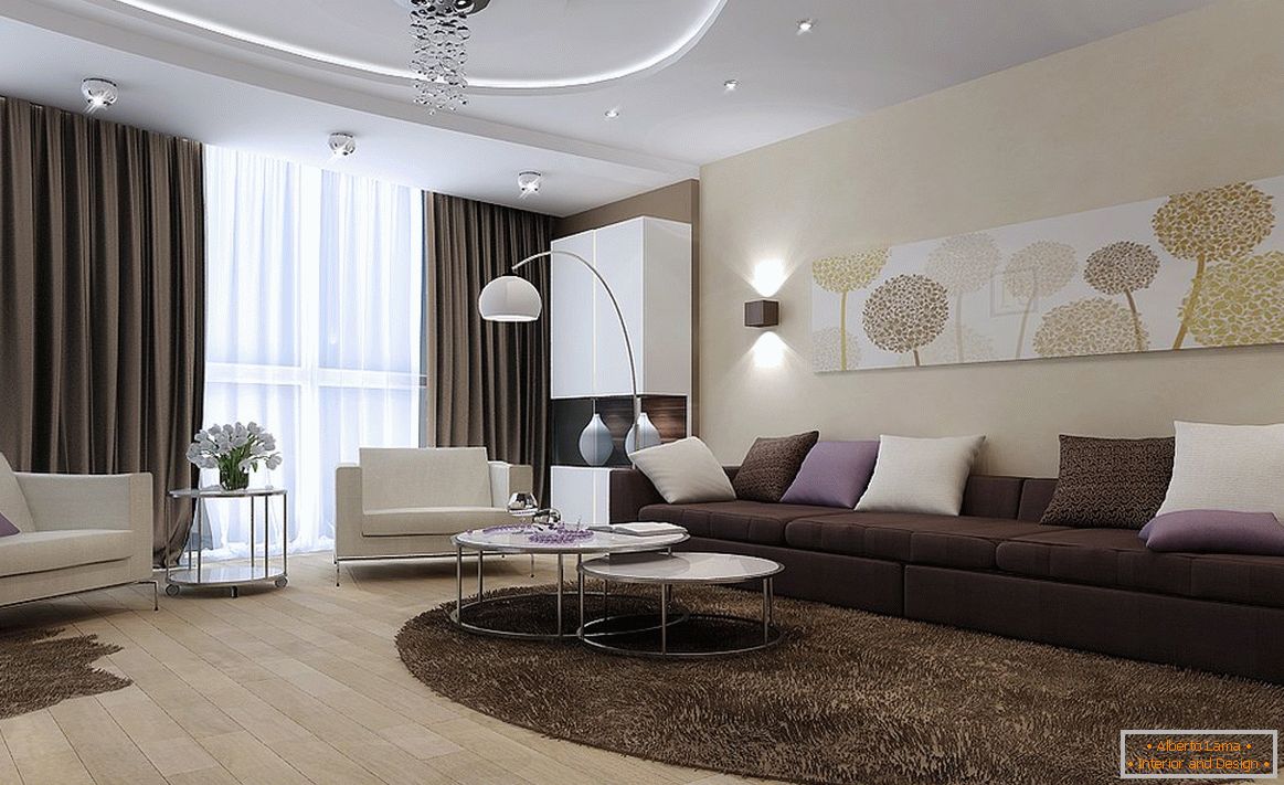
Most of the composite rectangle should be the most saturated, illuminated.


Golden section in color range
The room is very harmonious, where 62-65% of the whole space is given to the main color, the rest 35-38% - secondary, up to 5% - to various color accents. Pasting of walls with wallpaper of different colors, but similar texture, is carried out on the same principle.
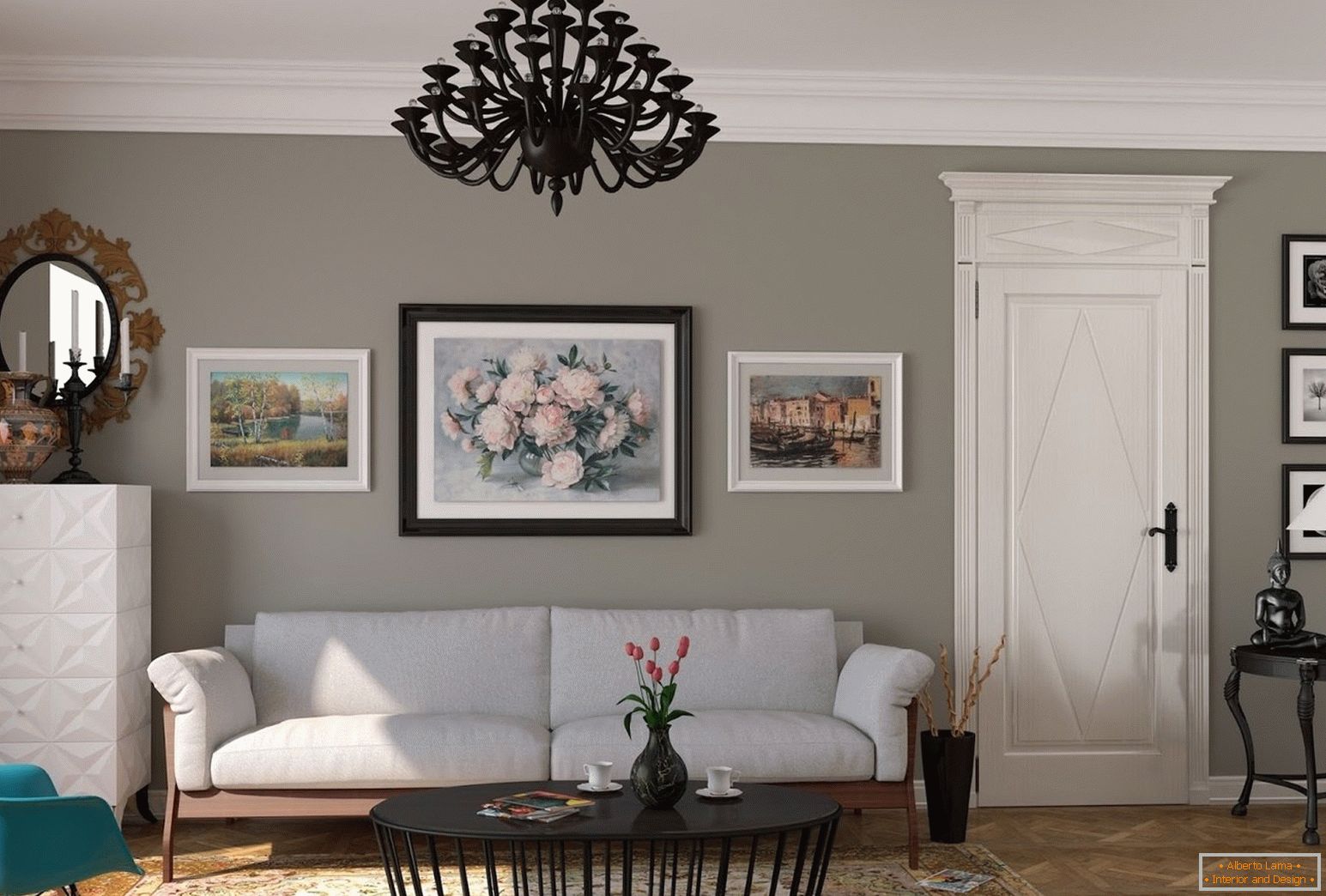
Minor color includes up to three shades, and accents in some cases allocate up to 10% of space.
Golden section at a choice of heights
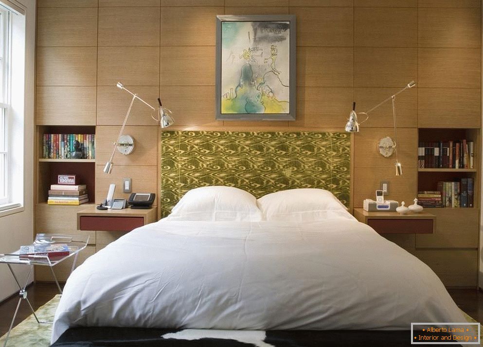
The height of the bedside tables, with lamps placed on them, is chosen in the size of 2/3 of the wall. If you choose a wall cladding with plastic, wooden panels, ceramic tiles, then it will also take two thirds of the height - the rest will go under painting, wallpapering. About one third of the height of the cabinets will be occupied by sofas with backs, kitchen countertops, and low "eastern" tables - a third of their height.
The lower points of any ceiling fixtures do not lower below five-eighths of the height of the room. If this proportion can not be observed, then the location of the fixtures "tied" to other interior items. Standing next to each other, the same decor elements should also be related to each other as 1 to 1.62.


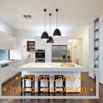
Golden section in furniture, decoration
When arranging furniture, it should be borne in mind that it occupies no more than 65% of the area of the room - otherwise the room will look cramped. The ideal number, dimensions of furniture rely on the size of its largest items - a closet, a sofa, a large table, a kitchen set. For example, the cabinet-wall will occupy two-thirds of the entire room, then the sofa bed will come out 2/3 of the size of the cabinet. In the same way, the table will refer to a sofa, chairs to a table, chairs to chairs, etc. Large decor elements are duplicated in different places of space with the same smaller ones, but with proportions.
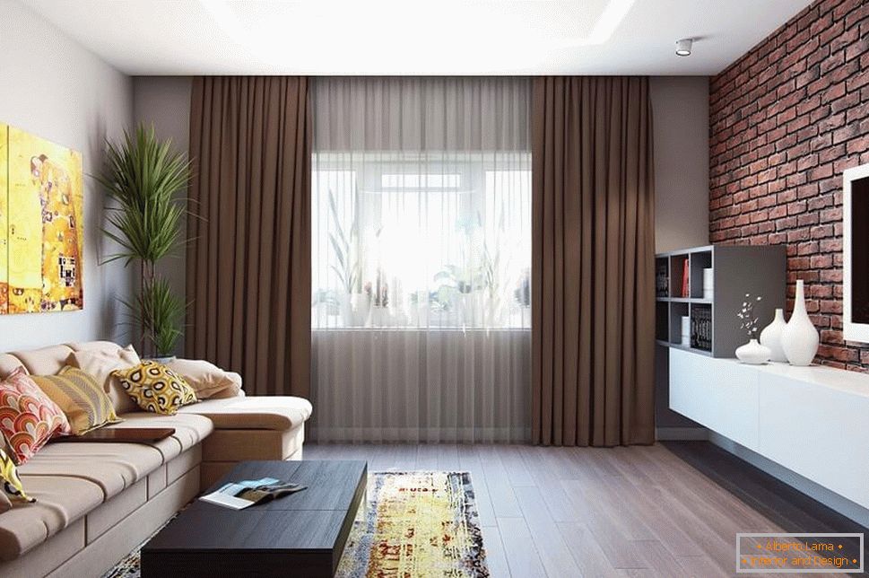
Some firms produce whole sets of furniture, relating to each other in height, size.
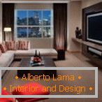
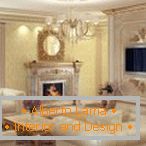
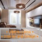
The golden section in landscape design - how to use
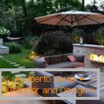
The application of methods of "divine proportions" in the design of household plots, urban parks is also justified. The favorite ratio for most designers is 8-5-3, so usually refers to the total space to the area of lawns and garden paths. A symmetric solution will also be successful, where the central and smaller parts are equal, and each of the lateral ones is half larger. A striking example of this is a star inscribed in a regular pentagon, in which the ratio of the diagonal and the side corresponds to "gold" in proportions.
Read also: Old boards in interior designThere are some other parameters:
- linear, air perspective - this is a visual change in size, clarity in the case of increasing distance. It seems that parallel lines converge into one - thus, gradually narrowing the path, create the impression of a larger space than there is;
- subordination, unity of forms - highlighting of accents, ratio of plant height, garden sculptures, farm buildings;
- balance of compositional decisions - a significant center is allocated, and in relation to it all other objects are placed, trying not to overload this or that sector of the garden.
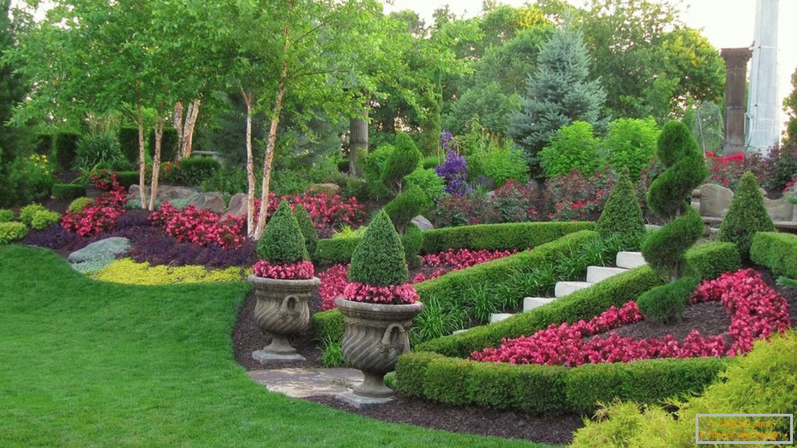
When planning the landscape, you should think over the basic "storyline" line, the stylistic direction of design, the ratio of not only all sizes, but also color "spots".




Where else is the golden section used?
The golden section of the proportions of man is most accurately depicted in the Vitruvian Man. They are also used in the graphic design of the modern world. In the Apple logo, the "truncated" spiral, Fibonacci numbers circles are guessed, and the design of the Toyota badge is made up of ovals, neatly inscribed in a rectangle, also in accordance with the golden section, which is also discernible in logos:
- BP,
- iCloud,
- Twitter,
- Pepsi,
- Apothecary Group.


For proper design of sites, web pages, the principles of the spiral are also applied - the most important content is placed in its center, usually in the upper left or right side. Clarity, intuition, emphasis in certain places is the main credo of such design. The best form of rectangular pictures is the ratio of their sides, tending to a proportion of 1 to 1.62. The application of ideal proportions in the text divides it into two unequal parts, each of which has its main idea, the plot. Approximately on the same principle, the calming "miraculous" action of popular conspiracies and prayers is based.
In "newspaper" design, modular grids are created in accordance with the "golden" proportions. Compliance with the rules of the golden section in clothing, choice of shoes, hairstyles, will also benefit the overall appearance of a person. In music, one of the techniques of an ideal, rapidly developing relationship, is called "crescendo."

Conclusion
"Divine proportions" surround a person everywhere, pleasing the eye, creating coziness in everyday life. Its principles are used by professional interior designers when arranging objects, modeling the shape of rooms, planning the landscape design of the land. If desired, the "golden" proportions for your own house, apartment, garden, it is easy to calculate yourself, using online constructors, calculators, present in the interface of some design sites.


