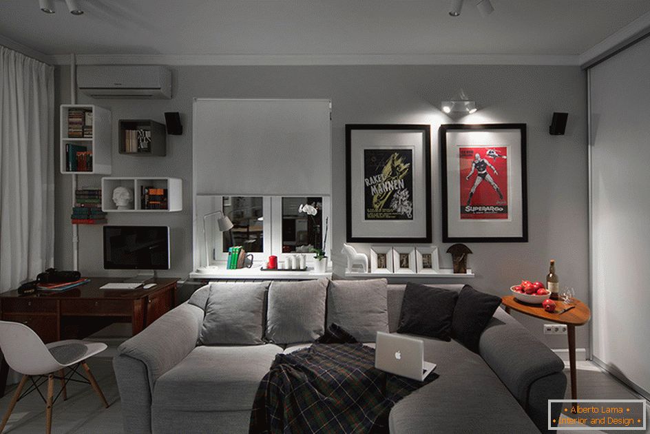
The appearance of a small odnushki of 30 square meters after major repairs has changed dramatically. The ceilings of the corner room were higher by 15 centimeters. It is professionally divided into zones.
The huge built-in closet solved the problem of storage of things. As a result of the conversion, the room intended for renting turned into a favorite residence of its owner.
The design of this typical Khrushchev was occupied by the Moscow studio m2project, represented by the chief architect Maxim Tikhonov. The company has already been working with similar projects of individual interiors for three years.
Terms of the order
For the implementation of the project of this modest housing, the owner has been allocated small funds. Proceeding from them, the specialists managed to translate their magnificent ideas into reality.
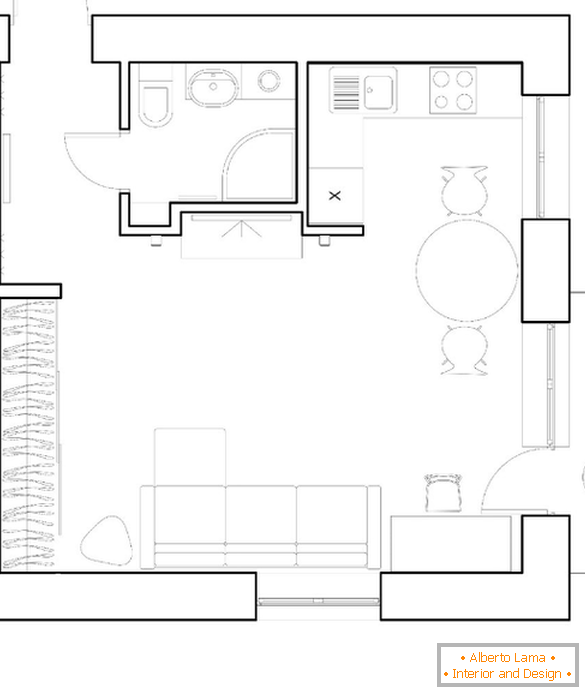
Changes in the plan
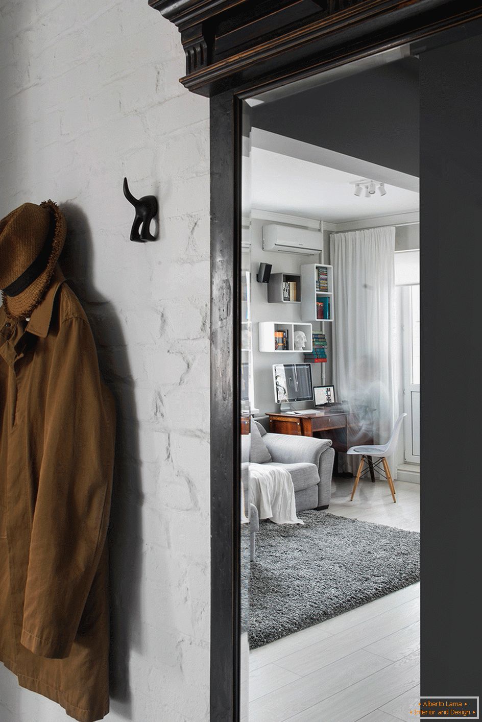
First of all, internal partitions, mezzanines were removed. Old wooden floors and logs are ripped off. The ceiling height has now become 290 cm. The plaster has been removed from the walls before the brick. The new layout allowed to economically and rationally use every part of the available space.
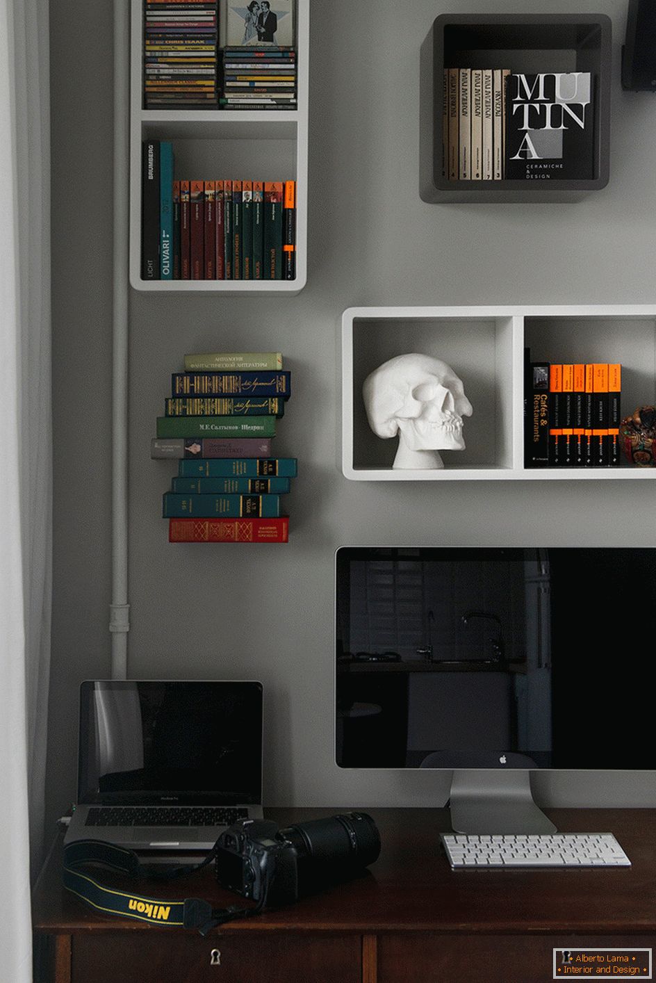
Storage System
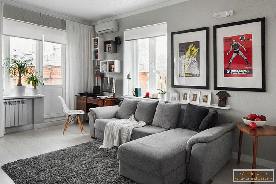
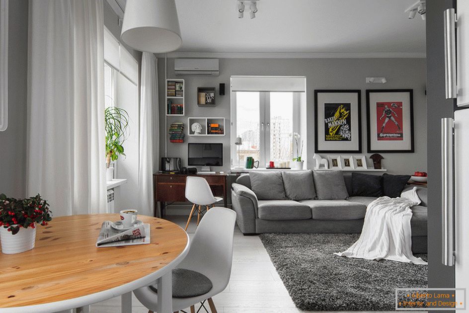
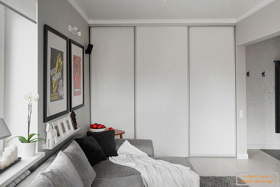
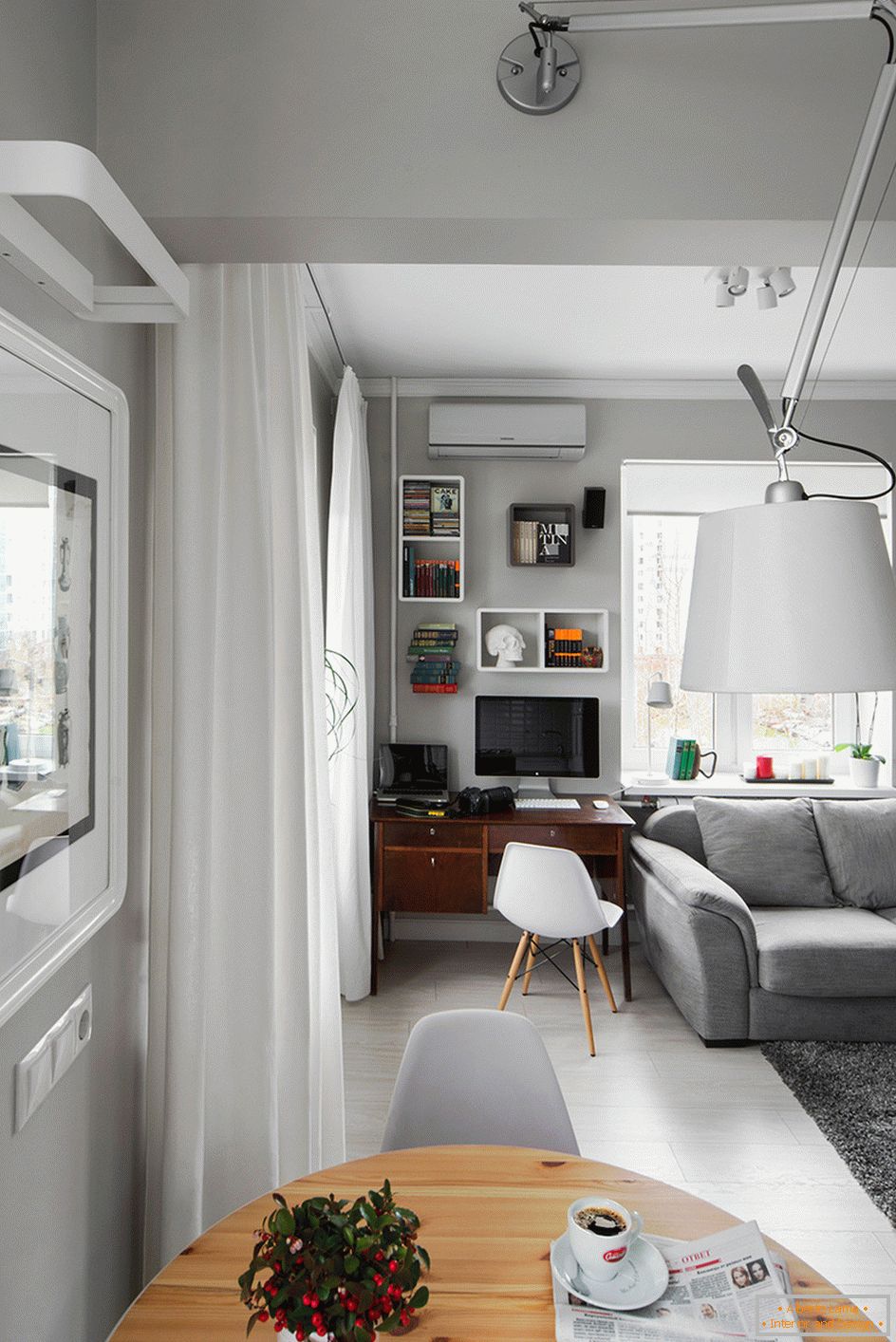
In a room that combines a living room with a kitchen, dining area and study, one wall is occupied by a built-in wardrobe. Aesthetic design, light color, merging with other surfaces, make it almost invisible. Due to the huge size, it is extremely functional. This solves the issue of storage. The apartment is always kept order.
Lighting
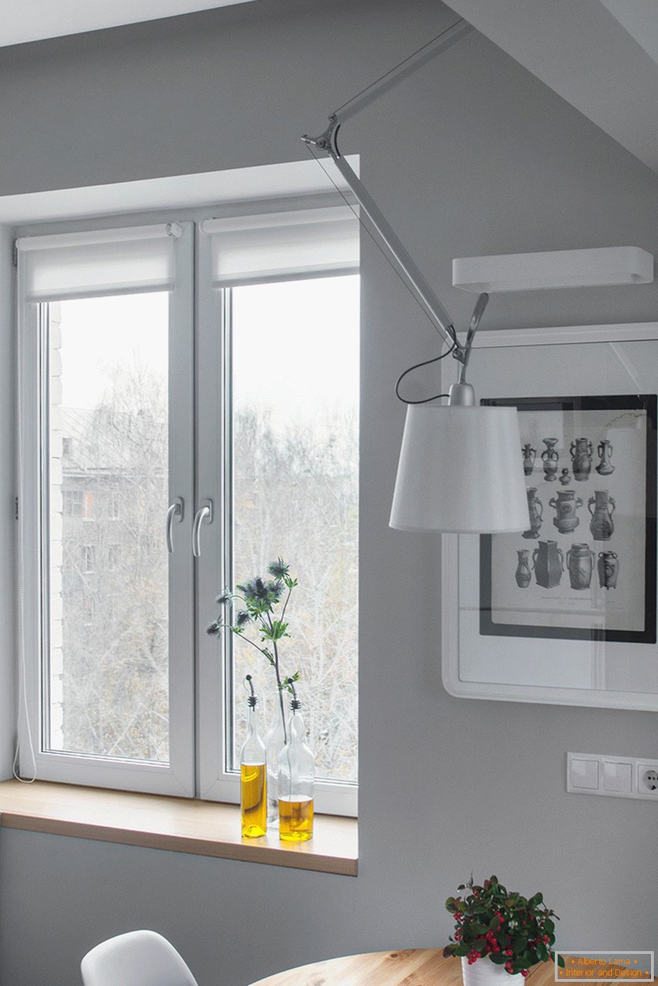
Three windows of the corner apartment let in the maximum amount of sunlight. A great idea of designers was a different lighting solution for each zone.
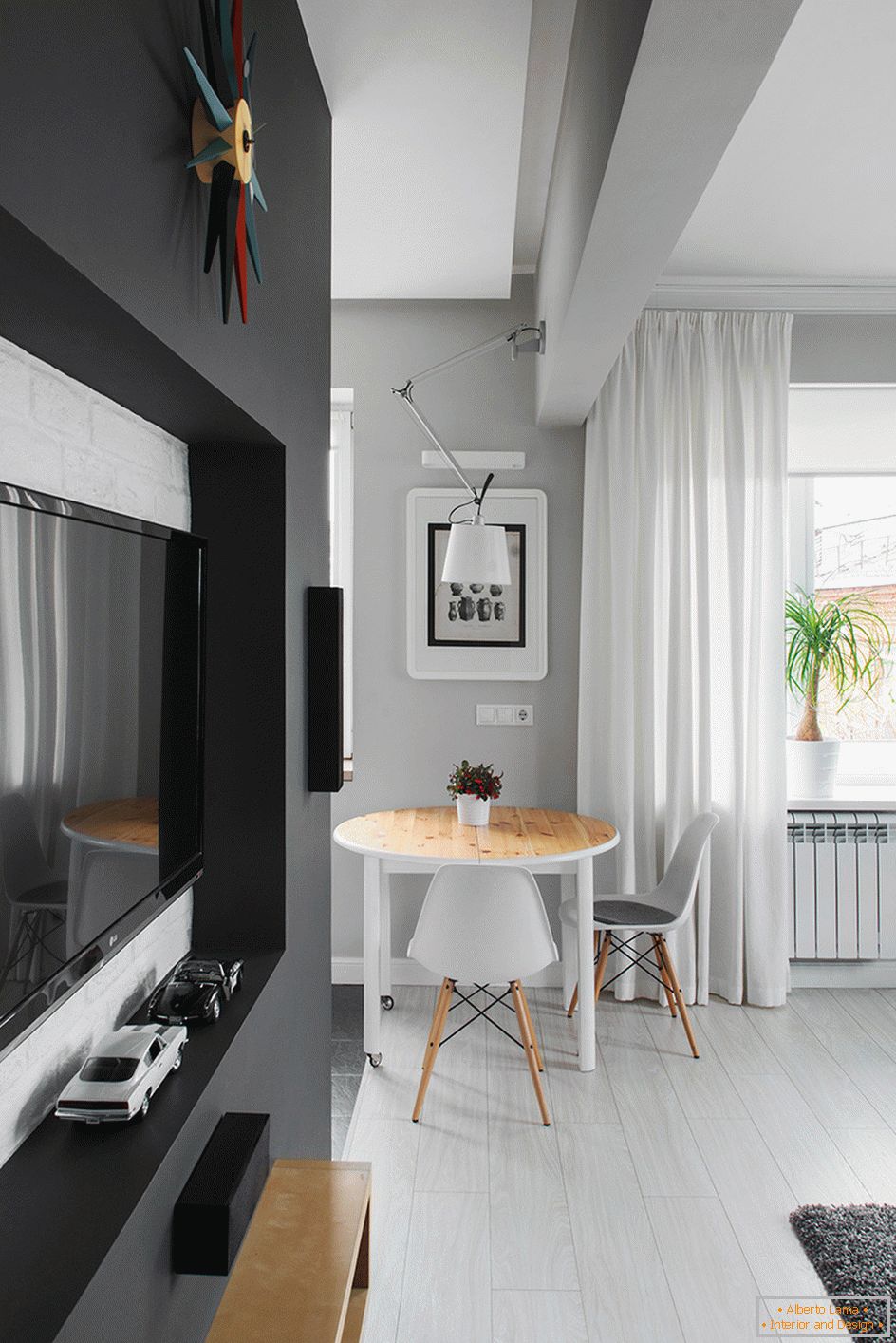
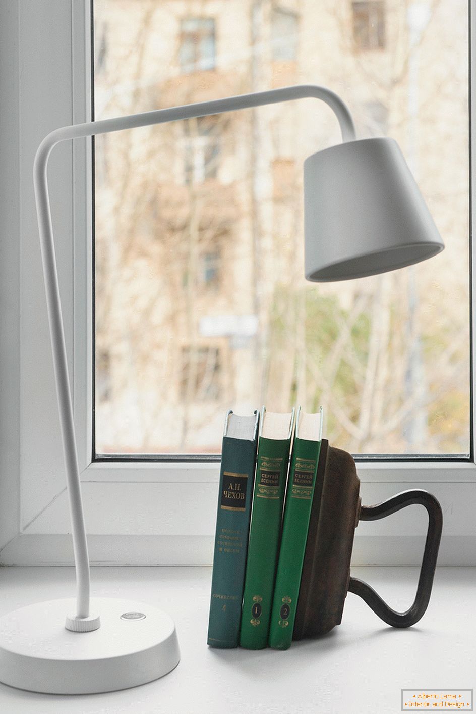
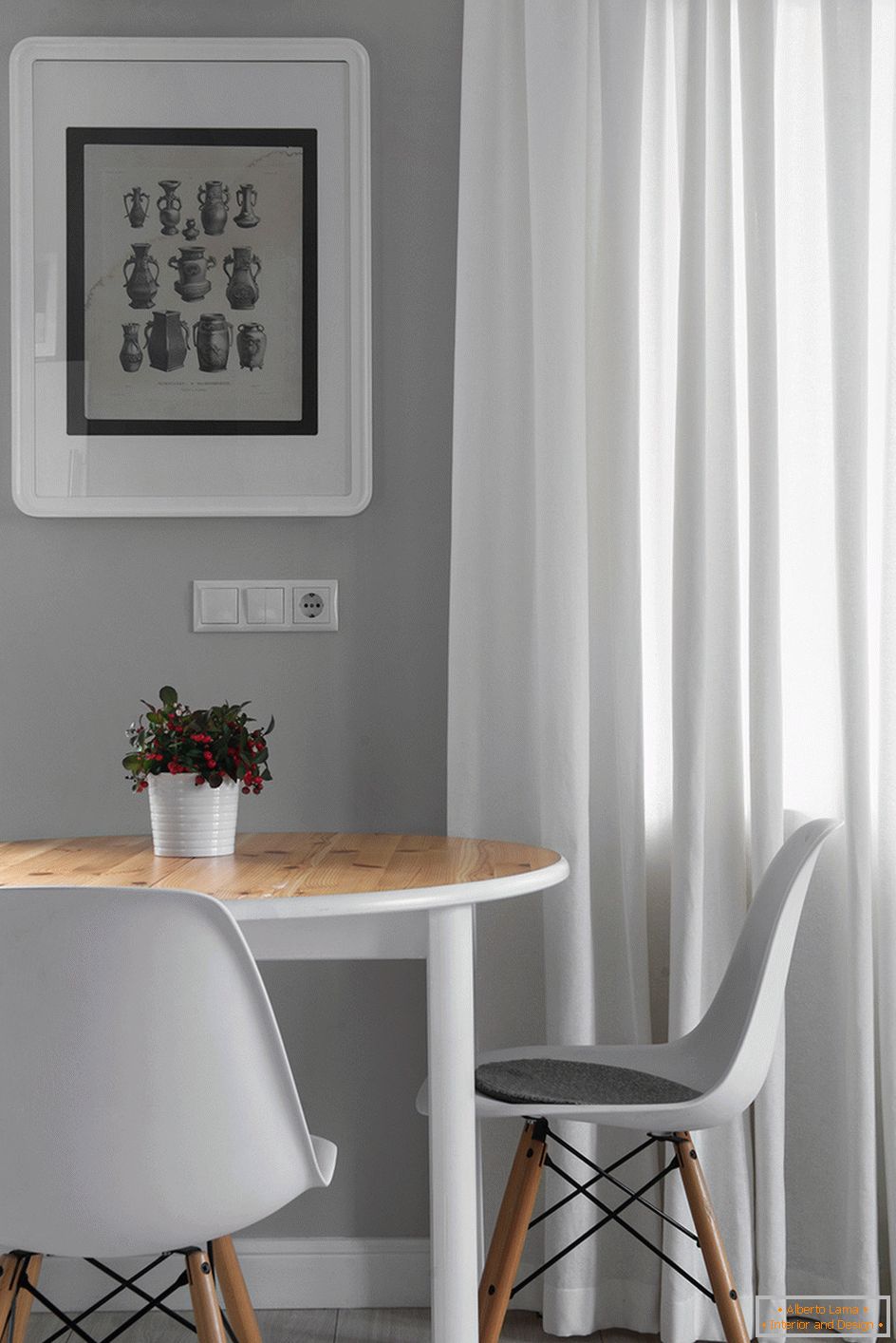
The dining room and cooking area is equipped with a white bubble, the brightness of which varies depending on the height adjustment. Other areas are equipped with original pendants, sconces, a table lamp.
Choice of shades
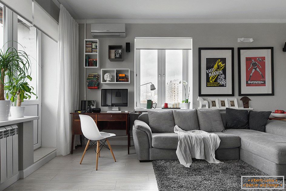
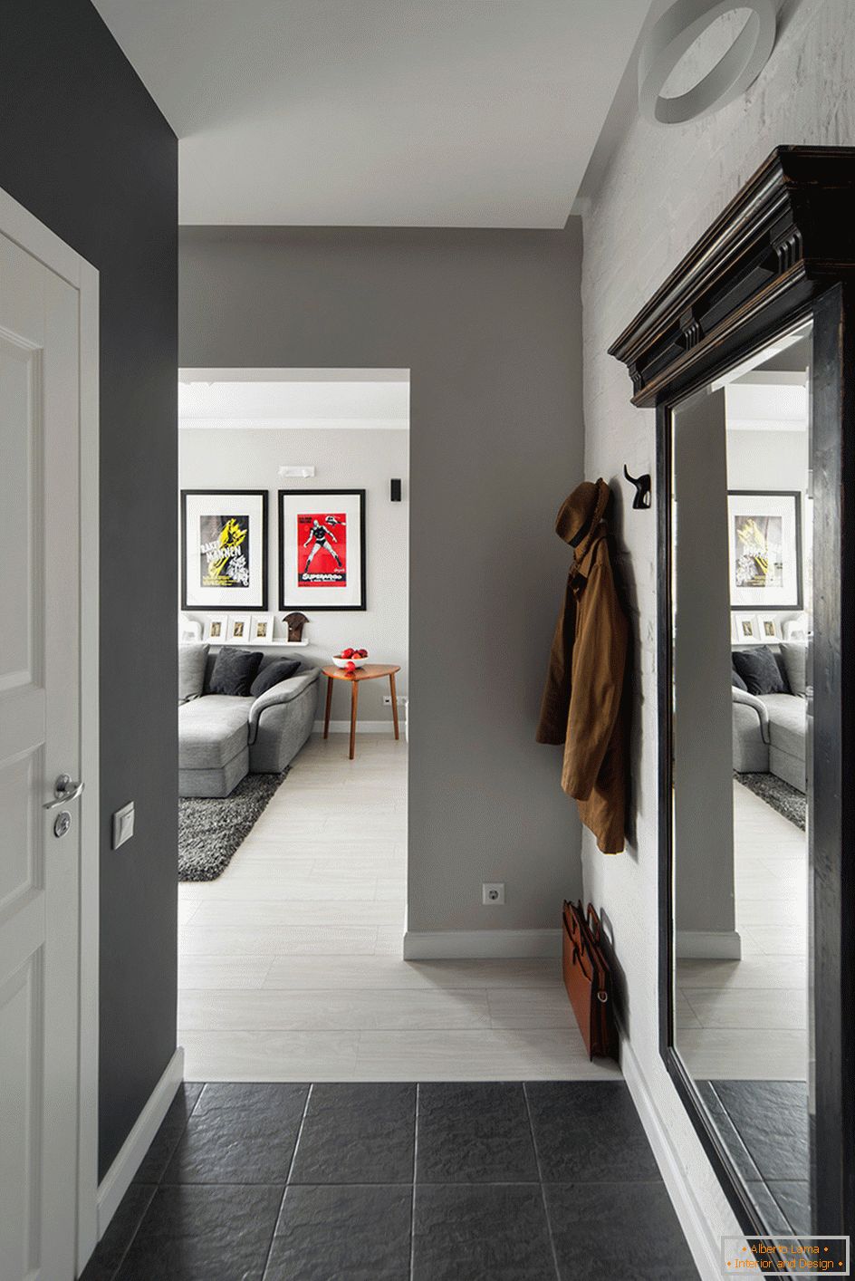
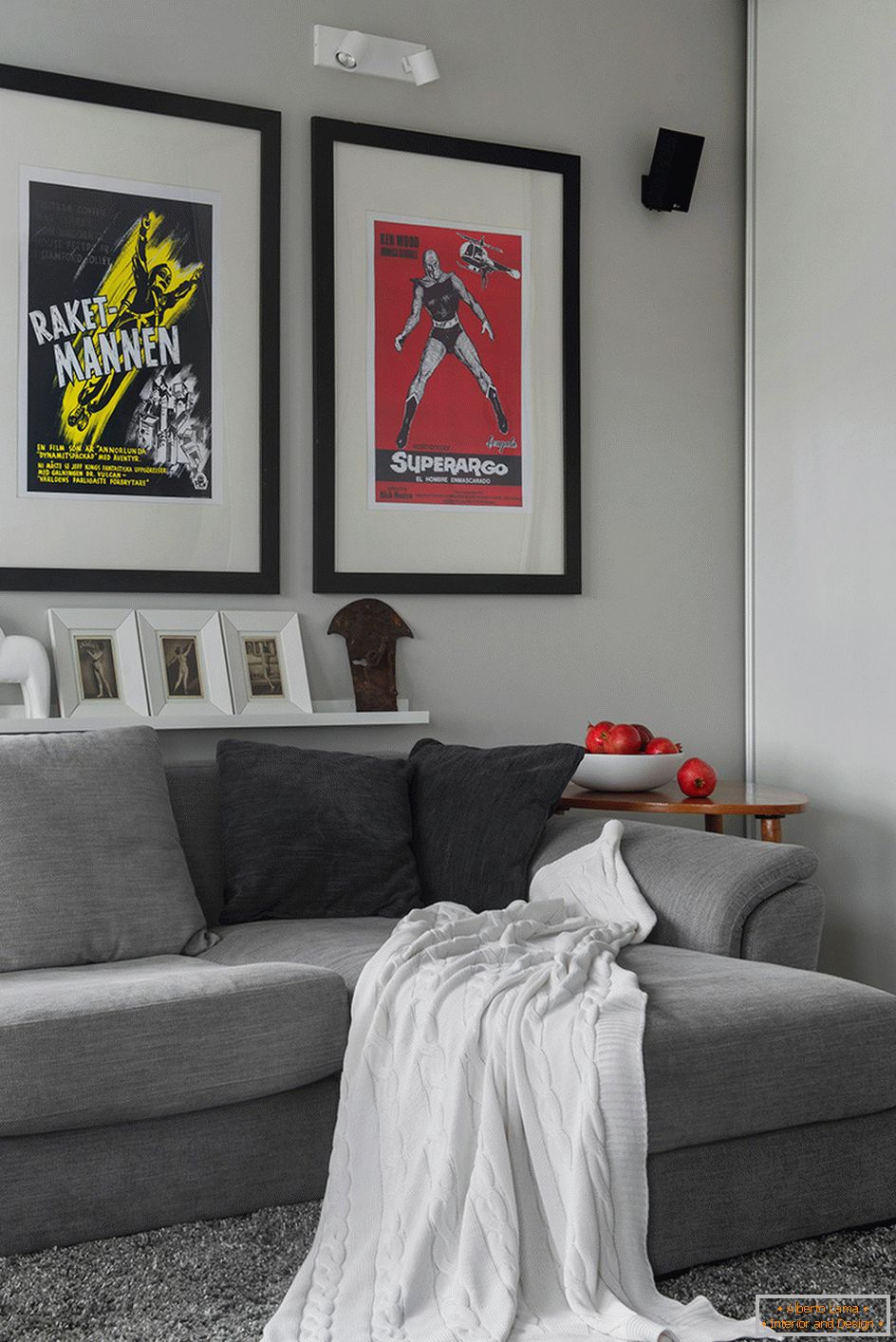
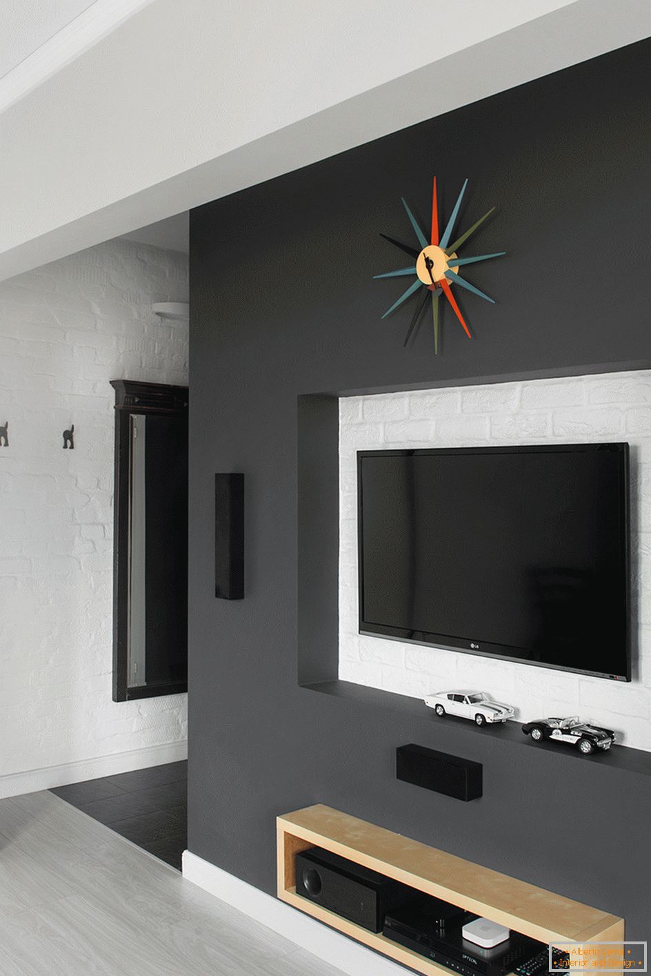
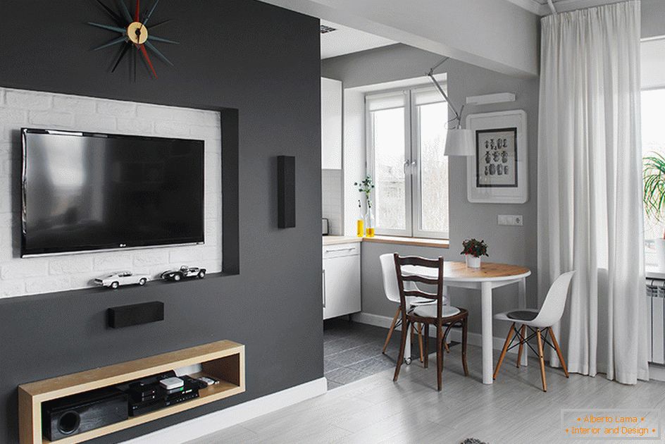
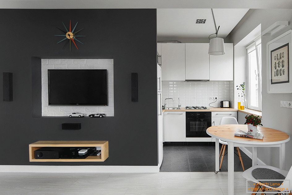
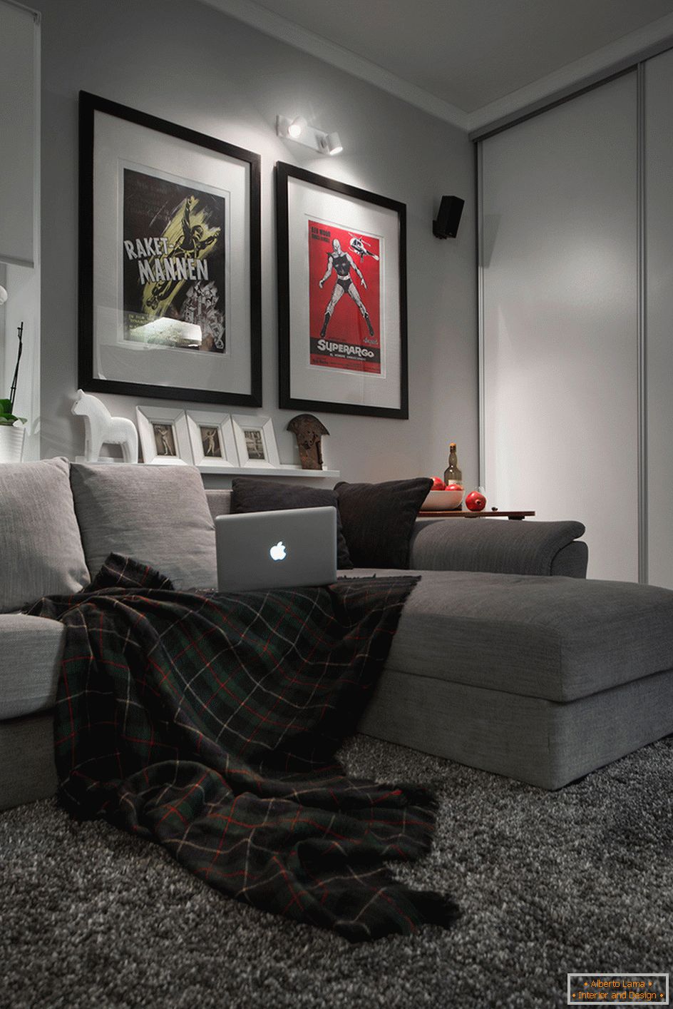
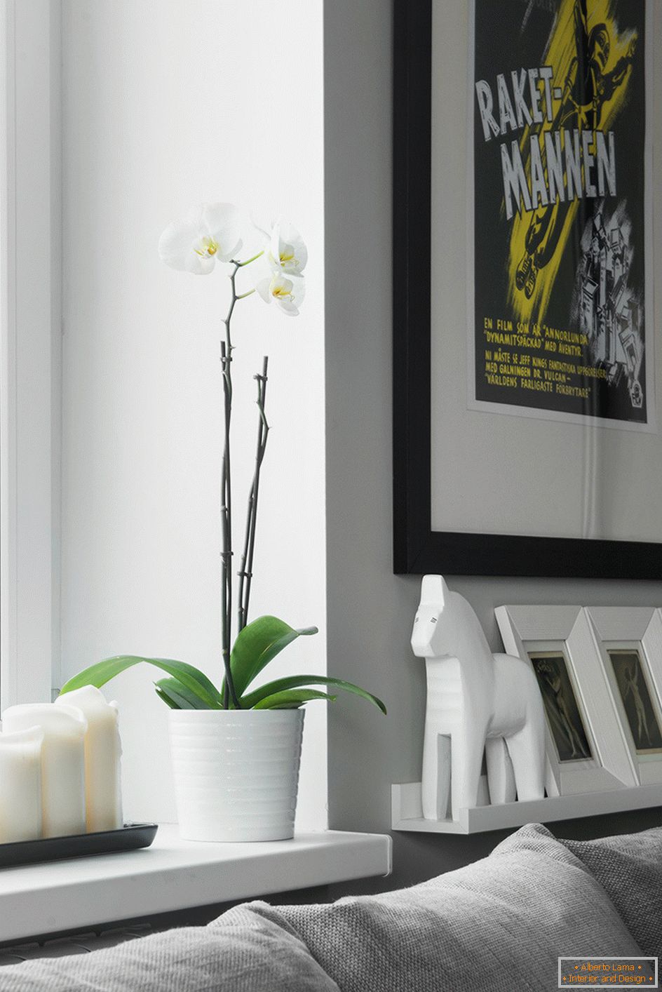
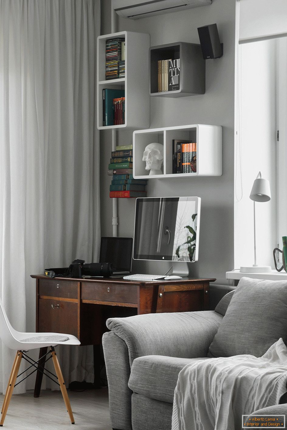
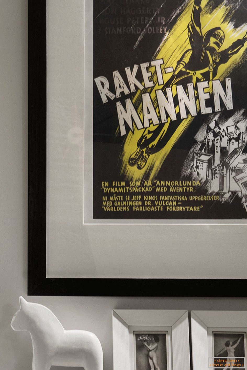
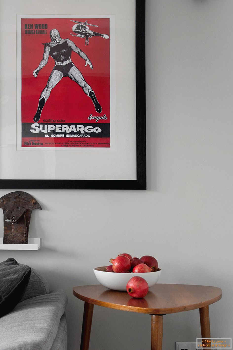
The predominant was a restrained light gray tone. The accent element can be considered a dark square, where the TV is installed. On the other side of this plot is a bathroom and a kitchen. Effectively look in the interior of the movie posters of the middle of the last century, wooden furniture.
Situation
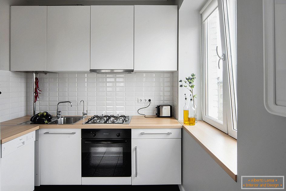
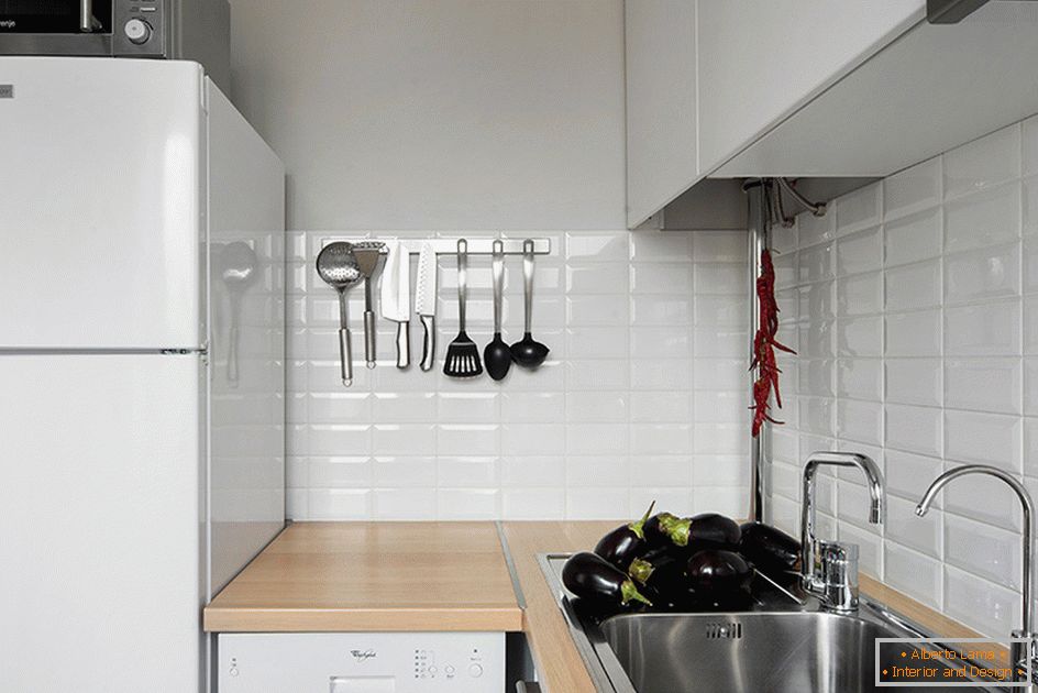
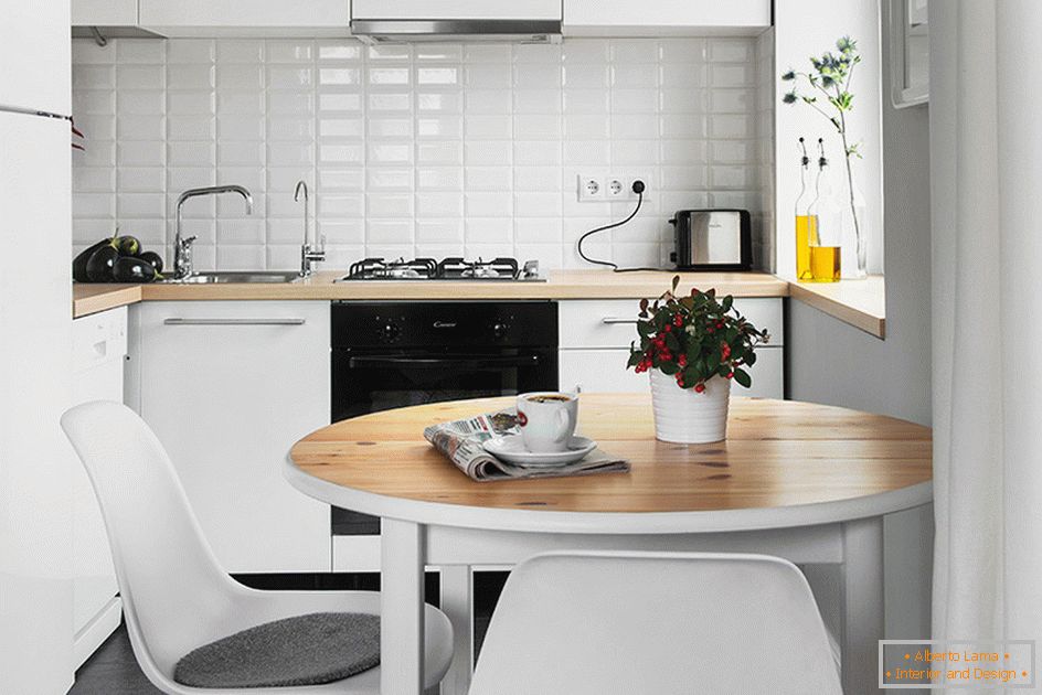
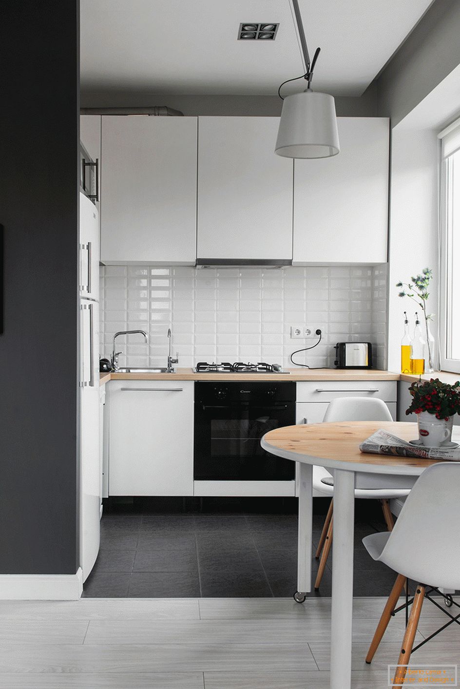
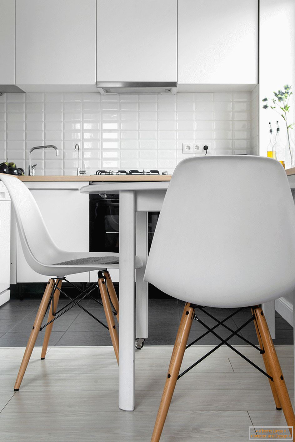
Of the total area in the kitchen there are only four squares. However, in it there was a place for installing the necessary household appliances.
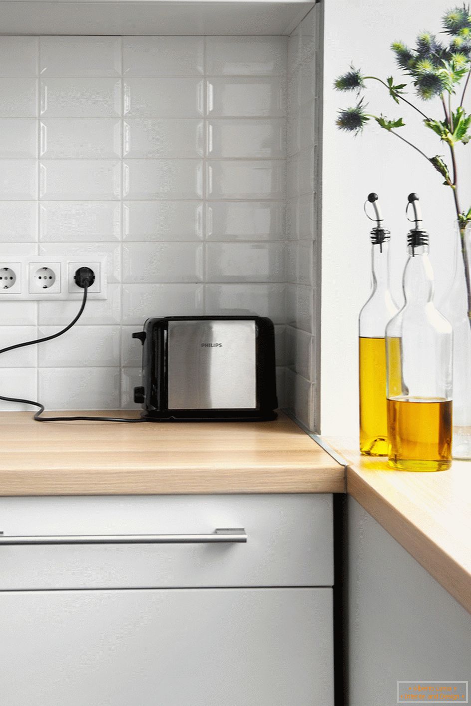
But the cabinets specialists had to combine. Facades are taken from the products of a well-known industrial company. The manufacture of the frame had to be ordered. The window sill is made of the same material as the table top. This increased the working surface of the cooking area.
Making up the furniture ensemble of the room, the architects used objects popular at different times.
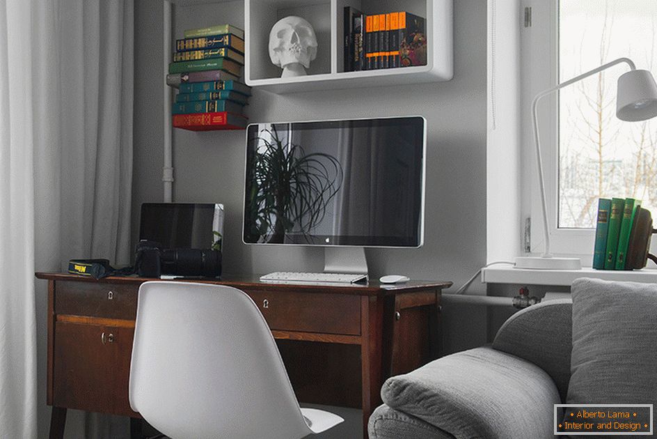
Here there is a chic IKEA folding sofa, classic branded armchairs. They are adjacent to a desk, made in Romania in the second half of the last century. There is also a mirror from the antique market, which was in vogue at the beginning of the previous era.
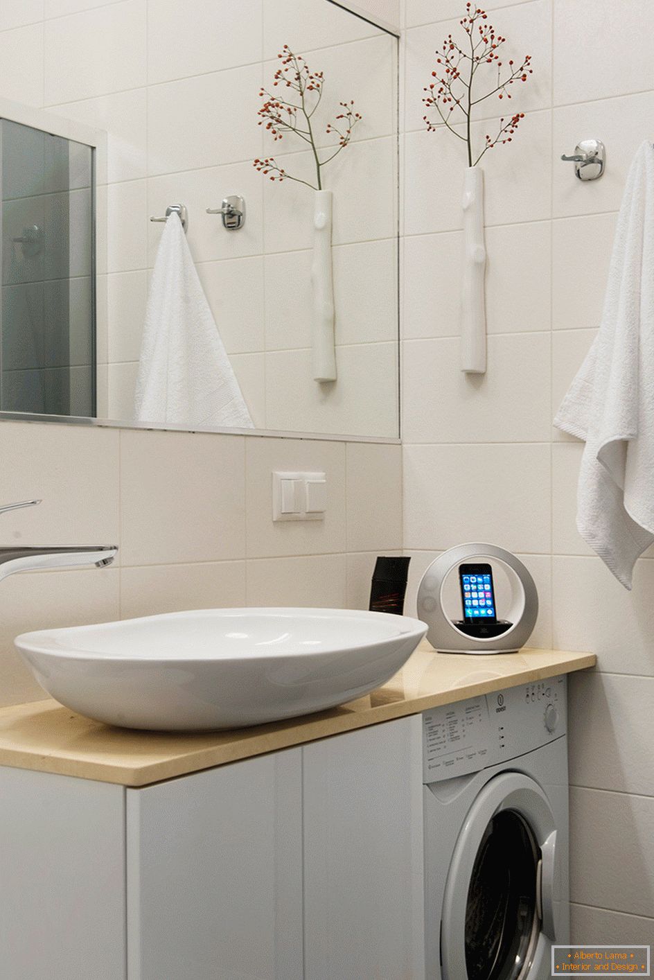
General layout of the premises
From three dozen square meters you can get quite a cozy and functional home. In this work, fresh creative thoughts and a great desire to change everything for the better are necessary.

