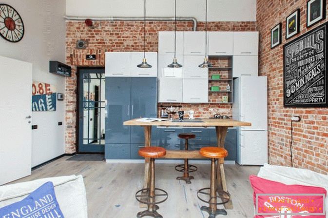
Ideal kitchen for a small apartment - a dream or a utopia? Today, designers and decorators offer a lot, if not an infinite number, of ideas and ready-made solutions for decorating the interior of a small kitchen, so that the question of an ideal kitchen automatically passes from the state "maybe" to the "so-so" position.
Do not believe me? See for yourself - for you a selection of 10 successful variations of the design of a small kitchen in different styles and directions. See the photos and read the recommendations of designers, and then - it's up to you ...
 1
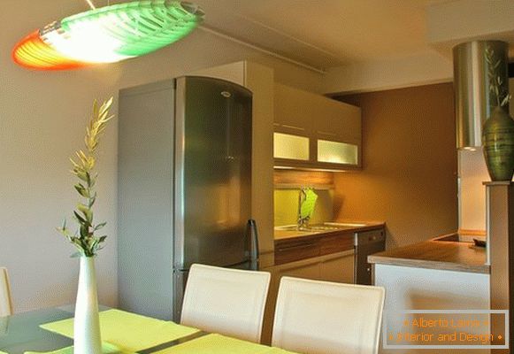
1 Agree, six square meters is not easy to plan the position of the refrigerator, stoves and furniture. However, "hard" does not mean impossible. In the presented photo one of the types of arrangement is proposed - a kitchen in two rows. On the one hand - a cabinet, a refrigerator and a sink, and on the other - a hob and a working kitchen table.
The dining table is located slightly to the side, by the window, which visually divides the area into a dining room and a cooking area.
Gypsum plasterboard partitions that separate the kitchen from the living room do not reach the ceiling. This simple trick allows you to avoid the feeling of enclosed space, and visually expand the room. Simple, stylish, and incredibly convenient.
Lighting. On it it is worthwhile to dwell in more detail, since in the development of this design project it was pre-arranged and carefully thought out. A large chandelier above the dining table, hanging cabinets and a hood with lighting - a maximum of light, and hence the maximum comfort and warmth. This constant rule should not be forgotten.
 2
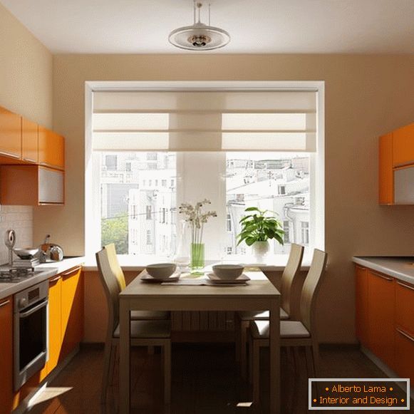
2 In front of you there is another variant of the layout of the kitchen in two rows. However, this time between the two rows of furniture parallel to each other is a dining table. This design is suitable for a square kitchen.
Color is the most effective way to visually expand the space. In this project, colors of exceptionally soft tones were used - white brickwork as an "apron", light beige walls and bright orange furniture.
A warm range of "edible" colors is an ideal "recipe" for creating a stylish interior, as well as a psychologically harmonious atmosphere for the place of cooking and eating.
A lot of cabinets and drawers allow you to effectively use every centimeter, and without that modest space.
 3
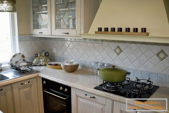
3 We offer you to get acquainted with another version of the design project for a small kitchen - L-shaped layout. Comfortable and rational for small narrow spaces. Provides continuity of equipment lines, which visually expands the room, and at the same time creates the possibility of constructing a working area near the window.
In this case it is a large square sink. What could be better is washing dishes, dreamily looking out the window!
A good solution is also the choice of color for furniture - light facades of the kitchen set, glazed doors of cabinets with decorative elements create a feeling of lightness and spaciousness.
 4
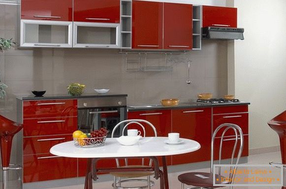
4 Kitchen in one row - another great idea for narrow elongated rooms. The main equipment in such projects is very compact along one wall, leaving more room for the dining area.
Again, the designer focuses on color - spectacular, we can say, classic, and hence a win-win combination of bright red, gray and white.
Many glossy surfaces - glossy tiles, lacquered furniture, chrome backrests and chair legs, as well as accessories - such an abundance of brilliant visually increases the space, and reduces the "pressing" effect of red in the interior.
Part of the working area is located above the main level - a well-known reception, when at least one piece of furniture "stretches" upwards, which creates an optical illusion that the ceilings are higher and there is more space. This also allows you to use the cabinets as a bar counter.
 5
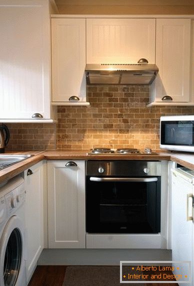
5 The U-shaped layout is beneficial both for large kitchens, and for small-sized areas of 5-6 sq.m.
It provides the location of equipment in a continuous line - tables, hanging cabinets, mini-fridge, washing machine, oven, hob, extractor and microwave - making it possible to effectively use not only the total area, but also corner elements. Agree - this is a whole art!
And again about the color we will say a word! The white-white kitchen set is harmoniously combined with warm natural shades of a table top, laminated to a light tree, and also with an "apron" made of tiles that imitate brickwork. Warm, cozy, and even airy!
 6
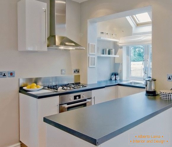
6 Pay attention to this unusual solution! The wall between the kitchen and the warmed lodges was demolished, and Vua-la is a comfortable U-shaped layout with a working area by the window. It is cozy and extraordinary light!
However, the "air" effect is achieved also due to the light walls and the tone of the delicate color of the furniture. Plus - the absence of hanging cabinets. Open shelves and "bare" walls. It turns out that enough and lower cabinets and boxes for storing dishes and food. Who would have thought?
 7
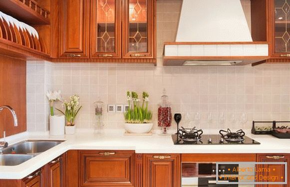
7 Not always an ideal combination of small space and classics from a solid wood array still has a place to be. Proof of this is the following design project.
Presented L-shaped arrangement of kitchen furniture is one of the most practical solutions for small kitchens, because it allows surprisingly convenient and compact to arrange the so-called "working triangle" - refrigerator, sink and hob.
Long floor and hanging cabinets, shelves, all sorts of drawers - all kitchen utensils are hidden, and not one millimeter of precious space is not lost.
Pay attention to one more detail: the table top made of artificial snow-white color turned out to be rather narrow, and in order to fit the stove and oven, the designers "drew" the original ledge.
 8
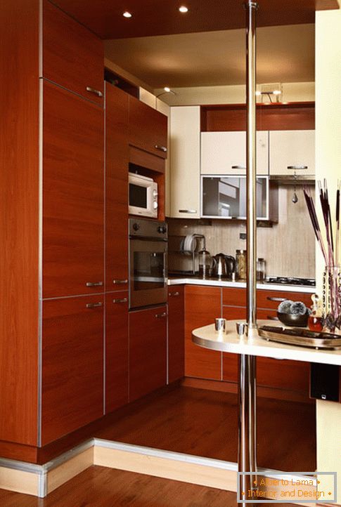
8 Bright accents in this project are a small podium, visually separating the living room and kitchen, and a bar along the wall. Considering in detail this kitchen interior, you understand how thoroughly every inch was carefully thought out.
The attractiveness of furniture gives the game contrasts. The milky white color of the countertop and several lockers is contrasted with a dark brown one. Small wardrobes are harmonious with large ones, and narrow ones with wide ones.
Spotlights above furniture and built-in furniture visually raise the ceiling, and expand the space.
 9
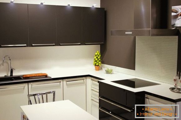
9 The original, and very stylish interior of the next project can be called "50 shades of gray". Different shades of gray look impressive against the background of bright white.
Add to this spectacular contrast are equally striking smooth facades, made in laconic, strict lines. Minimum of details - maximum space. Minimalism on six squares - this is also possible!
 10
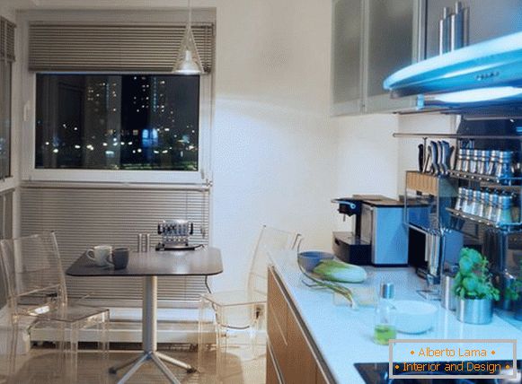
10 Kitchen interior in the style of high-tech - here you can spy a couple of interesting solutions for a small kitchen!
First - a table made in a minimalist style and chairs made of transparent plastic - create a feeling of lightness and airiness.
Second - instead of traditional curtains with ryusikami blinds with aluminum lamellas. The more natural light, the wider the space. And third: the abundance of mirror and shiny surfaces. This is a mirror tile "apron", and chrome handles, and a practical shiny rack for storing spices.
The brighter the sparkle and shimmers, the more visually more compact the kitchen!

