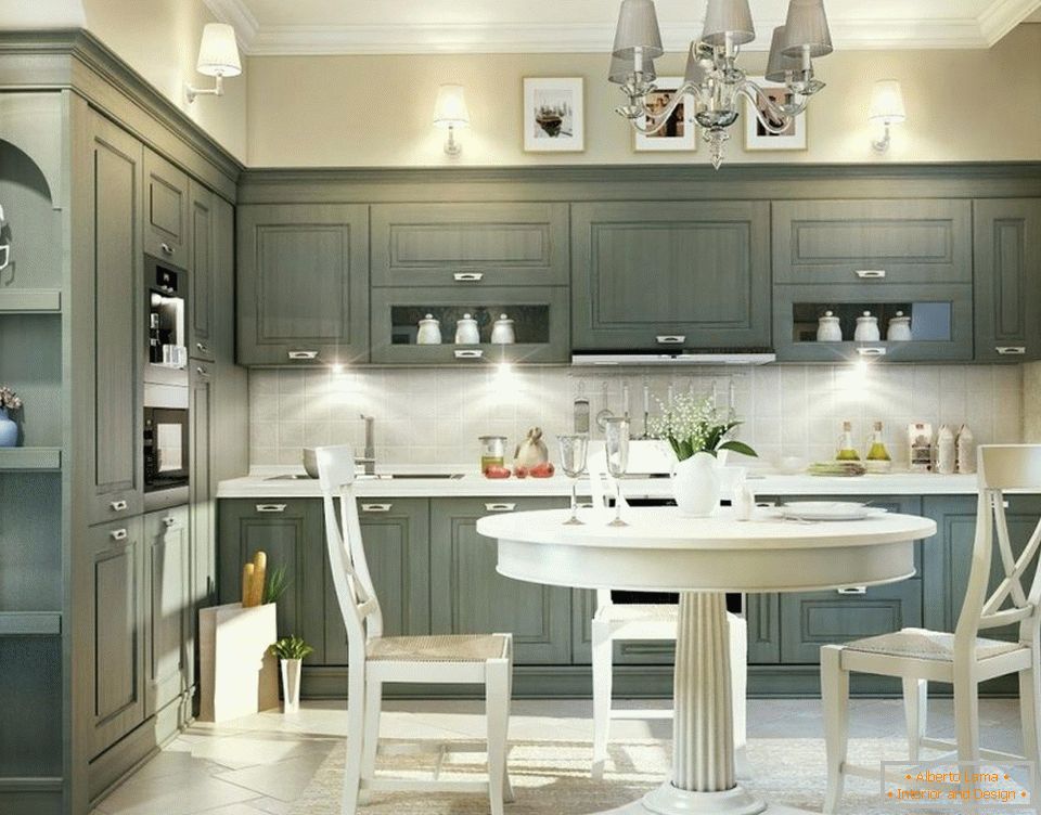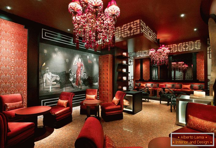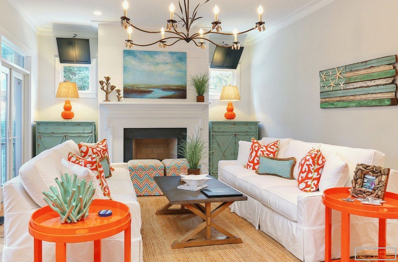
In all types of design, as well as in many areas of art associated with visual perception, an important role is played by the color palette. To know how to apply colors in the interior, it is important to study the basic principles of color - the science of color. Just like in any other real science, here there are laws, rules, formulas. Creating harmonious color combinations, you can create a mood and even induce to this or that action. Each color has its own psychology, capable of influencing the perception of a person. This property is widely used for the improvement of the arrangement of public places. Having learned from this article about the most important rules for using different palettes for the interior, you can independently compose quite professional color maps with any wishes in mind.
It is important to note that the Itten circle does not contain white, black and gray, they are neutral.
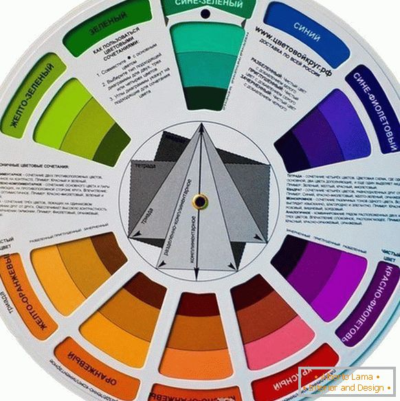
When mixing one of the colors with white, we get shades lighter, with the addition of black, we get shades darker. This creates a palette of one color from pastel to deep saturated.
Basic color options
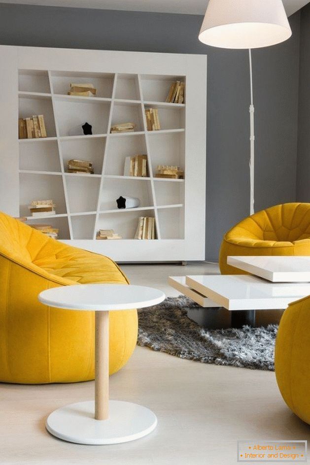
- Shades of one color series. The most extraordinary variant of combining colors, formed when the main color is mixed with neutral white or black. Example. Yellow color in the interior. The color of the walls can be picked up by lemon, the curtains will be more saturated shade, and the furniture is gray-yellow, you can add a beautiful picture, depicting yellow tulips.
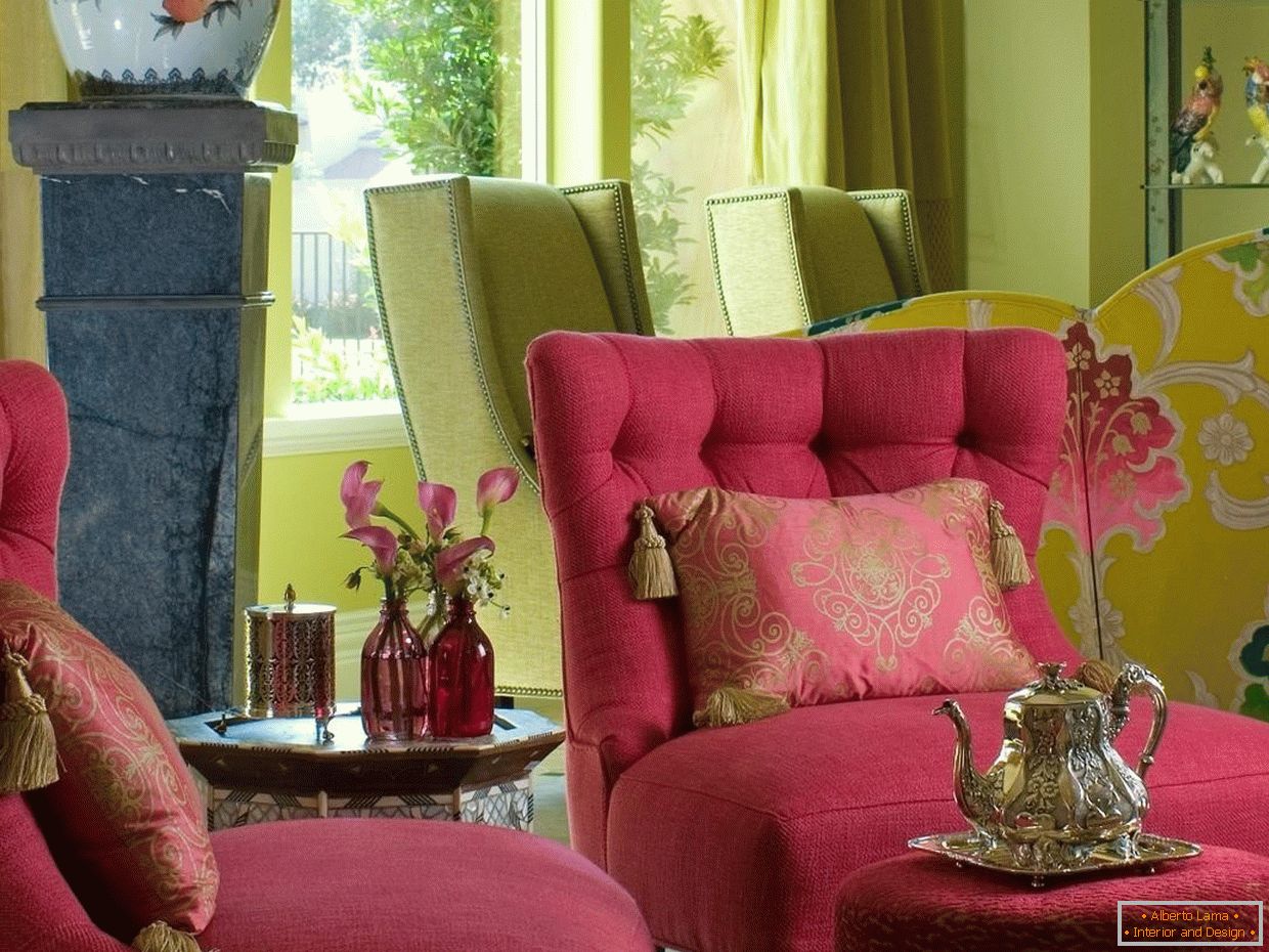
- A trio of adjacent colors. Alternatively: yellow, green, blue or purple, red, orange. When using such a scheme, it is desirable to select one main one, which will be the brightest in the composition, and the complementary colors should be muffled. Example. Consider the combination in the kitchen design of the main orange, additional red, purple: the facade of the kitchen set is saturated orange, the ends are quite light crimson, almost pink, the wallpaper is light lilac with "carrot" ornament. To emphasize the importance of the primary color, it is appropriate to add red curtains and a dining table of the same shade.
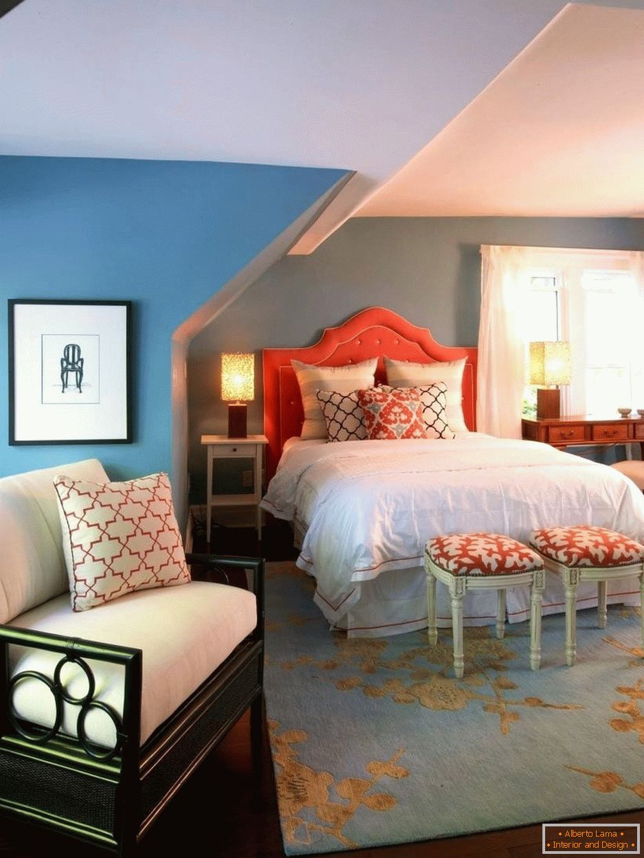
- Opposing colors. The colors of the circle of Itten, facing each other, are called contrast. This grouping is considered to be the most vivid and active. Example. Let's answer the question, with what color the tree is combined in the interior of the hall. Suppose there is furniture in the color of walnut (brown), this color is a derivative of red and black. In the circle, opposite the red-brown, you can find the color of the needles, so you need to select details of such tones, you can also add live plants with dark foliage.
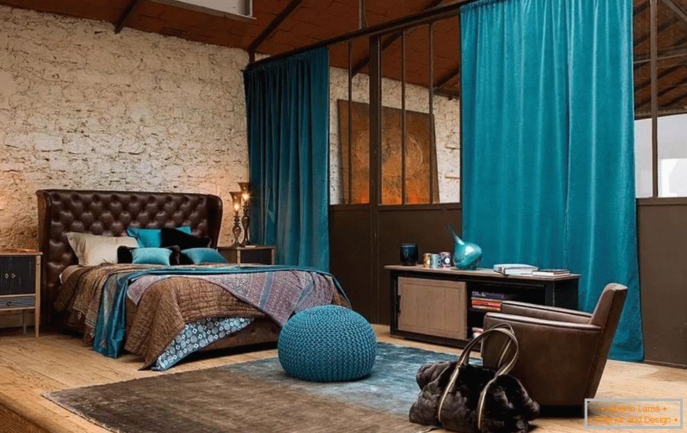
In addition to the above schemes, there are more complex ones, but for their use you need to have a lot of experience and an absolute understanding of the circle. For beginners, it will be quite enough to learn to operate with at least these three options.
The quantitative ratio of colors
To create a beautiful joint arrangement of colors, it is important to consider not only their compatibility, but also the quantitative ratio.
At the same intensity, colors are used in the following ratios: red - 6, orange - 4, yellow - 3, green - 6, blue - 8, violet - 9.
For example: if you chose orange (4) with blue (8) when choosing the color, then 8 parts of blue should be in 4 parts of orange, with the reduction of these values by 4, we get the ratio 1: 2, respectively. Note that red and green are equal in strength of perception. Example. When choosing a pair of colors, the lavender and gold ratio will be 1: 3, i.е. the first must be three times as large. The predominant color is lavender. To make the overall picture look more effective, you need to learn how to choose the right proportions.
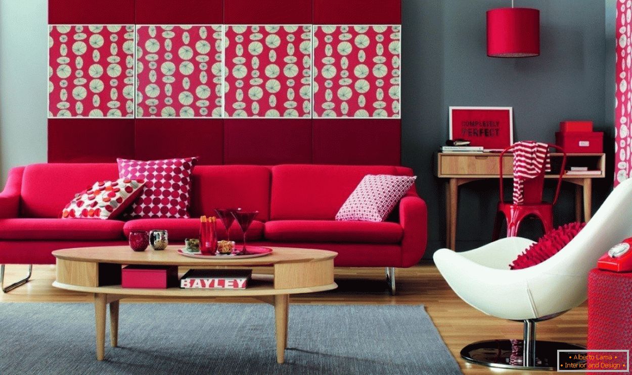
Hot & cold
The color temperature must be taken into account when forming the palette for the interior. Red, yellow, orange are called warm, and green, blue, violet with cold colors. Warm transmits the energy of fire and sun, induce movement.
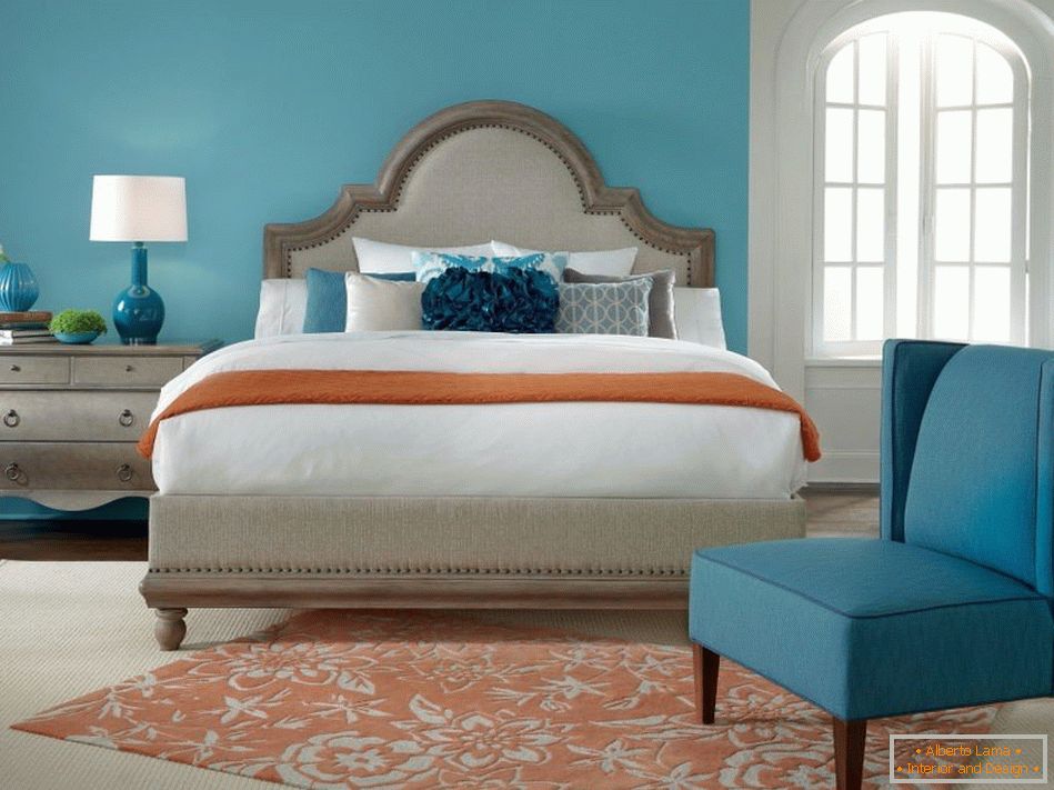
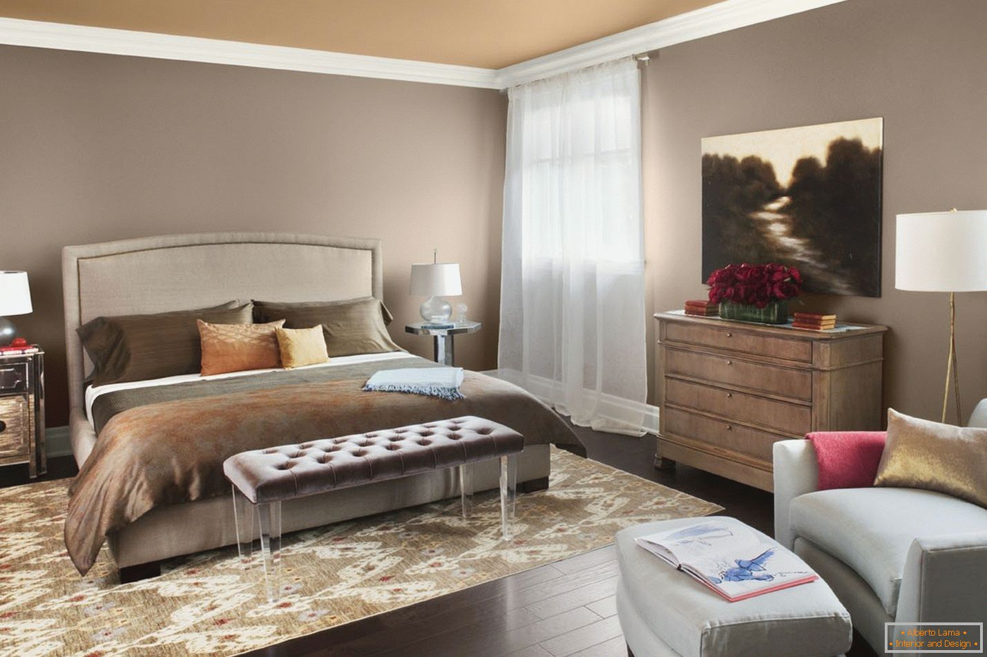 Cold on the contrary, express a peaceful movement of water, contribute to calm, dimensionality. From this rule it follows that for the bedroom it will be sensible to choose cold shades to create a relaxing atmosphere, and warm combinations will be appropriate for the nursery, reflecting the activity of the tenant of the room, contributing to a playful mood. Opposite to temperature colors can be combined, balancing the action of each other.
Black, white, gray in the interior
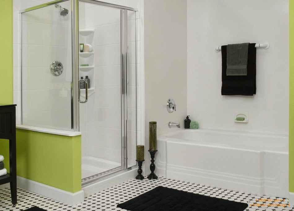
Black can not be attributed to either warm or cold, it is just like white, it is neutral, so it can be completed with any color. Black absorbs all surrounding color radiation, combining them and giving contrast. This color is often associated with style, as well as high cost, it gives depth, visually brings together and lands a general appearance. A beautiful combination of colors in the interior is formed by combining it with one or several colors. Separate black decor elements are able to radically change the situation, giving it elegance. Justified will be the use of such design in spacious rooms with sufficient lighting.
 White reflects all the colors of the rainbow, therefore visually expands and makes the space weightless, brightens, as it facilitates the interior. It can also be combined with any sector of the circle and be an ideal background for different decor. The effect of distance, giving objects of volume can be successfully applied in small rooms. Gray is formed by mixing black and white. From the amount of this or that component, this color can be more light or dark. All shades of gray can be easily combined with each other and with any other color. Very successful is his set with a pastel scale. Versatility, practicality, functionality of this color is amazing. If you do not know what color it is better to choose a decor element, then choose gray, it will definitely fit any design.
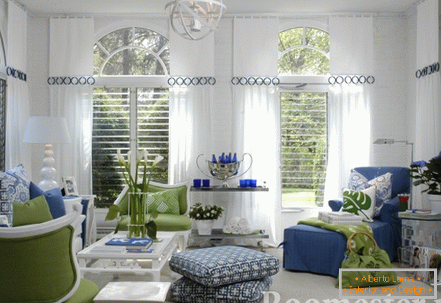
Gray room and black and white room
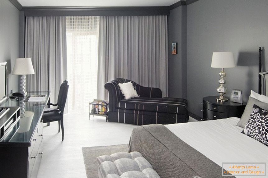
Very simple, but with the original solution will be to create a gray room, no matter how strange it sounds! Collecting in different proportions shades of gray can create a visually bright room, and dark. In a purely gray manifestation, the room will be quite calm, and if you add just one or several color accents, for example a vase with bright colors, a colorful picture, colored cushions on a sofa or a mottled carpet, then you will immediately feel the dynamics.
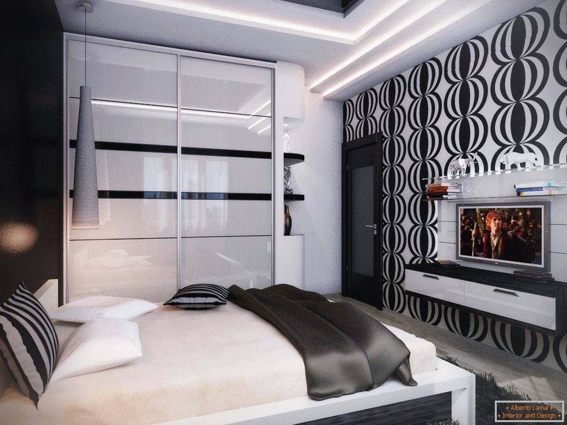 Black-and-white combination is very contrasting and will not suit every person. This color pair is psychologically rather difficult to perceive, sometimes causing two sensations. Therefore, rarely this arrangement occurs in living quarters, it is most acceptable in offices, salons, other public places where people do not spend too much time. If you still want to create such a monochrome design, then you should dilute it with gray, which will smooth out the too active contrast and will combine two eternally contradicting extremes of the color spectrum. It is important to take into account the proportional ratio, if it is 1: 1, then the situation will seem faceless, you need to decide which color will be dominant. If you select white, the space will expand, and giving preference to black, the effect will be reversed.
Pastel shades
The combination of pastel shades gives transparency, easy, unconstrained quality to design, associating with freshness, pleasant coolness. These muted color companions are characteristic of some specific styles, such as the shebi chic or the Provence. In fact, using a muted pastel scale, you can create interiors of various stylistic directions, even minimalism or loft. If you choose cold shades, lilac, heavenly, mint, then the room will be filled with refreshing air, this combination will be suitable if the windows are facing south, respectively, there is a large amount of natural light. Warm, light orange, pink, sandy create a comfortable, cozy decoration, well fill the space with a lack of sunlight.
Green
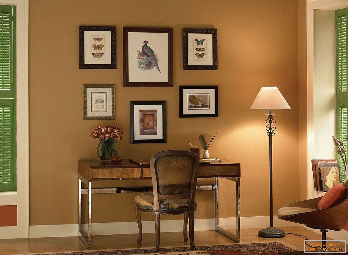
Almost always, the living rooms are supplemented with vegetable greens, because it gives a special decorative effect, has a positive effect on the environmental performance of the air, which is also not unimportant. Therefore, it is worth giving special attention to green. In the world of flora this color is considered neutral, moreover it is a background color, therefore in phytodesign it is combined without any problems with anything. In the interior of the premises, a slightly different story, tk. plants will be separate elements in the design.
See also: Black color in the interior: ideas of color combination +75 photo 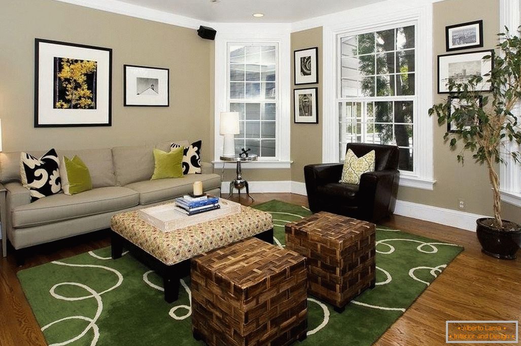 Контрастный дуэт нефритовый – гранатовый всегда будет удачным, но в случае, если взять их в равных количествах, чтобы они друг друга уравновешивали. Стоит учитывать насыщенность используемых оттенков, если в декоре использованы достаточно светлые варианты граната, то нефрит нужно выбирать не слишком темный, в противном случае, уменьшить его количество, создавая визуальное равновесие. При совместном использовании лесного зеленого с глубоким коралловым, стоит добавить шафрановые нотки, такое трио будет вполне гармоничным. Чтобы зеленые цветы хорошо смотрелись в лазурной комнате, можно также добавить медового, в том случае, если есть необходимость выдержать холодную палитру, то стоит заменить медовый на лиловый. Green с фиолетовым тоже можно уместить в одном проекте, разбавив их тандем цветом гуммигут.
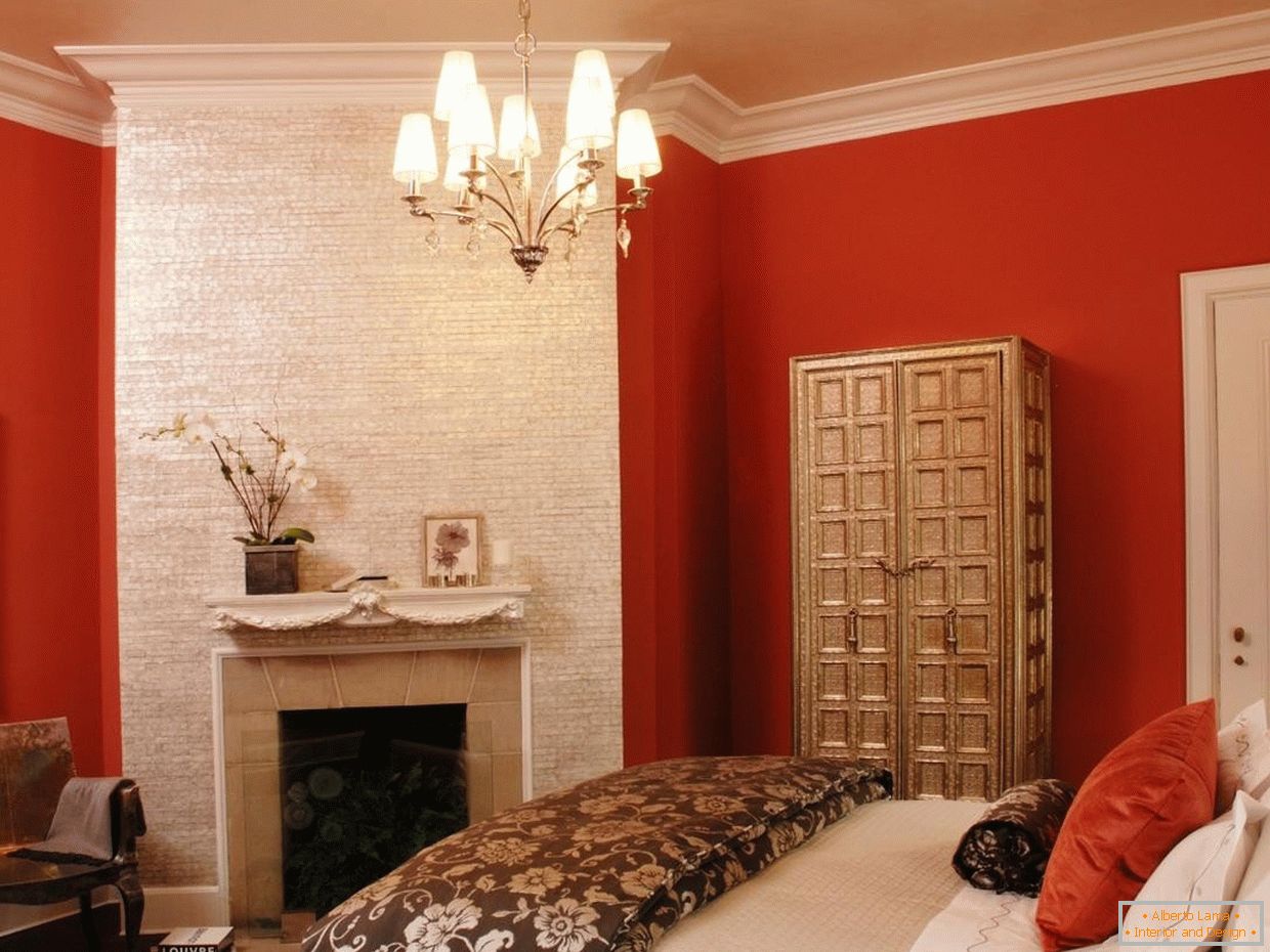
Effect of texture on color
The visual perception of the tactile characteristics of materials expresses the concept of texture. For example, we can, without touching an object, determine that it is smooth, rough, furry or prickly. From all of the above, it follows that the texture should influence the perception of color. Thus, the glossy surfaces impart a coldness to objects painted even in warm fire colors, and the things of a cold emerald color knitted from wool yarn will appear warm and pleasant.
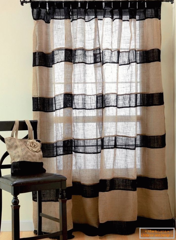
Regardless of color, fabrics made from coarse threads (burlap) look brutal, heavy, fabrics made from fine fibers (silk, chiffon) opposite, gently, airy. Such examples can be cited for any surfaces. Using different textures, the interior becomes more diverse and attractive, especially you need to consider these properties of things in monochrome interiors.
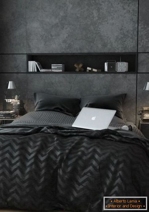
Effect of lighting on color
The quality of lighting significantly affects the color gamut. The correct light should emphasize the basic qualities of the selected colors. Lamps with a color temperature of 2500 - 3400 K (kelvin) can transform the interiors of warm colors. The characteristics of lighting devices in 5100 - 5600 K are suitable for cold designs. Neutral light, the most approximate to the natural 3500 - 5000 K, is universal. If it is wrong to choose the light sources, the colors can be distorted, and their perception will change radically.
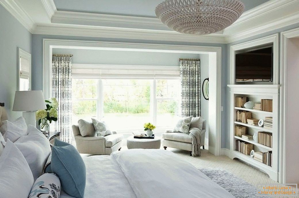
The perfect combination of colors for each his own, moreover, for each room, this figure will be different! Despite all the rules of design and color, in the first place it is important to rely on your own taste, if possible, writing personal preferences within the framework of art laws. To practice the choice of color combinations, choose images of any beautiful interiors, try to understand, based on what principles and rules, the designer made certain decisions, when creating this project. Multiple execution of such a task will provide the missing practical experience and understanding of the theory.

