Color can directly affect a person. Research in this area has proved the possibility of exposing surrounding paints to the central nervous and endocrine systems. Colors can soothe or excite, speed up or slow down metabolic processes. The colors in the environment have an impact on the development of the character of children and can change the mood of any person. In psychology, there are diagnostic tests of color perception for recognizing deviations and obtaining a picture of personality. In addition, psychology actively uses and develops the method of color therapy, art therapy in the treatment of certain diseases. Therefore, what colors surround yourself in a house where you sleep, eat, rest and talk with your family is extremely important.

Characteristic properties of chromatic colors:
- temperature (warm, cold);
- activity (muffled, bright);
- intensity (diluted or saturated).
If we talk about color temperatures, yellow and red - the colors of fire and sun, warm. The tone of the oceans and seas is blue, it is cold. One color can have a different temperature, depending on which temperature range the base color (semitone or sub-tone) belongs to, in the shade. With a predominance of red or yellow halftone, the color is warm, if the blue subtle is prevailing, it is cold. The figure shows the color circle, which clearly shows the temperature of different shades.

Picture
Natural harmony and balance gives a combination of tones from the gamma of one temperature. In the same way, you can achieve harmony, warm (or cold) tones are harmoniously combined among themselves in the interior. But in the design it is not an axiom, the layout of temperature contrasting shades, can solve many design problems.
Table of warm colors
In the interior, warm colors bring home comfort, warmth, create an upbeat mood. Warm shades will add light and heat to rooms with a north or east orientation, "warm" the room.

| Colors and shades | Prevailing halftones |
| Orange (pumpkin, mandarin orange, fiery orange, copper) - always warm | Yellow Red |
| Red (scarlet, pomegranate, carrot, marsala, burgundy) | Red |
| Yellow (golden, bright yellow, honey) | Yellow |
| Green (olive, yellow-green, grassy, bright green) | Yellow |
| Violet (lilac, eggplant) | Red |
| Brown (ocher, chocolate, coffee, vanilla, caramel) | Red, желтый |
| Gray (quartz, protective) | Warm brown, green |
| The blue (heavenly) | Warm green |
| Blue (dark azure, sapphire) | Warm purple |
Cold flowers table
The use of cold shades is particularly appropriate in the bedrooms, since such tones are serene, energetically inactive, help prepare for bed, adjust to a calm mood, relax. Tone solution of rooms in the cold range will help to muffle the excessively bright sunlight in the rooms, the windows of which are facing south and west.

| Colors and shades | Prevailing halftones |
| Turquoise (bright turquoise, cyan) - always cold | Blue, blue |
| Blue (cobalt, dark blue, azure blue) | Blue |
| Gray (anthracite, marengo) | Blue |
| Blue (aqua, azure) | Blue |
| Purple (dark purple, indigo) | Blue |
| Green (emerald, nephrite, dark green, mint) | Blue |
| Yellow (lemon) | Cool green |
| Red (crimson, carmine-red) | Cold violet |
| Brown (bistre, sepia, terracotta) | Cold violet |
Color and temperature
Tables well illustrate the convention of the concept of color temperature. A mixture of pods and peculiarities of perception of an individual, give a different visual perception of colors (colder / warmer).
Determine the color temperature can be decomposed into its components. To change the temperature - add unambiguously warm or cold halftone.


The recognition of hues by the human eye depends on the wavelength of the spectrum, thus:
- long waves strengthen the heartbeat, blood flows to the limbs, heat is felt - the color is regarded as warm;
- a short wave makes you feel relaxed, the processes in the body slow down, a feeling of coolness appears - the color is perceived as cold.
Relativity in the temperature difference of colors is associated with a small experience of observing absolutely pure spectral colors by the majority of people (in nature pure color is a rarity).
Colors-neighbors mutually affect the temperature. So, burgundy in tandem with sepia will give a warm sensation, with caramel - a cold color. Understanding this phenomenon should be used in interior solutions, it will allow to bring harmony into any space.

Create a color balance
Merge of colors with achromatic (black, gray, white), gives gradation of temperatures of final color, changes shades, tone and adds shadows. So in photography there is a concept of "white balance", which affects the illumination and the final quality of the image.
Neutral white can dilute cold or warm colors. If the orange is added white, we get a slightly colder orange. At the same time, white does not have magic that can make a warm color cool, only brings it closer to neutral. By the same principle, color gradation occurs, which is deprived of temperature saturation when black is added.
In interiors it is almost impossible to see pure spectral colors, they are "muted" in gray, shaded in black or lightened with white. And of course, use multi-component mixtures of chromatic colors.


Combination
In the interior design, combining warm and cold shades is extremely important. To achieve harmony in the room, you need to choose the dominant gamma (warm or cold) and add the opposite accents.
Combining correctly shades of different temperatures can be using other techniques:
- Balancing. The principle of balancing one color at the expense of another, showed the world a popular combination of cold turquoise, warm brown and beige;
- Gain. An interesting variant of combining colors of different temperatures is deliberate mutual reinforcement. So the cold emerald with a warm marsala make both tones deeper and nobler.
- Muting, reducing saturation. The effect is achieved by using neutral colors for the tinting of large areas, as backgrounds to bright colors.
Warm tones visually reduce the space, because they are perceived closer, cold - they can add depth, visually expand the room.


Shades of different temperatures can visually give the room the right shape. In a narrow room, long walls are painted with cold tones, short ones are warm, so the long walls move apart and the short ones approach. Painting the ceiling with cool shades can create the illusion of high ceilings.
See also: Black color in the interior: ideas of color combination +75 photoIn the living room
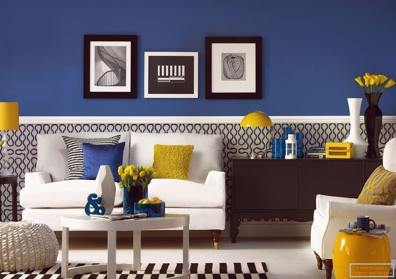
The living room is the central place in the house, where they gather in the family, rest and have fun. In large halls of houses, you can choose warm colors as the predominant range, and cool ones - to paint accessories or choose a cold scale for textiles. In typical apartments, the area of the living room is usually small, you want to expand the space, here you can make a palette of cool colors. Often, when decorating a living room, neutral colors are used to make the room neutral, so that the room is not boring, rich colors (cold or warm, depending on the preferences of the hosts) will come to the aid.

Variants of non-trivial color combinations for decorating living rooms:
- Gray, emerald, yellow. In general, gray color is a good base for living rooms, in this palette can also become a base color. A few accented walls, painted with a warm yellow, fill the room with an atmosphere of joy, warmth and comfort. The sofa with emerald upholstery will balance the yellow walls. Emerald with gray decorative elements will help harmoniously compose the details of the interior.
- White, brown, red. Combining shades only warm or cold, it's hard to make mistakes. The use of white will help to muffle the active red, which in such a tandem can be used for textile elements. Brown will become an additional tone of wood furniture in the room.
- Серый, синий, бежевый. Blue поспособствует расслаблению, это глубокий и благородный цвет, его характеристики усилит серый. Теплый оттенок беж добавит домашнего уюта в помещение.


These are just a few of the options for decorating halls, you should focus on your own preferences, temperament, size and position of the room, expectations of pastime in the living room.
In the bedroom
The bedroom is a resting place, a reboot of the whole organism, which is facilitated by muffled, pastel inactive, neutral tones.
If there are problems with sleep, the base color of the bedroom can make a pastel blue, it is good for calm and will give the owners a calm, restoring sleep. When combining cold blue with beige hues, you can get a harmonious and stylish room.
In order to relax, you can decorate the bedroom with ecru paints. This is a natural color, which consists of yellow, beige, cream, but this shade does not imply creating a romantic atmosphere, so it should be diluted with decor elements in active tones (burgundy, red in a daring combination with blue).


Choosing the shades of brown for bedroom decoration is difficult to guess, you can use brown from a warm and colder palette. If the design does not add other colors, bright accents, it is worth to diversify the room with textures and different materials, so that the room does not become too conservative.
In the kitchen
If there is a dining area in the kitchen, the tones for it should contribute to stirring up the appetite (warm honey, tangerine, carrot, and light green tones will perfectly cope with this task).
Благодаря технологиям, кухонные фасады перестали делать только из дерева. Крашенный МДФ, использование разноцветных пленок сняли всяческие ограничения в цветах кухонной мебели. Выбрав яркие фасады, стены лучше окрасить в нейтральные оттенки. In the kitchen большое значение имеют детали, для придания уюта, можно компоновать контрастный текстиль, посуду, выполненные в оттенках другой температуры нежели гарнитур.


If there is no desire to abandon classical wooden kitchens. A classic wooden kitchen set of Wenge tones in tandem with a bright accent - skinned (aprons made of glass), blue, red. The blue ornament on the Portuguese tile chosen for the kitchen apron will create a good tandem with a warm white oak kitchen. There are many combinations of wood texture and multi-colored aprons.
Read also: Colors in the interior - solutions from designersIn the nursery
From the temperament of the child depends on the choice of gamma for children. For neposeda, extremely active and easily excitable, it is good to arrange a room in calm cold tones, using the marine design theme. For a child sluggish and passive to "stir" the baby, you can dilute the room with bright scarlet, carrot accents (using decorations, decor, multicolored textiles).

Regardless of the sex of the child, in the nursery it is appropriate to use shades of yellow, which carry the cheerfulness, the energy of the sun. Applying yellow, you need to observe the measure, using muted tones or to limit the area of yellow surfaces. For the boy, the color of the yellow companion in the children's room can become a cold emerald or azure shades. In the girls' room, yellow is a tandem with a "cool" crimson.
Choosing a gamma for decorating a child, when the child is already aware, you need to be interested in the opinion of the baby, preferences. For children it is appropriate to choose bright, pure colors, but they definitely need to be used with basic neutral, pastel colors.

In the country houses on the attic floors, children's rooms are often equipped. The skewed ceiling itself can "crush", it is necessary to select light and simple colors for the design of the children's space in the attic.
In bathroom
The very purpose of the bathroom is to serve cleanliness, all hygienic procedures are made here, therefore practicality is the first place in choosing a palette for the design of the room. The black matt tile in the bathroom looks very impressive and stylish, but delivers problems when cleaning, this must be taken into account when making repairs. Having risked, you can beautifully complement the black color with warm pink and cold gray (combining the tile, using accessories, textiles)
In the restroom you can combine tiles with painted walls, laying tiles in places where water droplets and foams are expected to fall. Painting the walls, you can experiment, for example, choose a warm olive and compose with a cold graphite.


Since plumbing is most often made in white, the bathroom already has a neutral color to soften the brightness of almost pure colors. The option, which will combine red tiles, white plumbing and blue textiles, as well as decor elements, can turn out to be unusual and attractive.
Conclusion
Cold and warm colors show themselves well in interior design. Combining them in the same room, you can achieve different interesting effects, create an unusual space. Do not be hostage to outdated stereotypes that say that the neighborhood of red and blue is mauvais and bad taste, it's all about choosing a halftone and pre-laying the palette on paper or electronically (this will help to understand whether the idea is successful by a combination of tones or if it's worth changing the concept) .
Choosing colors for different rooms, you can be inspired by the nature or works of eminent masters of the design sphere, remembering that the sense of proportion and style is sometimes better than excessive extravagance (an overabundance of red can cause aggression). The decoration of a dwelling, a country house or an apartment is not designed to chase trends, it is preferable to coziness, comfort.


